
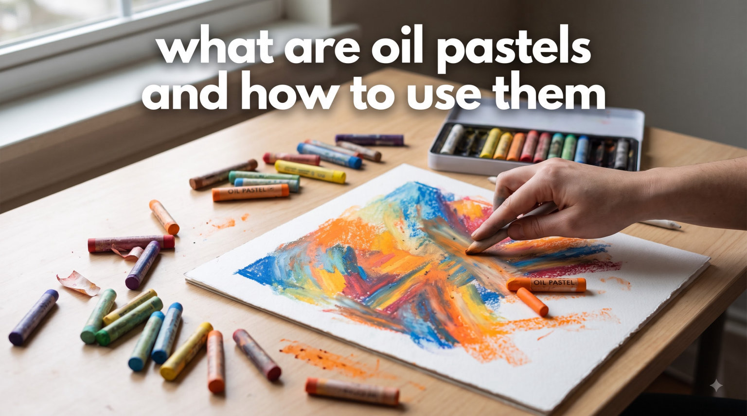
If you have ever wondered what are oil pastels and how to use them, you are in the right place. Oil pastels are one of the most forgiving, vibrant, and accessible art mediums available today. They look like thick crayons but behave more like paint, giving you the best of both worlds without the setup time, brushes, or solvents that traditional painting requires.
In this guide, I am going to walk you through everything you need to know about oil pastels in 2026. We will cover what they are made of, how they compare to similar mediums like soft pastels and wax crayons, which techniques actually work, and how to avoid the common mistakes that trip up most beginners. I have spent months working with oil pastels across different surfaces and brands, and I want to share what I learned so you can skip the frustration and start making art you are proud of.
Whether you are picking up oil pastels for the first time or you have been experimenting and want to level up your technique, this guide has something for you. I have pulled insights from professional artists, art forums, and my own studio practice to give you a resource that goes beyond surface-level advice. By the end, you will understand exactly how to get the most out of this underrated medium.
One thing I want to be upfront about: oil pastels are not just “fancy crayons.” They are a legitimate artist medium with a rich history and unique capabilities. Once you understand how to work with them, they open up creative possibilities that no other medium can match. Let me show you why.
Table of Contents
What Are Oil Pastels?
Oil pastels are crayon-like art tools made from pigment mixed with a non-drying oil and a wax binder. Unlike traditional pastels that use a gum or chalk binder, oil pastels stay soft, creamy, and workable almost indefinitely. That non-drying property is what makes them so blendable and expressive. You can rework an area hours, days, or even weeks later because the surface never fully sets.
The basic composition is straightforward: high-quality pigment provides the color, a non-drying oil (typically linseed oil or a similar mineral oil) gives them their creamy consistency, and wax acts as the binder that holds everything together in stick form. The ratio of these ingredients determines whether you are holding a student-grade stick or a professional-grade oil pastel. Higher-quality pastels contain more pigment and less filler, resulting in richer colors and smoother application.
Artist-grade oil pastels can contain up to 70 percent pigment by volume, with the remainder split between the oil binder and wax. Student-grade versions may contain only 30 to 40 percent pigment, with the rest being filler materials like calcium carbonate. This difference in pigment load is immediately visible when you compare the two side by side. Artist-grade pastels produce saturated, vibrant marks that jump off the page, while student-grade pastels often look flat and waxy by comparison.
The history of oil pastels is actually pretty interesting. They were invented in 1949 by Henri Sennelier at the request of Pablo Picasso. Picasso wanted a medium that combined the directness of drawing with the richness of oil paint, and after two years of experimentation, Sennelier delivered. The first oil pastels were produced in Paris and quickly gained popularity among artists who appreciated their immediacy and vibrant color output. Picasso reportedly purchased 40 sticks from that first production run, and the medium has been continuously manufactured ever since.
Today, oil pastels are used by everyone from young students to professional fine artists. Their key properties include a creamy texture that glides onto surfaces, vibrant, opaque colors that cover well, blendability that allows smooth transitions between hues, and a workable surface that stays open for reworking long after application. They also adhere to a wider variety of surfaces than most other drawing mediums, including paper, canvas, wood, and even glass. These characteristics make them unlike almost any other medium in the art supply world.
It is worth noting that oil pastels differ from oil sticks (sometimes called pigment sticks or oil bars) in important ways. Oil sticks contain a higher percentage of drying oil and will eventually cure and harden like traditional oil paint. Oil pastels, by contrast, use non-drying oil and wax, meaning they stay soft permanently. This distinction matters for how you store and display finished artwork, which we will cover later in this guide.
Oil Pastels vs Soft Pastels vs Crayons: What Sets Them Apart
One of the biggest sources of confusion for beginners is telling oil pastels apart from soft pastels and wax crayons. They all look similar at a glance, but they behave very differently once you start using them. Understanding these differences will help you choose the right tool for the effect you want to create.
Oil Pastels vs Soft Pastels
Soft pastels (also called chalk pastels) use a gum binder and contain much less oil. They produce a powdery, dusty texture that blends easily with a light touch but produces a significant amount of pigment dust. Soft pastels are brilliant for soft, atmospheric effects and are the go-to for many landscape artists who want delicate color transitions. However, they require fixative to keep from smudging, and that dust gets everywhere, on your hands, your clothes, and your workspace.
Oil pastels, by contrast, produce almost no dust. Their creamy texture stays on the surface rather than floating through the air. They never fully dry, which means you can rework areas days or even weeks later without cracking or flaking. This also means you need to frame finished pieces behind glass to protect them from accidental smudging. The tactile experience is entirely different: soft pastels feel like drawing with chalk, while oil pastels feel like drawing with lipstick or a thick lip balm.
When it comes to color intensity, oil pastels generally produce more saturated, opaque marks. Soft pastels can achieve a wider range of light, airy effects but struggle with deep, opaque coverage. If you want bold, painterly marks that sit on top of the paper, oil pastels are the better choice. If you prefer ethereal, atmospheric washes of color, soft pastels might suit you better.
Oil Pastels vs Wax Crayons
Wax crayons are the closest visual cousin to oil pastels, and many beginners assume they are basically the same thing. They are not. Standard wax crayons have a much harder consistency, lower pigment load, and significantly less blendability. They are designed primarily for children and prioritize washability and durability over artistic performance.
Oil pastels have a far higher concentration of pigment relative to binder, which gives them richer, more saturated colors. They go on thicker and more opaque than crayons, and they blend smoothly with finger pressure or tools. Crayons tend to skip and streak on most papers, depositing uneven color that is difficult to modify. Oil pastels glide and deposit even, buttery layers of color that can be pushed around and reworked. If you have tried crayons and felt limited by their performance, oil pastels offer a completely different and far more capable experience.
The practical differences show up immediately. Try blending two crayon colors together and you will get a patchy, uneven result. Do the same with oil pastels and your finger will smooth them into a seamless gradient in seconds. This blendability is the single biggest advantage oil pastels have over crayons, and it is what allows you to create nuanced, painterly artwork.
Oil Pastels vs Oil Sticks
Oil sticks (or oil bars) are larger, thicker versions that contain a higher percentage of drying oil and stand oil. They are essentially oil paint in stick form and will eventually dry like oil paint, forming a permanent surface. Oil pastels, on the other hand, use non-drying oil and never fully set. Oil sticks are better for large-scale work and impasto techniques where you want thick, sculptural paint application. Oil pastels excel at smaller-scale detail, blendability, and portability.
The choice between the two often comes down to working size and finishing preferences. If you want to create large canvases with permanent, dry surfaces, oil sticks are the way to go. If you prefer smaller works, sketchbook pieces, or artwork where you want to maintain the ability to rework areas over time, oil pastels are the better fit.
How to Use Oil Pastels: Getting Started for Beginners
Learning what are oil pastels and how to use them starts with having the right supplies and a few ground rules. The good news is that oil pastels require minimal equipment compared to almost any other painting medium. You do not need brushes, palettes, water containers, or drying racks. Just the pastels, some paper, and your hands.
Student Grade vs Artist Grade: What You Need to Know
Oil pastels come in two main quality tiers: student grade and artist grade. Student-grade pastels are more affordable but contain less pigment and more filler. They go on thinner, blend less smoothly, and the colors are less vibrant and more muted. Many forum users on r/Oilpastel report that cheap brands “feel like children’s crayons” and make it harder to learn proper technique because they do not respond to blending the way they should.
Artist-grade oil pastels from brands like Sennelier, Holbein, and Caran d’Ache deliver noticeably richer colors, smoother application, and far better blendability. The difference is not subtle. When I compared a student-grade set side by side with artist-grade pastels, the artist-grade sticks laid down color that was visibly thicker, more saturated, and easier to blend into smooth gradients.
You do not need to buy the most expensive set to get good results, though. Several forum communities consistently recommend Mungyo Gallery and Paul Rubens as budget-friendly options that still perform well for learning. These brands offer a middle ground: better pigment loads and softer consistency than the cheapest student sets, at a fraction of the cost of professional-grade options. If you are just starting out and want to keep costs down, either of these brands will serve you well.
What You Need to Start
Here is a practical list of what to pick up before your first session. You need a set of oil pastels (12 to 24 colors is plenty to start), heavy paper with some tooth or texture (more on surfaces below), a few blending tools (your fingers work great, plus a tortillion or two for detail work), and some paper towels for cleaning sticks between colors. That is the complete list. No brushes, no palettes, no solvents, no setup time, no cleanup beyond washing your hands.
One tip from forum artists that I found genuinely helpful: start with a smaller set rather than a massive 72-color box. Working with limited colors forces you to learn mixing and blending, which builds stronger foundational skills. With 12 to 18 colors, you will naturally start layering and combining sticks to create new hues, which teaches you how the medium behaves. You can always expand your set later once you understand the basics.
Another thing I wish someone had told me early on: protect your workspace. Oil pastels are inherently messy. The creamy texture that makes them so blendable also means they transfer to everything they touch. Lay down some newspaper or a disposable table cover before you start working. Your tables and countertops will thank you.
Essential Oil Pastel Techniques You Should Know
The real magic of oil pastels reveals itself through technique. Once you understand the core methods, you can create everything from soft, blended landscapes to bold, textured abstracts. Here are the techniques I use most often, explained in plain language with practical tips for each one.
1. Direct Application and Pressure Control
The most basic technique is simply drawing directly on your surface, but varying your pressure creates dramatically different effects. Light pressure gives you thin, translucent strokes that let the paper show through. Heavy pressure deposits thick, buttery layers of color that sit on top of the surface. Most of your blending and layering will involve somewhere in between.
I recommend practicing pressure control before tackling a full piece. Make a gradient strip on scrap paper, starting with the lightest touch you can manage and gradually increasing to full pressure. Notice how the texture changes from a whisper-thin line to a thick, opaque band. Notice too how the color intensity shifts as more pigment is deposited. This simple exercise takes five minutes and teaches you more about oil pastel handling than reading a dozen tutorials.
You can also vary the angle of the pastel stick to change your mark. Using the pointed tip gives you fine lines and details. Tilting the stick to use its side creates broad, sweeping strokes perfect for filling in large areas. Rotating the stick as you draw creates varied, organic lines that feel more natural and expressive than uniform strokes.
2. Blending with Your Fingers
Finger blending is the most popular blending method among oil pastel artists, and for good reason. Your fingertips provide just the right amount of warmth and pressure to smooth oil pastel into seamless gradients. Forum discussions consistently show that finger blending is the go-to method despite the mess factor. The natural warmth of your skin softens the wax binder just enough to make the colors flow together.
To blend with your fingers, apply two colors side by side on your surface, then use gentle circular motions to work them together where they meet. The warmth of your fingers softens the wax binder slightly, helping the colors merge into a smooth transition. Work in small areas rather than trying to blend a large section at once. And keep a damp paper towel nearby to clean your fingers between colors, because mixing warm and cool tones on dirty fingers is a fast track to muddy, dull results.
One important note: some oil pastel pigments contain ingredients you should not be absorbing through your skin repeatedly. If you plan to work with oil pastels frequently, consider wearing latex or nitrile gloves while blending. This also eliminates the need to constantly wash your hands and keeps the mess contained. Many professional oil pastel artists work with gloves for this reason.
3. Blending with Tools
When you need more precision than fingers allow, blending tools give you control over smaller areas and tighter gradients. Tortillions (tightly rolled paper stumps) are inexpensive and work well for blending tight corners, detailed areas, and small gradients. Blending stumps (similar but made of compressed paper) offer a slightly firmer touch and last longer before needing replacement.
For larger areas, try blending with a soft cloth, a chamois, or even a piece of heavy paper towel. Each material produces a slightly different texture in the finished blend. Paper towels give a softer, more diffused blend with a slightly textured finish. Chamois produces smoother, more seamless transitions. Some artists use silicone color shapers for even more controlled blending, especially when working on detailed areas where precision matters.
Do not overlook simple household items either. Cotton swabs work surprisingly well for small blending jobs. Makeup sponges can create soft, airbrushed-looking blends over larger areas. The key is to experiment with different materials and find what gives you the texture and control you want. Every tool leaves a slightly different mark, and part of developing your personal style involves discovering which tools feel right in your hands.
4. Layering and Building Color
Layering is where oil pastels really shine. Because they never fully dry, you can build up multiple layers of color to create depth and complexity that would be difficult with dry media. The key principle is to work from light colors to dark colors in most cases, applying thinner layers underneath and thicker layers on top.
Start with a light base layer applied with moderate pressure. This fills in the paper’s tooth and establishes your foundation color. Add your mid-tones on top, blending as needed to create smooth transitions. Then add your darkest values and brightest highlights last, using heavy pressure so they sit on top of the underlying layers without mixing through. If you try to add light colors over thick dark layers, the dark color will keep mixing through and muddying your highlights.
Keep your layer count reasonable. Three to four layers usually gives you plenty of depth and complexity without the surface turning into an overworked, muddy mess. If you feel like you need more layers than that, step back and consider whether you might be better off scraping back some existing color first and reapplying fresh layers on a cleaner surface.
Color temperature plays a big role in successful layering. Warm colors (yellows, oranges, reds) naturally advance visually, while cool colors (blues, purples, cool greens) recede. Using this to your advantage when layering can create a sense of depth and dimension in your work, even in abstract pieces where there is no literal foreground or background.
5. Scumbling
Scumbling involves applying broken, irregular strokes of a lighter or different color over an existing layer without fully covering it. The underlying color peeks through the gaps in the scumbled strokes, creating visual texture and color vibration that you cannot achieve through flat blending alone. It is one of the most expressive techniques available with oil pastels.
This technique works beautifully for suggesting texture in landscapes: think dappled sunlight filtering through leaves, rough stone surfaces catching side light, or the play of light and shadow on moving water. Use a light touch and let the pastel skip across the surface naturally rather than trying to make every stroke perfect. The irregularity and broken quality of the marks is the whole point.
Scumbling also works well for creating atmospheric effects in skies and backgrounds. A light scumble of white or pale yellow over a blue base creates the impression of wispy clouds or haze. A warm orange scumbled over cool purple creates a sunset glow that feels luminous and alive. The key is keeping your pressure light and allowing the base color to show through.
6. Sgraffito (Scratching Through Layers)
Sgraffito is a technique borrowed from ceramics and printmaking where you scratch through a top layer of color to reveal the layer underneath. With oil pastels, you apply a base layer of one color, then cover it completely with a contrasting layer, and finally use a sharp tool to scratch patterns, lines, or details into the top layer. The base color shows through wherever you scratch, creating crisp, detailed marks that would be impossible to draw directly with a blunt oil pastel stick.
You can use a variety of tools for sgraffito: a wooden skewer, a palette knife edge, the tip of a brush handle, a sharpened dowel, or even a toothpick for very fine lines. Each tool produces a different width and character of line. A palette knife gives you broad, bold scratches. A toothpick creates hair-fine details. A wooden skewer falls somewhere in between and is probably the most versatile option for general use.
This technique is perfect for adding fine details to oil pastel work: tree branches against a sky, texture lines on animal fur, crosshatching patterns, or written text. Because oil pastels never fully dry, your sgraffito marks stay crisp and visible indefinitely. Just be careful not to press so hard that you tear the paper underneath.
7. Blending with Solvents
For a smoother, more painterly effect, you can blend oil pastels with solvents. Baby oil is the most accessible and safest option for home studios. Apply a small amount to a cotton swab, soft brush, or cotton ball and work it into the oil pastel on your surface. The solvent partially dissolves the wax binder, allowing you to spread and smooth the color like thin paint. This creates wash-like effects that are impossible to achieve with dry blending alone.
Mineral spirits and turpentine also work but require proper ventilation and safety precautions. They dissolve the binder more aggressively than baby oil, creating smoother, more fluid blends. For beginners working at home, baby oil is more than sufficient and dramatically safer. It gives you a watercolor-like wash effect while maintaining the vibrant pigment quality that makes oil pastels special. Just remember that solvents can affect certain papers, so always test on a scrap piece first.
When using any solvent, apply the oil pastel first, then use the solvent to blend and smooth. You can also apply solvent to a brush and pick up color directly from the oil pastel stick, then paint with it as if it were traditional paint. This opens up a whole range of techniques that blur the line between drawing and painting.
8. Masking with Tape
Masking tape is a simple but surprisingly effective tool with oil pastels. Apply tape to your surface to create clean edges, sharp borders, or protected areas you want to keep blank. Oil pastels will not bleed under well-adhered tape the way liquid paint can, which gives you crisp, clean lines when you remove the tape.
This technique is especially useful for geometric compositions, architectural elements, lettering, or any area where you need a hard edge that would be difficult to achieve freehand. Use low-tack painter’s tape rather than standard masking tape, which might be too aggressive and could damage delicate papers when removed. Press the tape edges down firmly to ensure a clean seal before applying pastel, and remove the tape slowly at a low angle to avoid lifting any surrounding pastel.
Can You Use Oil Pastels with Water? Exploring Mixed Media
This is a question I see frequently in art forums, and it deserves a clear, detailed answer. Because oil pastels are made with oil and wax, water alone will not dissolve or blend them. Water beads up on the oily surface rather than mixing in, much like water on a freshly waxed car. That said, you can absolutely combine oil pastels with water-based media in creative and exciting ways.
Watercolor Resist Technique
The most popular mixed media approach is the watercolor resist technique. Draw or write with oil pastels on watercolor paper, then wash watercolor paint over the entire surface. The watercolor adheres to the bare paper but slides right off the oil pastel marks, creating a resist effect where your pastel marks remain bright and vivid against the watercolor background. This is a fantastic technique for creating bold outlines, decorative patterns, or undersea scenes where the pastel marks shine through watery washes.
The resist technique works because of the fundamental incompatibility between oil and water. The waxy, oily surface of your pastel marks repels the water-based paint, preventing it from adhering to or staining those areas. The contrast between the bold, opaque pastel marks and the transparent, flowing watercolor creates a visual dynamic that neither medium can achieve on its own.
Oil Pastels Over Watercolor Underpainting
Another powerful approach is to paint a loose watercolor underpainting first, let it dry completely, and then add oil pastel details and texture on top. The watercolor provides a fast, atmospheric base layer that establishes your overall color scheme and value structure. The oil pastels then add bold marks, lines, highlights, and focal points on top of that foundation.
This combination gives you the soft transparency of watercolor with the bold opacity of oil pastel, and it works especially well for landscapes and urban sketches where you want both atmospheric depth and graphic punch. I have used this approach for outdoor sketching and found it remarkably effective. The watercolor dries fast in the field, and then you can add oil pastel details without waiting for anything else to set.
Important Considerations for Mixed Media
When mixing oil pastels with water-based media, always apply the water-based materials first and let them dry completely before adding oil pastels. Applying water over oil pastel will not work because the oily surface repels water. Also, use heavyweight paper (140-pound minimum) that can handle both wet and dry media. Lightweight papers will buckle under water and then get torn by the pressure of oil pastel application.
One more consideration: because oil pastels never dry, a finished mixed media piece that combines watercolor and oil pastel will need the same protective framing as a pure oil pastel work. The watercolor portions will be dry and permanent, but the oil pastel areas will remain vulnerable to smudging until protected behind glass.
Best Surfaces and Papers for Oil Pastels
The surface you choose makes a massive difference in how your oil pastels perform. Oil pastels need some degree of tooth (surface texture) to grip onto. A perfectly smooth surface will cause the pastel to slide around without depositing color evenly, while the right amount of texture grabs the pastel and holds it in place. Getting this right is one of the most important factors in achieving satisfying results.
Heavyweight Watercolor Paper
My top recommendation for beginners is 140-pound (300 gsm) or heavier watercolor paper with a cold-pressed texture. The subtle bumps and valleys of cold-pressed paper grip oil pastel beautifully, and the heavy weight stands up to the pressure and layering without buckling or tearing. Both individual sheets and bound pads work well. Hot-pressed watercolor paper is smoother and works if you prefer less texture, but it holds fewer layers because the surface tooth fills up faster.
If you plan to use solvents or combine oil pastels with watercolor (as described above), watercolor paper is the obvious choice because it is already designed to handle wet media. Even if you are using oil pastels dry, the texture and durability of good watercolor paper make it an excellent foundation.
Pastel Paper
Papers specifically designed for pastels feature a textured surface (often with a fine grit or felt-like texture) that grabs pigment exceptionally well. Brands like Canson Mi-Teintes are widely available and come in a range of colors from neutral grays to warm earth tones to deep blues. Using a toned pastel paper can unify your piece, because the paper color shows through between your strokes and acts as a unifying mid-tone throughout the composition.
When using pastel paper, try the textured side rather than the smoother side for oil pastel work. The texture provides the grip the pastel needs. Some pastel papers have a cork or sand texture that can hold many more layers than standard paper, which is useful for complex, layered pieces. Pastel paper is also available in larger sheets than most sketch pads, giving you more room to work.
Canvas and Gessoed Boards
Oil pastels work on canvas, especially if you apply a layer of gesso first to add tooth. Stretched canvas gives you a more formal, painting-like finished product, and the texture of woven canvas creates interesting visual effects with the pastel. Gessoed boards (rigid wood or composite panels coated with gesso) are even better because they provide a rigid, stable surface that will not flex and potentially crack thick pastel layers over time.
Working on canvas or panel gives your oil pastel pieces a fine-art presentation that paper does not always provide. You can hang a canvas directly on the wall without framing, which appeals to artists who want a more immediate display option. Keep in mind that the non-drying nature of oil pastels means unframed canvas works are still vulnerable to smudging from contact, so consider where the piece will hang.
Bristol Cardstock
Bristol cardstock (especially vellum surface, not the smooth plate finish) is a good option for smaller works and detailed pieces. It has a smoother finish than watercolor paper but still enough tooth for oil pastel adhesion. It is affordable, comes in convenient pad form, and works well for practice pieces, studies, and sketches. Many urban sketchers carry small Bristol pads specifically for oil pastel work on the go.
Surfaces to Avoid
Thin printer paper or sketch paper will tear under the pressure oil pastels require and cannot handle multiple layers. Standard office paper is far too thin and smooth. Glossy or coated papers (like photo paper or magazine paper) are too smooth for pastel to adhere to, and the coating can interact poorly with the oil binder. While you can technically use oil pastels on wood, metal, or glass, these surfaces need preparation with gesso or primer before the pastel will stick properly and build up enough texture to be workable.
Common Oil Pastel Mistakes and How to Fix Them
After working with oil pastels and spending time in artist communities, I see the same mistakes come up over and over. These are not signs of lack of talent. They are simply the natural result of approaching a new medium without understanding its quirks. Here are the most common mistakes and practical fixes for each one.
Colors Turning Muddy
This is the number one complaint I see in forums, and it is the most discouraging experience for new oil pastel artists. Muddy colors happen when you over-blend too many layers, especially when mixing complementary colors (like red and green, or blue and orange). Complementary colors neutralize each other when mixed, producing grays and browns rather than vibrant intermediate hues. The more you blend them, the muddier they get.
The fix is to limit your layering to three or four layers maximum, blend gently rather than aggressively scrubbing the surface, and work in small sections so you maintain control over color mixing. If an area does turn muddy, try scraping back to a lower layer with a palette knife and reapplying fresh color on top. You can also use the muddy area as a neutral base and add vibrant color on top of it with heavy pressure.
Using the Wrong Paper
Using smooth, thin paper is a recipe for frustration. The pastel will not adhere properly, colors will look washed out and streaky, and you will tear through the paper with the heavy pressure needed for proper blending and layering. Invest in paper with actual tooth and sufficient weight (140-pound minimum). The paper is the cheapest part of your supply list, so this is not the place to cut corners.
Pressing Too Hard Too Early
Going full pressure on your first layer fills the paper’s tooth immediately, leaving nowhere for subsequent layers to grip. When you try to add more color on top, it slides around on the slick surface rather than adhering. Start with light to moderate pressure on your base layers and save heavy pressure for your final layers and highlights. Think of it as building a foundation before adding the decorative elements on top.
Not Cleaning Sticks Between Colors
Oil pastels are soft, and they pick up whatever color they touch. If you blend a dark blue into a light yellow without cleaning the blue stick first, you will contaminate the yellow stick and end up with a greenish-yellow in your set permanently. Get in the habit of wiping each stick on a paper towel after every few strokes. It takes two seconds and saves you from ruining colors in your set. Some artists even keep a designated “cleaning pad” of scrap paper at their workspace and roll each stick across it before putting it back in the box.
Using Low-Quality Pastels
Forum users consistently report that the biggest early frustration is cheap pastels that do not blend. Student-grade pastels from unknown brands often have so much filler that they behave like waxy crayons rather than proper oil pastels. The colors go on thin and streaky, they resist blending, and the overall experience feels nothing like what oil pastels are supposed to be. You do not need professional-grade Sennelier to start, but spending a little more on a reputable budget brand like Mungyo Gallery or Paul Rubens will make your learning experience dramatically more enjoyable and give you accurate feedback about your technique.
Skipping the Planning Stage
Because oil pastels are so immediate and fun to use, it is tempting to just start laying down color without any plan. This often leads to overworked areas, poor composition, and muddy colors as you try to fix problems by adding more and more layers. Spend a few minutes sketching your composition lightly with a pencil first. Know where your light source is, where your darkest darks and lightest lights will be, and which colors you plan to use. Five minutes of planning saves hours of frustration.
How to Clean, Store, and Protect Your Oil Pastels
Taking care of your oil pastels properly keeps them working well and extends their usable life significantly. Oil pastels are fairly durable as art supplies go, but they do have some specific care requirements that are worth knowing about.
Cleaning Sticks Between Uses
During a work session, oil pastel sticks inevitably pick up other colors from blending and from resting on your workspace. To keep them clean, wipe each stick on a clean paper towel or rag after you use it. For stubborn color transfer that will not wipe off, lightly rub the stick on a scrap piece of paper until the contaminated outer layer is removed and you are back to the true, clean color underneath. Some artists keep a dedicated “cleaning rag” at their workspace specifically for this purpose.
The softer the pastel, the more frequently it will need cleaning. Artist-grade pastels pick up contamination faster than harder student-grade sticks because their surface is more pliable. This is a small trade-off for the vastly superior performance of artist-grade materials.
Proper Storage
Store your oil pastels in a cool, dry place away from direct sunlight. Most sets come in fitted boxes or trays with individual compartments that work fine for storage. If your set did not include a good storage solution, a foam-lined tackle box, a compartmentalized art supply organizer, or even an ice cube tray can work well. The key is keeping sticks separated enough that they do not rub against each other and cross-contaminate.
Temperature matters more than you might think. Do not leave oil pastels in a hot car, a sunny windowsill, or an unairconditioned attic during summer. High temperatures can soften the wax binder and cause the sticks to warp, flatten on one side, or stick together into an unusable lump. I learned this the hard way after leaving a set in my car during a July afternoon. Conversely, extremely cold temperatures make the sticks harder and more brittle, though they usually return to normal consistency once they warm back to room temperature.
Protecting Finished Artwork
Because oil pastels never fully dry, finished artwork remains vulnerable to smudging indefinitely. This is not a flaw. It is an inherent characteristic of the medium. The best protection is framing behind glass with a mat spacer so the glass does not touch the pastel surface. This provides complete protection while keeping the artwork visible and vibrant.
Fixative sprays exist for oil pastels, but they come with significant caveats. Fixative tends to darken colors slightly and can alter the creamy surface texture that makes oil pastels special. The protection they provide is also partial at best. I only use fixative as a temporary measure during the working process (to seal a layer before adding more on top), never as a final protective coating. For finished pieces, framing behind glass remains the gold standard.
If framing behind glass is not practical or affordable, you can place a sheet of glassine paper (a smooth, non-stick archival paper) between the surface of the pastel and any protective covering like a folder or portfolio. Glassine paper will not stick to oil pastel and provides a reasonable level of protection for works in storage or transit. Never use regular paper, wax paper, or plastic wrap, which can stick to the pastel surface and damage it when removed.
Famous Artists Who Used Oil Pastels
Oil pastels have a surprisingly rich history in fine art, and knowing that heritage can change how you think about the medium. This is not a niche hobby supply. It is a serious artist medium with a pedigree that connects directly to some of the most important artists of the 20th century.
The medium was born from Pablo Picasso’s request to Henri Sennelier in 1947. Picasso wanted a versatile medium he could use without brushes or solvents, something that combined the immediacy of drawing with the color richness of oil painting. After two years of development and formulation, Sennelier produced the first commercial oil pastels in his Paris shop. Picasso reportedly bought 40 of the initial production run and used them extensively in his later work. The medium has been continuously manufactured by Sennelier ever since, and the original formulation is still available today.
Jean-Michel Basquiat, one of the most influential and celebrated artists of the 1980s, is often associated with oil pastels. This comes up frequently in search questions, so let me clarify the distinction. Basquiat used oil sticks (also called pigment sticks), which are related to but technically different from oil pastels. Oil sticks contain a drying oil binder that eventually sets hard like oil paint, while oil pastels use a non-drying oil and wax combination that stays workable permanently. The visual effect and application technique are very similar, and Basquiat’s raw, expressive, graffiti-influenced style has inspired many artists to pick up oil pastels specifically to explore similar creative territory.
Contemporary artists continue to push oil pastels in exciting new directions. The medium is particularly popular among urban sketchers who value its portability and lack of cleanup, mixed media artists who combine it with watercolor, ink, and collage, and illustrators who appreciate its vibrant color range and ability to work on surfaces that traditional paint cannot easily handle. The oil pastel community is active and growing, with dedicated forums, social media groups, and YouTube channels sharing techniques and inspiration.
A Simple First Exercise: Your First Oil Pastel Piece
Reading about techniques is useful, but the fastest way to understand oil pastels is to use them. Here is a simple first exercise that will teach you the basics in under 30 minutes. All you need is one oil pastel set, one sheet of heavy paper, and your fingers.
Start by drawing a simple landscape: a horizon line across the middle of your page, a sky above, and ground below. Use two or three blues for the sky and two or three greens for the ground. Apply the lightest color first with moderate pressure, covering each area. Then add the medium shade on top, concentrating it toward the top of the sky and the bottom of the ground. Finally, add your darkest shade with heavy pressure at the very top of the sky and the very bottom of the ground.
Now blend each section with your fingers, working in small circular motions from light areas into dark areas. Notice how the colors transition smoothly where you blend them together. If the transition looks streaky, keep blending. If it looks muddy, you may have overworked it. Try a lighter touch next time.
Once the sky and ground are blended to your satisfaction, add a bright yellow or orange sun near the horizon. Apply it with heavy pressure so it sits on top of the blue. Then use your finger to gently pull some of that warm color outward from the sun, creating a soft glow effect in the surrounding sky.
This simple exercise teaches you pressure control, finger blending, layering, and the importance of working light to dark. It also produces a surprisingly attractive little piece that you can feel good about. From here, you can start experimenting with more colors, different surfaces, and the other techniques described in this guide.
FAQs
What is the rule of 3 in oil pastels?
The rule of 3 in oil pastels refers to limiting yourself to three layers of color to prevent muddying. Apply a base layer with light pressure, a middle layer with moderate pressure, and a final layer with heavy pressure. Staying within three layers keeps colors clean and vibrant while still giving you enough depth for rich, dimensional artwork.
Are oil pastels easy for beginners?
Yes, oil pastels are one of the easiest art mediums for beginners to pick up. They require no brushes, no water, no solvents, and no setup time. You draw directly on paper and blend with your fingers. The creamy texture is forgiving, mistakes can be reworked because the pastel never fully dries, and the vibrant colors make even simple pieces look impressive. Most beginners can create satisfying results within their first session.
What are the disadvantages of oil pastels?
The main disadvantages of oil pastels are that they never fully dry, making finished artwork vulnerable to smudging unless framed behind glass. They can be messy to work with, especially when blending with fingers. Fine detail work is challenging because the sticks are blunt and thick. Cheap student-grade pastels perform poorly and can discourage beginners. They also require paper with tooth or texture, which costs more than basic drawing paper.
Did Basquiat use oil pastels?
Jean-Michel Basquiat used oil sticks (also called pigment sticks), which are related to but technically different from oil pastels. Oil sticks contain a drying oil binder that eventually sets hard, while oil pastels use non-drying oil and wax and stay workable permanently. The application technique and visual effect are very similar, and Basquiat’s expressive, raw style has inspired many artists to work with oil pastels specifically.
Can you use oil pastels on canvas?
Yes, oil pastels work well on canvas, especially if you apply a coat of gesso first to add tooth and texture for the pastel to grip. Stretched canvas gives your finished piece a professional, painting-like quality. Canvas boards and gessoed panels are also excellent options because their rigid surface prevents the cracking that can occur on flexible stretched canvas over time.
How long do oil pastels last?
Oil pastels can last for decades when stored properly. Because they use a non-drying oil and wax binder, they do not dry out or become brittle over time like some other art supplies. Keep them in a cool, dry place away from direct sunlight and extreme heat. The main enemy of oil pastel longevity is high temperature, which can soften the wax and cause sticks to warp or fuse together.
Wrapping Up: Your Oil Pastel Journey Starts Here
We have covered a lot of ground in this guide on what are oil pastels and how to use them. You now know that oil pastels are pigment sticks made with non-drying oil and wax, giving them a creamy, endlessly blendable texture unlike any other art medium. You understand how they differ from soft pastels, wax crayons, and oil sticks, which surfaces and papers work best, and eight distinct techniques you can start using right away.
More importantly, you know the mistakes to avoid. Keep your layers to three or four, use paper with actual tooth, start with light pressure and build up, and clean your sticks between colors. These simple habits will save you from the frustration that drives so many beginners away from the medium before they have a chance to experience what makes it special.
You also know how to combine oil pastels with water-based media for mixed media effects, how to protect and store your finished artwork, and how famous artists from Picasso to Basquiat have used related mediums to create some of the most celebrated artwork of the past century.
The best thing you can do now is start making art. Pick up a set of oil pastels, grab some heavy watercolor paper, and spend thirty minutes experimenting with pressure, blending, and layering. Try the simple landscape exercise above, or just make abstract marks and see what happens. Do not worry about making something perfect. Worry about learning how the medium feels in your hands. Every professional oil pastel artist started exactly where you are right now.
Oil pastels are one of the most rewarding art mediums I have worked with. They are immediate, forgiving, and capable of producing stunningly vibrant work that stands alongside any other medium. With the techniques and knowledge from this guide, you have everything you need to start creating. The only thing left is to pick up a pastel and make your first mark.