
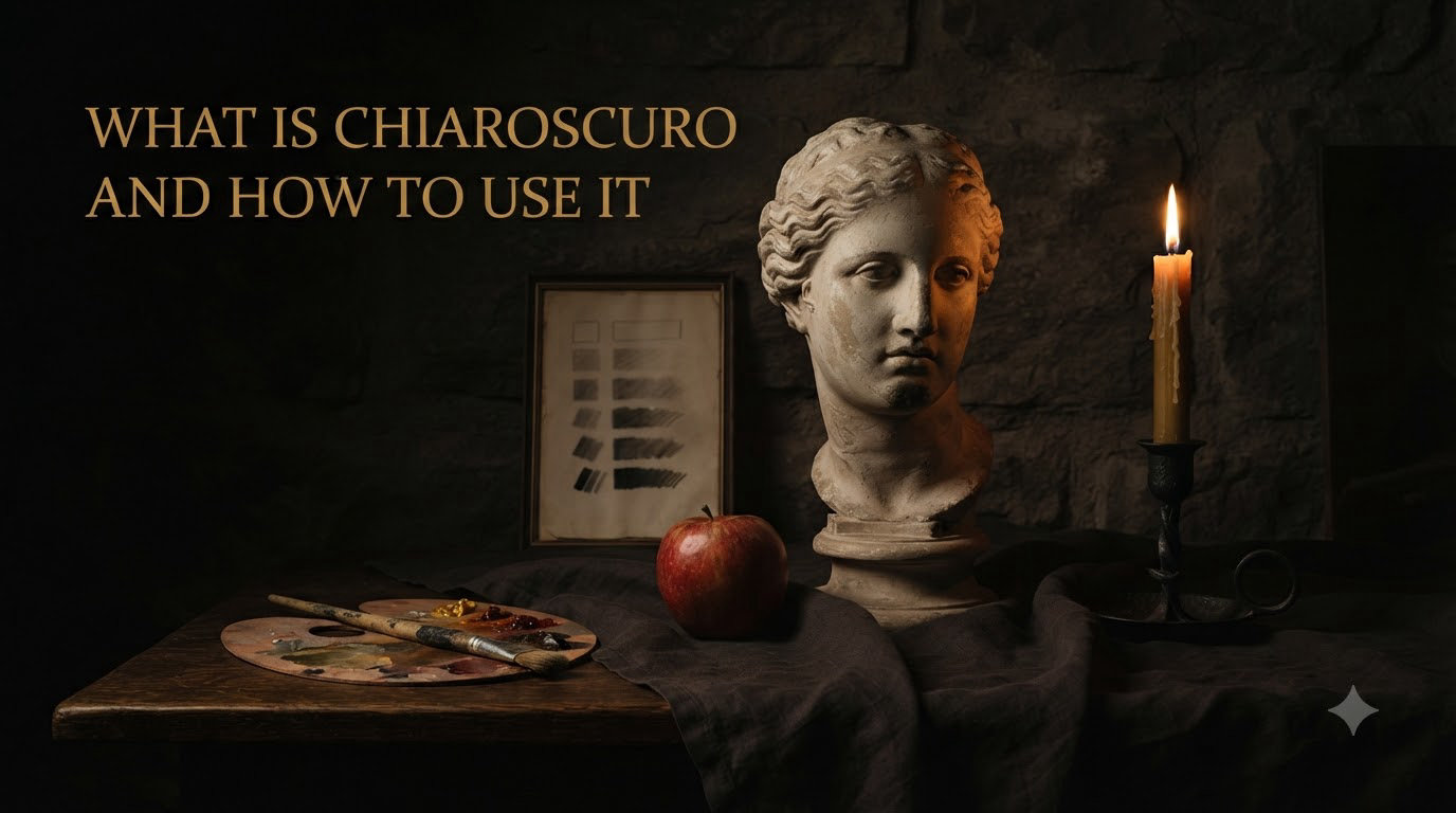
If you have ever stood in front of a painting and felt like the subject was literally emerging from the canvas, you have experienced chiaroscuro. It is one of the oldest and most powerful techniques in visual art, responsible for some of the most dramatic and memorable images in Western painting. Whether you are a painter, photographer, or digital artist, understanding what chiaroscuro is and how to use it can completely change the way you approach light, shadow, and depth in your own work.
In this guide, I will break down exactly what chiaroscuro means, walk through its history from ancient Greece to modern cinema, and give you practical step-by-step instructions to start using it in your art. I have spent years studying and teaching traditional oil painting techniques like chiaroscuro, and I can tell you that once you understand the core principles, the technique clicks. Whether you work in oils, acrylics, charcoal, or a digital tablet, the fundamentals are the same.
Chiaroscuro is not just a historical curiosity. It is an active, living technique used every day by portrait photographers, film directors, concept artists, and painters around the world. By the end of this article, you will know exactly what it is, where it came from, and how to apply it to your own creative projects.
Table of Contents
What Is Chiaroscuro? Definition and Meaning
Chiaroscuro is an art technique that uses strong contrasts between light and dark to create the illusion of three-dimensional volume on a flat surface. The word comes from two Italian words: chiaro, meaning light or clear, and scuro, meaning dark or obscure. Together, they describe exactly what the technique does. It balances light against shadow to make flat things look solid and real.
At its core, chiaroscuro is about controlling how light falls on a subject. When a single strong light source hits an object, it creates bright highlights on one side and deep shadows on the other. That contrast between light and dark tells our eyes that the object has shape, weight, and form. Without that contrast, everything looks flat and lifeless on the canvas.
Think of it this way. If you draw a circle on paper, it is just a circle. But if you shade one side dark and leave the opposite side bright with a smooth transition in between, it suddenly looks like a sphere. That transformation from flat to three-dimensional is chiaroscuro in action. It is one of the most direct and powerful tools an artist has for creating the illusion of reality.
The technique operates on what artists call a value scale. This is a gradient that runs from pure white to pure black with many shades of gray in between. Chiaroscuro uses the full range of that scale. Highlights sit near the white end, midtones fill the middle, and shadows push toward black. The wider the range between your lightest lights and darkest darks, the more dramatic the effect becomes. A narrow range gives you a softer, more subtle result.
It is worth distinguishing chiaroscuro from a few related terms early on so you can keep them straight. Sfumato, another Italian technique pioneered by Leonardo da Vinci, is about softening edges and blending colors so smoothly that transitions are nearly invisible. Chiaroscuro is more about the contrast itself rather than the softness of edges. Grisaille is painting entirely in gray tones to simulate sculpture. These techniques overlap, but chiaroscuro specifically refers to the strategic interplay of light and shadow to create depth and drama in a composition.
Chiaroscuro also differs from simple shading. Shading is any darkening of a surface to suggest form. Chiaroscuro is a deliberate compositional strategy that uses the full value range to organize the entire image around a dramatic light-dark structure. You are not just adding shadow. You are designing the painting around the relationship between illumination and darkness.
The History of Chiaroscuro: From Ancient Greece to the Baroque
Chiaroscuro did not start with the Renaissance, even though that is when it reached its artistic peak. The story begins much earlier, and understanding that history helps you appreciate why the technique works the way it does and how it evolved over centuries of artistic experimentation.
Ancient Origins and Skiagraphia
The earliest known use of light and shadow in art dates back to ancient Greece. Greek painters developed a technique called skiagraphia, which translates to “shadow painting.” They used it to suggest depth and volume on flat surfaces, particularly in stage scenery for theatrical productions and in large-scale frescoes decorating public buildings.
Skiagraphia was relatively crude by later standards, but it established the fundamental idea that shadows could make painted objects look real rather than flat. The ancient Greeks understood that when light falls on a three-dimensional object, the resulting pattern of light and shadow contains visual information about the object’s shape and position in space.
Not much of this ancient work survives today, but contemporary accounts from writers like Plutarch describe how Greek artists were beginning to understand the relationship between light sources and shading. They experimented with shading to suggest volume on figures in vase painting and panel paintings. The concept was planted. It would take over a thousand years before artists really developed it into a systematic technique.
The Renaissance Revolution (Leonardo da Vinci)
The real breakthrough came during the Italian Renaissance in the late 1400s and early 1500s. Leonardo da Vinci was the first artist to systematically study how light falls on three-dimensional forms and translate those observations into a coherent painting technique. His notebooks are filled with detailed observations about light, shadow, atmospheric perspective, and how the human eye perceives depth.
Leonardo developed what he called “chiaro” and “scuro” as separate but related concepts in his writings on painting. He observed that objects lit by a single light source have a predictable and consistent pattern: a bright highlight where the light hits directly, a halftone area where the light begins to curve away, a core shadow on the opposite side, reflected light bouncing back from nearby surfaces, and a cast shadow falling behind or below the object.
This observation became the foundation of chiaroscuro as a formal technique. Once you understand this pattern, you can apply it to any subject under any lighting condition and produce convincing three-dimensional form on a flat canvas.
The development of oil paint during this period was critical to the advancement of chiaroscuro. Unlike tempera or fresco, oil paint dries slowly and can be layered in thin, translucent glazes. This allowed Renaissance artists to build up incredibly subtle gradations of light and shadow that were simply impossible with earlier materials. Leonardo’s Mona Lisa and The Virgin of the Rocks showcase his mastery of these smooth tonal transitions. The faces in his paintings seem to glow from within, emerging from soft shadows with no visible brushwork.
Other Renaissance painters built on Leonardo’s foundation. Artists like Raphael and Correggio adopted and refined chiaroscuro techniques in their own work, using contrast to create depth and draw the viewer’s eye to key figures in their compositions.
Caravaggio and the Baroque Explosion
If Leonardo pioneered chiaroscuro, Michelangelo Merisi da Caravaggio detonated it. Working in Rome around 1599, Caravaggio pushed the contrast between light and dark to levels no one had attempted before. His paintings feature figures emerging from pitch-black backgrounds, illuminated by a single intense light source that seems to cut through the darkness like a blade.
The Calling of Saint Matthew (1599-1600) is perhaps the most famous example of this approach. Christ points at Matthew in a dim Roman tavern, and a beam of light slices across the canvas to illuminate the scene. The contrast is extreme. Faces glow against walls of shadow, fabrics shimmer in isolated pools of brightness, and everything else disappears into darkness. It is theatrical, intense, and completely unlike anything painted before Caravaggio.
What made Caravaggio’s approach revolutionary was not just the level of contrast but the way he used light as a narrative tool. The beam of light in The Calling of Saint Matthew is not just illumination. It is divine intervention made visible. The darkness is not just absence of light. It is spiritual ignorance. Every technical choice serves the story.
Caravaggio’s influence was immediate and enormous. Artists across Europe traveled to Rome to see his work, and a generation of painters known as the Caravaggisti adopted his radical approach. The technique spread rapidly through Italy, Spain, France, and the Netherlands, transforming European art in the process. Painters like Artemisia Gentileschi, Peter Paul Rubens, and Diego Velazquez all absorbed Caravaggio’s lessons about dramatic contrast.
Dutch Masters: Rembrandt and Georges de La Tour
In the Netherlands, Rembrandt van Rijn took chiaroscuro in a warmer, more human direction. Where Caravaggio’s light is sharp and dramatic, Rembrandt’s light feels golden and intimate. His self-portraits show his face emerging from velvety shadows, lit by a gentle glow that seems to come from nowhere and everywhere at once. His The Night Watch (1642) uses chiaroscuro to guide the viewer’s eye through a complex group composition, with the two central figures bathed in light while the rest fade into shadow.
Rembrandt’s approach to chiaroscuro was deeply psychological. He used light not just to show form but to reveal character and emotion. In his later self-portraits, the thickly painted highlights on his forehead and nose contrast with thin, dark glazes in the shadows, creating a sense of lived experience and emotional weight that goes far beyond simple rendering of light on form.
Georges de La Tour, working in France around the same period, specialized in candlelit scenes. His paintings like Magdalen with the Smoking Flame feature a single candle as the light source, and the entire composition is organized around that tiny point of illumination. The result is haunting. Faces are half-lit, hands glow amber, and everything beyond the candle’s reach is swallowed by darkness.
De La Tour’s work demonstrates a principle that is useful for any artist: the more limited your light source, the more dramatic the chiaroscuro effect. A single candle in a dark room creates more intense contrast than a bright window. This is why chiaroscuro painters often worked with controlled, directional light rather than ambient illumination.
These artists proved that chiaroscuro was not a single approach but a versatile family of techniques. It could be explosive and theatrical (Caravaggio), warm and psychological (Rembrandt), or quiet and meditative (de La Tour). The same fundamental principles yielded wildly different results depending on the artist’s intent and sensibility.
Chiaroscuro vs Tenebrism: Understanding the Difference
One of the most common questions I see from art students and even experienced painters is about the difference between chiaroscuro and tenebrism. The confusion is understandable because the two techniques look similar and share the same historical DNA. But they are distinct approaches with different visual goals and different emotional effects.
Chiaroscuro is the broader, overarching concept. It refers to any deliberate use of light and dark contrast to create volume and depth in a composition. The contrast can be subtle or dramatic, soft or sharp. Leonardo da Vinci’s gentle sfumato shading qualifies as chiaroscuro. So does Rembrandt’s warm golden light. The key characteristic is that chiaroscuro uses a full range of tonal values, from bright highlights through gradual midtones to deeper shadows.
Tenebrism is a specific, extreme subset of chiaroscuro. The word comes from the Italian tenerebroso, meaning dark, gloomy, or murky. Tenebrism deliberately uses violent contrasts where large areas of the canvas are engulfed in deep black shadow, and only key elements are dramatically illuminated. There is very little middle ground in a tenebrist painting. The midtones that characterize standard chiaroscuro are often missing entirely, replaced by an abrupt jump from bright light to total darkness.
Caravaggio is the artist most associated with tenebrism, though the term itself was coined later by art historians describing his work. When people say a painting is “tenebrist,” they mean it has those stark, theatrical contrasts with dominant dark areas and selective bright illumination that creates a spotlight effect. The Spanish painter Jusepe de Ribera and the Neapolitan painter Mattia Preti are other notable tenebrists.
Think of it this way. Chiaroscuro is the parent technique, and tenebrism is one of its more dramatic children. If you are painting a softly lit portrait with gentle shadows and smooth transitions, that is chiaroscuro without tenebrism. If you are painting a figure blasting out of total darkness under a single intense spotlight with no midtone gradation, that is tenebrism leaning into its most extreme form. All tenebrism is chiaroscuro, but not all chiaroscuro is tenebrism.
For practical purposes, the distinction matters because it affects how you approach your painting. Standard chiaroscuro gives you room for nuance, atmosphere, and gentle mood. Tenebrism forces you to make bold choices about what to illuminate and what to leave in darkness. Both are valid. The right choice depends on the mood and story you want to convey.
How to Use Chiaroscuro in Your Art: Step-by-Step Guide
This is where theory becomes practice. I am going to walk you through the exact process for setting up and executing a chiaroscuro painting, from choosing your materials to putting the final touches on your piece. If you are looking for art supplies and creative gifts to get started, that link has some solid recommendations for building your kit.
The process I am describing works for oil painting, acrylic painting, and even digital painting. The materials change, but the sequence of decisions stays the same. You establish your light, map your values, and build from big shapes to small details.
Supplies You Need
You do not need expensive equipment to practice chiaroscuro. Here is what I recommend for beginners starting out with this technique:
- Paints: Oil paint is ideal because of its slow drying time and superior blending capability. Acrylic works too if you add a retarding medium to slow the drying. You really only need a warm and cool version of each primary color, plus titanium white and a dark brown like burnt umber or a black.
- Brushes: A few round and flat brushes in various sizes will cover everything you need. You do not need anything fancy. A medium flat brush handles the broad value shapes, and a smaller round brush refines the transitions.
- Surface: A toned canvas or panel works best for chiaroscuro. Starting on a white surface makes it much harder to judge your values accurately. A mid-gray or warm brown ground gives you a neutral baseline so you can immediately see whether your lights are light enough and your darks are dark enough.
- Light source: A single desk lamp or clip light. This is the single most important piece of the puzzle. You want one directional light source, not multiple sources competing with each other.
- Subject: A simple still life works perfectly for your first attempt. An egg, an apple, or a white ball sitting on a dark cloth gives you clear, readable light and shadow shapes to study and paint.
- Dark background: A piece of dark fabric or a dark-painted board behind your subject. This creates the contrast between subject and background that is essential to the chiaroscuro effect.
Setting Up Your Lighting
The lighting setup is where chiaroscuro lives or dies. Get this right, and the painting practically paints itself because the values are already organized for you on the subject. Get it wrong, and you will be fighting the setup the entire time, trying to invent contrast that the lighting does not provide.
Place your subject on a table against a dark background. Position your single light source at a 45-degree angle to one side, slightly above eye level with the subject. This angle produces the most informative and complete shadow pattern. You get a clear highlight on the lit side, a visible core shadow on the dark side, reflected light bouncing back from the table surface, and a cast shadow falling to one side. All the elements of form are visible in a single glance.
Turn off all other lights in the room. This step is non-negotiable. Any secondary light source will fill in your shadows and kill the dramatic contrast you need. If there is window light streaming in, cover it with a blanket or cardboard. If your phone screen is glowing on the table, set it face down. You want that single lamp to be the only illumination in the room.
Now squint at your subject. Squinting eliminates color and detail, leaving only the big abstract shapes of light and dark. Those shapes are exactly what you need to paint. If the contrast looks clear and dramatic when you squint, your setup is ready. If it looks muddy or unclear, adjust the light angle or darken the background until the light and shadow shapes read clearly.
Take a photo of your setup with your phone and convert it to black and white. This removes all color information and shows you the pure value structure you will be painting. If the black-and-white version looks dramatic and clear, you are good to go. If it looks flat, your lighting needs adjustment.
Painting Process: 6 Steps to Chiaroscuro
Step 1: Block in the major shapes. Using a thin, dark paint mixed with a little medium, sketch the outlines of your subject and the major shadow shapes on your toned canvas. Do not worry about detail at this stage. You are just mapping where the light areas end and the dark areas begin. Think of it as drawing a topographic map of light and shadow. Keep it loose and general.
Step 2: Establish your darkest darks. Fill in the shadow areas with your darkest value. This anchors the entire painting and gives you a reference point for every other value decision. Everything else will be measured against this darkness. I recommend mixing burnt umber with ultramarine blue for a rich, deep dark rather than using straight black, which can look flat and lifeless on the canvas.
Step 3: Establish your lightest lights. Paint the brightest highlights with thick, opaque paint loaded with titanium white. This gives you the two extremes of your value scale placed side by side on the canvas. Now you can see the full range your painting will cover, and every subsequent value decision falls somewhere between these two poles.
Step 4: Fill in the midtones. Work the middle values between your darks and lights. This is where the three-dimensional illusion really starts to take shape and come alive. The transitions between tones should follow the form of the object. On a sphere or egg, the transition is smooth and curved. On a box or angular object, it is sharper and more defined.
Step 5: Refine the transitions. Step back from the canvas and look at the overall effect from a distance. Are the transitions between light and shadow smooth where they should be? Are the core shadows dark enough? Are the highlights bright enough to create the contrast you want? Adjust the edges where light meets shadow. Soft edges suggest rounded, curving forms. Hard edges suggest sharp angles or cast shadows. This variety of edge quality is what makes the painting feel real rather than mechanical.
Step 6: Add final details and accents. Save the smallest details and brightest accents for last, after the big value structure is solid. A tiny bright spot on a highlight, a subtle reflected light glowing in the shadow area, or a softening of an edge can bring the whole painting together. But be careful not to overwork it. Chiaroscuro relies on bold, clear contrast, and too much fussing can muddy the effect and flatten the form you worked so hard to build.
A Beginner Exercise to Try Tonight
Here is the exercise I give to every student learning chiaroscuro for the first time. It takes about 30 minutes and teaches you more about light and shadow than hours of reading can.
Take a white egg and place it on a piece of white paper on a table. Set up your single light at 45 degrees, slightly elevated. Now paint or draw the egg using only two values: one dark and one light. No midtones. No blending. No gradients. Just two flat tones separated by a clean edge where the shadow begins.
What you will notice immediately is that even with only two values, the egg already looks three-dimensional. That is the raw power of contrast. The illusion of form does not require smooth gradients or subtle transitions. It requires a clear distinction between the lit side and the shadow side.
Once you see this, add a third value for the midtones along the transition zone. Then add a fourth value for the reflected light in the shadow. Build up slowly, one value at a time, and you will understand exactly how chiaroscuro constructs the illusion of solid form from nothing but light and shadow on a flat surface.
Common Chiaroscuro Mistakes and How to Fix Them
Over the years, I have seen the same mistakes crop up again and again when artists try chiaroscuro for the first time. These errors are so common that I can almost guarantee you will run into at least one of them. The good news is they are all fixable once you know what to look for.
Mistake 1: Shadows that are too light. This is the single most common issue I see. Beginners are afraid of dark paint, so their shadows end up gray and weak instead of rich and deep. The fix is simple but requires courage. Make your shadows darker than you think they need to be. Squint at your subject and your painting simultaneously. If the shadow contrast in the painting matches what you see on the subject, you are on track. If the painting looks flatter and less dramatic than reality, darken the shadows.
Mistake 2: No single dominant light source. If you have light coming from multiple directions, the shadows cancel each other out and the dramatic contrast disappears entirely. This is the most common setup error. Stick with one light source. If you absolutely must have some fill light to see what you are doing, make it very weak. The drama of chiaroscuro depends entirely on one directional light creating clear, unified, readable shadows.
Mistake 3: Overblending the transitions. Many beginners smooth every edge until the whole painting looks airbrushed and plastic. This actually flattens the form instead of building it, because real objects have a variety of edge qualities. In reality, some edges should be sharp and crisp (cast shadows, fabric creases, where the subject meets the background) and some should be soft and gradual (form shadows on curved surfaces, the edge of a cheek turning away from the light). Vary your edge quality deliberately to create a more convincing illusion.
Mistake 4: Ignoring reflected light. In a chiaroscuro setup, light bounces off nearby surfaces like the tabletop and back into the shadow side of your subject. This reflected light is subtle but important. It is what makes shadows look real and three-dimensional instead of like flat black holes punched into the form. Look carefully for that faint glow in the shadow and paint it. It is quiet but it makes an enormous difference in the realism of your work.
Mistake 5: Copying the subject instead of designing the values. This is perhaps the most conceptual mistake on the list, but it catches almost everyone. Chiaroscuro is not about faithfully reproducing every value you see in front of you. It is about designing a pattern of light and dark that works as a painting on the canvas. Sometimes you need to exaggerate the contrast, simplify the midtones, or darken the background to make the subject read clearly. Paint what makes the image work as a composition, not what is literally there in real life.
Artists on forums like Reddit’s r/learnart and r/ArtCrit frequently mention that their chiaroscuro work looks “wrong” even when the technical aspects seem correct. In my experience, the issue almost always comes down to one of these five mistakes. The values are too compressed, the lighting is not unified, or the transitions have been overworked into a muddy mess.
Chiaroscuro in Modern Art Forms
Chiaroscuro is not a museum piece collecting dust in art history books. It is alive and well in contemporary art and media. In fact, you probably encounter it more often than you realize. The same principles that Caravaggio used with oil paint in 1600 are being used right now by photographers, filmmakers, and digital artists around the world.
Photography and Chiaroscuro Lighting
Photographers call it “low-key lighting” when they use a single directional light to create dramatic shadow patterns on a subject. Portrait photographers use it constantly for moody, character-rich headshots that reveal personality through the interplay of light and shadow. The setup is identical to a painting studio setup. One key light, minimal or no fill, and a dark background to maximize contrast.
Rembrandt lighting is a specific photographic technique named directly after the Dutch master. The key light is positioned to create a small, characteristic triangle of light on the shadow side of the subject’s cheek. It is one of the most popular portrait lighting setups in commercial and fine art photography, and it is borrowed straight from Rembrandt’s self-portraits. If you look at his paintings, you will see that exact triangle of light on his own face.
Product photographers also use chiaroscuro to make objects look expensive and desirable. A watch or bottle of perfume photographed under a single spot against a dark background is classic chiaroscuro applied to commercial work. The technique sells products by making them look dramatic and three-dimensional.
Cinematography and Film Noir
Film noir in the 1940s and 1950s was essentially chiaroscuro on celluloid. Directors like John Alton used harsh directional lighting to cast long shadows across crime scenes, detectives’ offices, and rain-slicked streets. The visual language of film noir was lifted directly from Caravaggio and the Baroque painters, and it became one of the most recognizable visual styles in cinema history. Venetian blinds casting striped shadows across a face is pure chiaroscuro.
Modern filmmakers still rely heavily on chiaroscuro principles to this day. Roger Deakins’ cinematography on films like Blade Runner 2049 and Sicario uses extreme contrast to create mood and guide the viewer’s eye through the frame. Gordon Willis, who shot The Godfather, was famous for his dark, low-key lighting that made characters appear to emerge from shadow. The technique is the same one Caravaggio used four hundred years ago, just executed with much more sophisticated technology.
Digital Art and Chiaroscuro Effects
Digital artists have access to every possible tool and effect, yet chiaroscuro remains one of the most effective techniques for creating convincing form and mood in digital paintings. In programs like Photoshop, Procreate, and Clip Studio Paint, artists can control value precisely using layers, blending modes, opacity controls, and adjustment curves.
The digital approach mirrors the traditional oil painting process. You establish your darkest darks and lightest lights first, then work the midtones. Many digital artists create a grayscale underpainting on a separate layer to nail the value structure before adding color on top. This is essentially the same method Renaissance painters used with their monochrome underlayers, just adapted for a digital workflow.
Concept artists working in the entertainment industry use chiaroscuro constantly to create dramatic key frames for films and games. A single strong light source cutting across a character or environment creates instant visual interest and narrative tension that would be impossible with flat, even lighting.
3D rendering and game design also rely heavily on chiaroscuro principles. Environmental artists use dramatic single-light setups to create mood and atmosphere in game scenes, and character artists sculpt form through careful control of light and shadow across digital surfaces. Rendering engines like Unreal Engine and Blender give artists precise control over how light and shadow interact with digital geometry.
Famous Chiaroscuro Paintings You Should Study
Studying masterworks is one of the fastest ways to improve your own understanding of chiaroscuro. I recommend spending time with each of these paintings and really analyzing how the artist organized the values. Look at where the lightest lights are placed, where the darkest darks sit, and how the transitions between them are handled.
The Calling of Saint Matthew by Caravaggio (1599-1600). The gold standard of dramatic chiaroscuro and tenebrism. Study how the light enters from the upper right and illuminates only the key figures while the rest of the composition dissolves into deep shadow. Notice how the darkest darks are not on the figures themselves but in the background, which pushes the illuminated subjects forward toward the viewer.
The Night Watch by Rembrandt (1642). A masterclass in using chiaroscuro to organize a complex multi-figure composition. The two central figures glow with concentrated light while the surrounding militia members fade into progressively deeper shadow. Rembrandt uses light as a compositional and narrative tool to tell you exactly where to look and who matters most in the scene.
Magdalen with the Smoking Flame by Georges de La Tour (c. 1640). The entire painting is organized around a single candle flame on the table. Study how the light falls off dramatically with distance, how the closest surfaces glow warm amber while everything beyond the candle’s reach goes cold and dark. It is a lesson in how limited, localized light sources create maximum theatrical drama.
The Mona Lisa by Leonardo da Vinci (c. 1503-1519). This is subtle, restrained chiaroscuro at its finest. Leonardo’s sfumato technique creates impossibly soft, almost invisible transitions between light and shadow on the face. Compare this gentle approach to Caravaggio’s explosive contrasts and you will see the full range of what chiaroscuro can accomplish, from whisper-soft to thunder-loud.
Girl with a Pearl Earring by Johannes Vermeer (c. 1665). Vermeer’s use of light is precise and controlled to an extraordinary degree. The pearl catches a bright, sharp highlight, the face is modeled with subtle tonal shifts, and the dark blue-black background pushes the figure forward in space. It is a relatively small painting with enormous visual depth, all achieved through careful, deliberate value control.
Supper at Emmaus by Caravaggio (1601). Another stunning example of Caravaggio’s mastery. Christ is revealed to two disciples in a moment of recognition, and the lighting dramatizes the revelation perfectly. The outstretched arms of the surprised disciple create leading lines that Caravaggio illuminates with his signature directional light.
Frequently Asked Questions About Chiaroscuro
What is chiaroscuro in simple terms?
Chiaroscuro is an art technique that uses strong contrasts between light and dark to make flat surfaces look three-dimensional. The word comes from Italian: chiaro meaning light and scuro meaning dark. When you see a painting where a face seems to glow out of a dark background, that is chiaroscuro at work.
How to use the chiaroscuro technique?
Set up a single strong light source hitting your subject from one side at roughly 45 degrees. Turn off all other lights. Squint at your subject to see only the big shapes of light and shadow. Block in the darks and lights first with just two or three values. Then gradually refine the midtones and transitions. Work from general shapes to specific details, building contrast slowly. Stop before you overwork it.
What is the most famous painting of chiaroscuro?
Caravaggio’s The Calling of Saint Matthew (1599-1600) is widely considered the most famous chiaroscuro painting. A dramatic beam of light cuts through a dark tavern to illuminate Christ and the tax collectors. Other iconic examples include Rembrandt’s The Night Watch, Georges de La Tour’s candlelight paintings, and Leonardo da Vinci’s The Virgin of the Rocks.
Is chiaroscuro still relevant today?
Absolutely. Chiaroscuro is essential in portrait photography (especially low-key and Rembrandt lighting), film noir and modern cinematography, digital painting, 3D rendering, and video game design. Any time you see dramatic single-light setups in a movie or a moody photograph, you are looking at chiaroscuro principles in action. The technique has been continuously used for over 500 years because the physics of light and shadow have not changed.
Bringing Light and Shadow Together
Chiaroscuro is one of those techniques that sounds complex when you read about its history and theory, but becomes intuitive once you actually start practicing it. The core idea is simple and timeless. Use light and dark contrast to create form, depth, and mood. From the ancient Greeks painting stage scenery with skiagraphia to modern photographers sculpting faces with a single key light, the principle has remained the same for over two thousand years.
The best way to learn what chiaroscuro is and how to use it is to practice it with your own hands. Set up that egg exercise I described earlier. Paint a white ball on a dark surface with just two values. Work your way up to a full still life with multiple objects. Study the old masters, especially Caravaggio, Rembrandt, and Georges de La Tour. Pay close attention to how they control the transitions between light and shadow, and try to apply what you observe in their paintings to your own work on the canvas.
Every great painter, photographer, and cinematographer who works with dramatic light is using the same fundamental technique described in this guide. The tools evolve, the media change, but the underlying principles of chiaroscuro remain constant because they are based on the physics of how light interacts with three-dimensional form. Start simple, be patient with yourself, and let the light do the heavy lifting.