
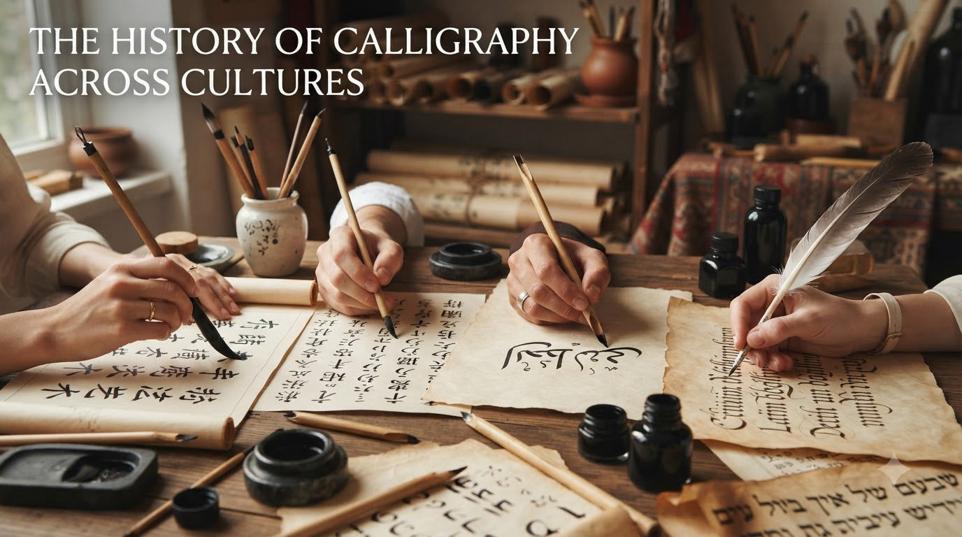
Calligraphy — from the Greek words kallos (beauty) and graphein (to write) — is the art of beautiful handwriting elevated to the status of visual expression. Across thousands of years and on every inhabited continent, humans have taken the simple act of recording language and transformed it into something far more meaningful: a practice that blends communication with artistry, discipline with creative freedom, and cultural identity with universal human expression.
The history of calligraphy across cultures is not a single story but rather a collection of parallel traditions, each shaped by unique religious beliefs, available materials, aesthetic philosophies, and social structures. From the wedge-shaped marks pressed into clay tablets in ancient Mesopotamia to the flowing ink washes of Chinese brush masters, from the geometric perfection of Arabic Quranic scripts to the ornate flourishes of European medieval manuscripts, calligraphy has served as one of humanity’s most enduring art forms.
In this guide, I want to walk you through how calligraphy developed independently in different parts of the world. We will look at the earliest writing systems that birthed calligraphic traditions, explore how East Asian, Islamic, Western, and Mesoamerican cultures each created their own approaches to beautiful writing, and examine how these ancient practices continue to evolve and thrive in 2026. Whether you are a practicing calligrapher, a history enthusiast, or simply curious about how humans have made words beautiful, this comprehensive overview has something for you.
What makes the study of calligraphy across cultures so compelling is how it reveals our shared instincts. Civilizations that had no contact with one another independently arrived at the same conclusion: that writing could be more than functional. It could be sacred. It could be beautiful. It could carry meaning beyond the words themselves.
Table of Contents
The Earliest Origins: Where Did Calligraphy Begin?
The story of calligraphy begins with the story of writing itself. Before writing could become beautiful, it had to exist at all. The earliest known writing systems emerged in Mesopotamia and Egypt roughly 5,500 years ago, and from these practical origins, the art of calligraphy would eventually grow.
Cuneiform: The First Written Script (~3500 BCE)
Around 3500 BCE, the Sumerians of southern Mesopotamia developed cuneiform, a system of writing that used wedge-shaped marks pressed into soft clay tablets with a reed stylus. The word “cuneiform” itself comes from the Latin cuneus, meaning “wedge.” Initially, cuneiform was purely pictographic — small drawings representing objects like grain, livestock, and containers used for record-keeping in temple economies.
Over centuries, these pictograms became increasingly abstract. Scribes began using the marks to represent sounds rather than objects, transforming cuneiform into a syllabic writing system capable of recording literature, law, and poetry. The Epic of Gilgamesh, one of the oldest surviving works of literature, was recorded in cuneiform on clay tablets around 2100 BCE.
What makes cuneiform relevant to the history of calligraphy across cultures is the evidence that scribes took deliberate care with the appearance of their marks. Tablets from different periods show consistent stroke order, careful spacing, and a clear concern for the visual quality of the writing. Scribes trained for years in formal schools called edubba, learning not just what to write but how to write it beautifully.
Egyptian Hieroglyphics: Sacred Writing (~3200 BCE)
Shortly after cuneiform appeared, ancient Egypt developed its own writing system: hieroglyphics. The word comes from the Greek hieros (sacred) and glyphein (to carve), and the Egyptians themselves called their writing medu-netjer, meaning “the gods’ words.” This name alone tells us something important — from the very beginning, the Egyptians understood their writing as having aesthetic and spiritual significance beyond mere communication.
Egyptian hieroglyphics existed alongside two simplified scripts: hieratic (used for everyday documents on papyrus) and demotic (a later, even more simplified form). But hieroglyphics themselves were reserved for monumental inscriptions, temple walls, tombs, and religious texts. The visual quality of these inscriptions was paramount, with scribes carefully composing the arrangement of bird, reed, eye, and snake symbols into balanced, visually harmonious compositions.
The Rosetta Stone, inscribed in 196 BCE, contains text in three scripts — hieroglyphic, demotic, and Greek — and its eventual decipherment in 1822 by Jean-Francois Champollion opened the door to understanding not just Egyptian language but the aesthetic principles that governed their calligraphic tradition.
From Utility to Art: The Birth of Calligraphic Intent
The transition from functional writing to intentional calligraphy happened gradually. In both Mesopotamia and Egypt, we can trace a clear progression. Early writing was messy, inconsistent, and purely practical. But as scribal professions developed and writing became associated with religious, royal, and legal authority, the visual quality of the writing became increasingly important.
Scribes became respected members of society. In Egypt, the scribe’s palette — holding reed brushes and cakes of ink — was a symbol of learning and status. In Mesopotamia, scribe families passed their craft down through generations. The message was clear: how you wrote mattered almost as much as what you wrote.
This principle — that the visual form of writing carries meaning and value separate from its linguistic content — is the foundation upon which every calligraphic tradition in the world would be built.
East Asian Calligraphy: China, Japan, and Korea
Of all the world’s calligraphic traditions, East Asian calligraphy holds the most revered position relative to other art forms. In China, Japan, and Korea, calligraphy has been considered the highest visual art for over two thousand years — a status that Western traditions never quite assigned to their own lettering arts.
Chinese Calligraphy: The Four Treasures and Five Scripts
Chinese calligraphy stands as the oldest continuous calligraphic tradition in the world, with a documented history stretching back over three millennia. It is deeply intertwined with Chinese painting, poetry, philosophy, and governance. To understand Chinese calligraphy is to understand something fundamental about Chinese civilization itself.
The earliest examples of Chinese writing appear on oracle bones — turtle shells and animal bones used for divination during the Shang Dynasty (~1200 BCE). These oracle bone inscriptions already show a concern for consistent form and balanced composition, suggesting that the Chinese aesthetic approach to writing developed early and deliberately.
Over the centuries, Chinese calligraphy evolved through five major script styles, each with its own character and purpose. The Seal Script (Zhuanshu), used during the Qin Dynasty (~221 BCE), features uniform, somewhat rigid strokes with an elegant, archaic feel. The Clerical Script (Lishu), developed during the Han Dynasty, flattened and simplified the characters, making them faster to write while introducing the dramatic “silkworm head and swallow tail” brush technique.
The Regular Script (Kaishu), which emerged around 200 CE, became the standard form of Chinese writing that persists today. Each stroke is executed with precision and clarity, making it the foundation for calligraphic study. The Semi-Cursive Script (Xingshu) allows for faster, more flowing strokes while maintaining legibility, and the Cursive Script (Caoshu) takes this freedom to its extreme, with strokes flowing together in rapid, expressive movements that can be nearly impossible for untrained readers to decipher.
Central to Chinese calligraphy are the Four Treasures of the Study: the brush (made from animal hair, typically goat, wolf, or rabbit), the ink (solid ink sticks ground on an inkstone with water), the paper (xuan paper, known for its ability to show subtle variations in ink density), and the inkstone itself. These tools have remained essentially unchanged for over a thousand years.
No discussion of Chinese calligraphy would be complete without mentioning Wang Xizhi (303-361 CE), often called the Sage of Calligraphy. His Lanting Xu (Preface to the Poems Collected from the Orchid Pavilion), written in 353 CE, is considered the greatest calligraphy work in Chinese history. The original was reportedly buried with Emperor Taizong of the Tang Dynasty because he loved it so much he could not bear to part with it, even in death.
In Chinese culture, calligraphy was not merely an art form — it was a window into the character and moral quality of the calligrapher. The ability to write well was a requirement for government service, and calligraphy was considered one of the four essential arts of the Chinese scholar gentleman, alongside painting, poetry, and playing the guqin (a stringed musical instrument).
Japanese Shodo: Zen and the Art of the Brush
Japan’s calligraphic tradition, known as shodo (the way of writing), was profoundly shaped by Chinese influence beginning in the 5th and 6th centuries CE. Buddhist monks traveling from China and Korea brought not only religious texts but also the tools, techniques, and aesthetic philosophy of Chinese calligraphy. Over time, however, Japan developed its own distinct approach.
One of the most significant divergences came with the development of kana syllabic scripts (hiragana and katakana) during the Heian period (794-1185 CE). While kanji characters carried the weight of Chinese calligraphic tradition, kana offered Japanese calligraphers a native script with its own aesthetic possibilities — lighter, more flowing, and suited to the Japanese language’s phonetic structure. The Tales of Genji, written by Murasaki Shikibu in the early 11th century, represents one of the high points of Heian-era calligraphy and literary culture.
The connection between Japanese calligraphy and Zen Buddhism is especially significant. In the Zen tradition, calligraphy became a form of meditation and spiritual practice. The concept of hitsuzendo — the Way of the Brush — teaches that calligraphy should be executed in a state of mental clarity and single-pointed concentration. A stroke, once made, cannot be corrected or revised. This gives Japanese brush calligraphy an immediacy and spontaneity that reflects the Zen emphasis on being fully present in each moment.
Japanese calligraphers also developed the practice of ensho — the creation of single-character works that express complex philosophical concepts. A single character for “emptiness,” “truth,” or “peace,” rendered in a dynamic burst of ink, can carry enormous artistic and spiritual weight.
Korean Calligraphy: Elegance and Independence
Korean calligraphy shares deep roots with the Chinese tradition, as Korea adopted Chinese characters (hanja) early in its history. However, Korea’s calligraphic identity took a dramatic turn with the creation of Hangul, the Korean alphabet, by King Sejong the Great and his scholars in 1443 CE. Hangul’s geometric, scientifically designed letterforms offered Korean calligraphers an entirely new medium for artistic expression.
One of Korea’s most celebrated calligraphers is Kim Jeong-hui (1786-1856), who developed the distinctive Chusa style. Known for its bold, unconventional brushwork and slightly distorted character proportions, the Chusa style broke from classical Chinese-influenced forms and asserted a uniquely Korean aesthetic identity. Kim Jeong-hui demonstrated that Korean calligraphy could honor tradition while forging its own path.
In 2026, Korean calligraphy continues to blend hanja and Hangul traditions, with contemporary calligraphers exploring the tension between the flowing brushwork inherited from Chinese practice and the clean, geometric structure of the native Korean alphabet.
Islamic and Arabic Calligraphy: Writing the Divine
Among all the world’s calligraphic traditions, Islamic calligraphy holds a unique position. In Islamic culture, calligraphy is not merely the most important visual art — for much of history, it was virtually the only visual art. The Islamic prohibition against depicting human and animal figures in religious contexts (aniconism) meant that the artistic energy that other cultures channeled into sculpture, painting, and representational art was instead directed toward the art of writing.
The result is a tradition of extraordinary richness and sophistication. Arabic calligraphy became the primary means of artistic expression across the Islamic world, adorning mosque walls, Quranic pages, ceramic tiles, metalwork, textiles, and architecture from Spain to Indonesia.
The Development of Arabic Script
The Arabic script evolved from the Nabataean Aramaic alphabet and was initially used for recording pre-Islamic Arabic poetry and tribal records. The rise of Islam in the 7th century CE transformed Arabic script from a regional writing system into a vehicle for recording the Quran, the holy book of Islam. The need to preserve and beautifully render the word of God gave Arabic calligraphy its sacred purpose and drove the development of increasingly refined scripts.
Several major Arabic calligraphic styles emerged over the centuries, each with distinct characteristics. Kufic, the earliest developed style, features angular, geometric letterforms with straight lines and sharp angles. It was the primary script for Quranic manuscripts for several centuries and is named after the city of Kufa in Iraq. Naskh, a more rounded and readable cursive script, eventually replaced Kufic as the standard for Quranic copying and remains one of the most widely used Arabic scripts today.
Thuluth, characterized by its large, elegant proportions and flowing curves, became the preferred script for monumental inscriptions on buildings. Nastaliq, developed in Persia, features a distinctive hanging baseline where letters appear to cascade downward from the line above. It became the dominant script for Persian and Urdu writing and is considered one of the most beautiful calligraphic styles in the world.
Other notable styles include Muhaqqaq (used for large-scale Quranic manuscripts), Raihan (a smaller, lighter version of Muhaqqaq), Riq’a (a simplified script used for everyday writing), and Diwani (an ornate Ottoman court script with interlocking letters that was deliberately difficult to read, adding an element of secrecy to official documents).
Why Calligraphers Were the Most Honored Artists
In Islamic civilization, calligraphers held a status that painters, sculptors, and architects in other cultures could only dream of. This reverence stemmed from several factors rooted in Islamic theology and culture.
First, calligraphy was the means of recording and transmitting the Quran — the literal word of God in Islamic belief. The calligrapher who rendered Quranic verses was performing an act of worship, handling divine revelation with their hands. Second, because Islam discouraged figurative imagery in religious contexts, calligraphy became the primary vehicle for beautifying sacred spaces. Third, the Prophet Muhammad himself was said to have valued good handwriting, and several hadith (sayings of the Prophet) encourage beautiful writing.
Ibn Muqlah (886-940 CE), a Persian calligrapher and government official, is credited with systematizing Arabic calligraphy by establishing proportional rules based on the dot as a unit of measurement. His system, called al-khatt al-mansub (proportional script), brought mathematical precision to Arabic letterforms and remains foundational to the tradition. Later masters like Ibn al-Bawwab (d. 1022 CE) and Yaqut al-Mustasimi (d. 1298 CE) refined these principles further, creating standards that calligraphers still follow.
Regional Flourishing: Ottoman, Persian, and Mughal Traditions
Islamic calligraphy did not remain a monolithic tradition. As Islam spread across three continents, regional styles developed distinct characters. The Ottoman Turks became particularly renowned for their calligraphy, producing masters like Sheikh Hamdullah (1429-1520 CE), who reformed the six canonical scripts and established the Ottoman calligraphic tradition that would flourish for centuries. The Topkapi Palace in Istanbul houses some of the finest Islamic calligraphic works ever created.
Persian calligraphers, working in the Nastaliq script, developed a tradition of extraordinary beauty and refinement. The Mughal Empire in South Asia combined Persian calligraphic traditions with Indian artistic sensibilities, producing works like the magnificent calligraphic panels of the Taj Mahal. Each region adapted the shared tradition of Arabic calligraphy to its own aesthetic preferences and cultural values, creating a rich tapestry of interconnected but distinct styles.
Western Calligraphy: From Roman Capitals to Copperplate
Western calligraphy traces a long and winding path from the monumental inscriptions of the Roman Empire through the illuminated manuscripts of medieval monasteries to the elegant penmanship of the 18th and 19th centuries. While never achieving the same status relative to other arts that calligraphy enjoyed in East Asian or Islamic cultures, Western calligraphy has produced an extraordinarily diverse range of scripts and styles.
Roman Foundations: Square Capitals and Rustic Script
The story of Western calligraphy properly begins with the Romans. Roman Square Capitals (Capitalis Monumentalis), as seen on Trajan’s Column in Rome (inscribed around 113 CE), represent what many calligraphers and typographers consider the most beautiful alphabet ever created. The letters are perfectly proportioned, with subtle serifs that guide the eye along the line of text, and a sense of monumental dignity that has influenced type design for two thousand years.
Rustic Capitals were a more compressed, somewhat informal version used for faster writing on papyrus and wax tablets. Despite their name, Rustic Capitals display considerable elegance and were used for literary works, not just everyday documents. The tension between formal and informal scripts — between careful monumentality and efficient utility — would define Western calligraphic development for centuries to come.
Medieval Manuscripts: Uncial, Insular, and Carolingian
As the Roman Empire declined and Christianity spread across Europe, the center of calligraphic activity shifted from secular workshops to monastic scriptoria. Monks became the primary custodians of writing and, by extension, of calligraphic knowledge. The manuscripts they produced represent some of the most spectacular achievements in the history of calligraphy across cultures.
Uncial and Half-Uncial scripts, developed between the 3rd and 6th centuries CE, introduced rounded letterforms that were faster to write than Roman Capitals and better suited to the parchment codex format that was replacing papyrus scrolls. These scripts feature broad, flowing strokes with a distinctive roundness that gives them an inviting, readable quality.
The Insular scripts of Ireland and England (6th-9th centuries CE) took calligraphic ornamentation to extraordinary heights. The Book of Kells, created around 800 CE by Celtic monks, contains pages of such intricate decoration that a single page can take hours to study properly. The interlace patterns, animal forms, and decorative flourishes integrated into the letterforms create a uniquely Celtic calligraphic aesthetic that stands apart from anything else in the Western tradition.
Perhaps the most consequential development in Western calligraphy was Carolingian Minuscule, developed during the reign of Charlemagne in the late 8th century CE. Charlemagne recognized that the diversity of scripts across his empire made communication difficult, and he commissioned the creation of a standardized, legible script. The resulting Carolingian Minuscule was clean, consistent, and highly readable — so successful that it became the model for modern lowercase letters. When Renaissance humanists in the 15th century discovered Carolingian manuscripts, they mistook them for ancient Roman originals and adopted the script as their own, directly influencing the typefaces we use today.
Gothic Blackletter: The Texture of the Middle Ages
From the 12th century onward, a new style of writing emerged that would dominate European calligraphy for three centuries: Gothic Blackletter. Also known as Textura, this dense, angular script was characterized by narrow, vertically emphasized letters packed closely together, creating a texture so tight that the pages of a Gothic manuscript can appear almost woven rather than written.
The development of Blackletter was driven by practical needs. As European universities grew and demand for books increased, scribes needed to write faster and fit more text on expensive parchment. Blackletter’s compressed letterforms allowed more words per page, while its systematic stroke patterns enabled speed. The major Blackletter styles include Textura Quadrata (the most formal and angular), Textura Prescisus (with feet cut off square), and Fraktur (a later German variant with broken, angular curves).
Johannes Gutenberg’s famous 42-line Bible, printed around 1455, was set in a Textura typeface that mimicked the handwriting of the era. This is a crucial moment in the history of calligraphy across cultures: for the first time, mechanical reproduction could mimic the appearance of hand-lettered text. Many assumed that printing would kill calligraphy entirely. It did not, but it fundamentally changed the relationship between writing and reproduction.
Renaissance to Modern: Humanist, Italic, and Copperplate
The Renaissance brought a deliberate rejection of Gothic Blackletter. Italian humanists, inspired by their rediscovery of classical texts, sought writing styles that embodied the clarity, elegance, and proportion they admired in ancient Roman culture. The result was Humanist Minuscule, a script based on the Carolingian models they believed (incorrectly) to be ancient Roman originals. Humanist Minuscule featured wide, rounded letterforms with generous spacing — the antithesis of dense Gothic Blackletter.
Italic script emerged in the early 16th century, developed by Italian writing masters like Ludovico Arrighi and Giovanni Tagliente. Italic features slanted, cursive letterforms designed for rapid but elegant writing. It quickly became the preferred script for personal correspondence and literary works, and its influence persists in the italic typefaces we use on computers today.
The 17th and 18th centuries saw the development of Copperplate script, named for the engraved copper plates used to print writing manuals. Copperplate featured thin upstrokes and thick downstrokes created with a flexible pointed pen, along with elaborate flourishes that became increasingly ornate over time. English Round Hand, popularized by writing masters like George Bickham, became the standard for business and personal correspondence throughout the English-speaking world.
In America, Platt Rogers Spencer developed Spencerian Script in the 1840s, a more flowing and Americanized version of Copperplate that became the standard handwriting taught in American schools. The Coca-Cola logo, one of the most recognized wordmarks in the world, is rendered in Spencerian Script.
Mesoamerican Writing Systems: Glyphs and Beyond
When discussing the history of calligraphy across cultures, most resources focus exclusively on Eurasian traditions. But the Americas developed their own sophisticated writing systems, some of which displayed clear calligraphic qualities — deliberate attention to the visual form and aesthetic quality of written symbols.
Maya Hieroglyphic Writing
The Maya civilization of Mesoamerica developed the most sophisticated writing system in the pre-Columbian Americas. Maya glyphs, dating back to around 300 BCE (with full development by 200 CE), combine logographic elements (symbols representing whole words) with syllabic elements (symbols representing sounds). This combination created a writing system capable of recording complex historical narratives, astronomical observations, mathematical calculations, and religious texts.
Maya scribes carved glyphs into stone monuments, painted them on ceramic vessels, and wrote them in screenfold books made from bark paper. The visual quality of Maya glyphs varies considerably depending on the medium and the skill of the scribe, but the finest examples display a remarkable combination of pictorial detail and calligraphic fluidity. The glyphs are not simply functional symbols — they are miniature works of art, with individual signs featuring human faces, animal forms, and abstract geometric elements rendered with care and aesthetic intention.
Tragically, the vast majority of Maya books were destroyed during the Spanish conquest. Bishop Diego de Landa ordered the burning of thousands of Maya manuscripts in 1562, an act of cultural destruction that makes the loss of the Library of Alexandria seem modest by comparison. Only four Maya codices survived, and it was not until the late 20th century that scholars achieved significant progress in deciphering the script.
Aztec, Zapotec, and Mixtec Writing
The Aztec (Nahua) writing system used a combination of pictographic and ideographic elements. While less fully developed as a phonetic system than Maya writing, Aztec pictographic manuscripts display clear aesthetic intention in their composition, color, and arrangement. The Codex Mendoza and the Borbonicus Codex show how Aztec scribes combined written symbols with visual narratives in a way that blurs the line between writing and painting.
The Zapotec civilization (centered in what is now Oaxaca, Mexico) developed one of the earliest writing systems in Mesoamerica, with inscriptions dating back to around 600 BCE. Mixtec manuscripts, created later but in the same region, are among the most visually stunning pre-Columbian documents, featuring vibrant colors and meticulous attention to visual detail.
The Andean Khipu: Writing Without Ink
Perhaps the most unconventional entry in the history of calligraphy across cultures is the Andean khipu (or quipu). The Inca civilization, which controlled a vast empire in South America, used knotted cords to record numerical data, historical events, and possibly narrative information. While scholars continue to debate whether khipu constitute “writing” in the traditional sense, they represent a fundamentally different approach to recording and encoding information — one based on tactile patterns rather than visual symbols.
Each khipu consists of a main cord from which pendant strings hang, with knots tied at various positions. The type, position, and direction of knots encode information, and the color and material of the cords add additional layers of meaning. Some khipu contain hundreds of cords and thousands of knots, creating a recording system of remarkable complexity. Whether or not khipu qualify as calligraphy, they deserve inclusion in any discussion of humanity’s diverse approaches to recording and preserving knowledge.
The Modern Calligraphy Revival: From Decline to Renaissance
The history of calligraphy across cultures might seem like a story of decline. The printing press, the typewriter, and the computer each threatened to render hand lettering obsolete. Yet calligraphy has proven remarkably resilient. Rather than disappearing, it has repeatedly reinvented itself, finding new purposes and new audiences in each era.
The Arts and Crafts Revival
The first major revival of calligraphy in the modern era came through the English Arts and Crafts movement of the late 19th century. Edward Johnston (1872-1944), widely regarded as the father of modern calligraphy, studied medieval manuscripts at the British Museum and developed a systematic approach to teaching italic and foundational hands based on historical principles. His 1906 book Writing, Illuminating, and Lettering became the foundational text for modern Western calligraphy.
Johnston also designed the typeface for the London Underground railway system, creating a sans-serif design that remains in use today. His student Eric Gill went on to create the Gill Sans typeface, while another student, Graily Hewitt, became a leading figure in the revival of letter carving and monumental inscription. Together, these practitioners demonstrated that calligraphy was not a dead art but a living tradition capable of serving contemporary needs.
The Counterculture and New Expressions
The 1960s and 1970s brought another wave of calligraphic interest, driven partly by the broader cultural movement toward handmade, artisanal, and non-industrial creative expression. Calligraphy workshops flourished, and new approaches emerged that combined historical techniques with contemporary aesthetics.
In East Asia, the 20th century saw the emergence of avant-garde calligraphy movements in Japan and China. Artists began creating large-scale abstract calligraphic works that pushed the boundaries of traditional practice, treating individual characters as abstract compositions rather than linguistic units. This movement connected Eastern calligraphic traditions with Western abstract expressionism, creating fascinating cross-cultural dialogues.
Digital Calligraphy and the Social Media Era
In 2026, calligraphy is experiencing yet another renaissance, fueled by digital technology and social media. Tablets with pressure-sensitive styli have created new tools for digital calligraphy, allowing artists to create lettering that mimics traditional brush and pen effects while offering the ability to undo, edit, and share instantly. Apps like Procreate have become essential tools for modern lettering artists.
Instagram, TikTok, and YouTube have been instrumental in popularizing modern calligraphy. Short videos showing calligraphers at work — the satisfying sweep of a brush across paper, the careful formation of flourishes — attract millions of views and have introduced a new generation to the art form. The hashtag #calligraphy has hundreds of millions of posts across social platforms.
At the same time, traditional calligraphy continues to thrive. Workshops, guilds, and societies around the world teach historical scripts using the same tools and techniques that scribes used centuries ago. There is a growing appreciation for the tactile, analog quality of hand lettering in an increasingly digital world. Calligraphy today occupies a unique position: simultaneously ancient and contemporary, traditional and innovative.
Calligraphy History Timeline: A Quick Reference
Here is a chronological overview of major milestones in the history of calligraphy across cultures:
~3500 BCE — Cuneiform script developed in Mesopotamia; earliest known writing system
~3200 BCE — Egyptian hieroglyphics emerge; scribes trained in formal writing schools
~1200 BCE — Chinese oracle bone script; earliest Chinese writing appears
~300 BCE — Maya hieroglyphic writing begins developing in Mesoamerica
~200 CE — Regular Script (Kaishu) emerges in China, becoming the standard Chinese script
~113 CE — Trajan’s Column inscribed with Roman Square Capitals
~300 CE — Wang Xizhi born; later called the Sage of Chinese Calligraphy
~400 CE — Uncial and Half-Uncial scripts developed by early Christian scribes
~600 CE — Insular scripts flourish in Ireland and England
~650 CE — Arabic calligraphy begins systematic development with the spread of Islam
~780 CE — Carolingian Minuscule standardized under Charlemagne’s direction
~900 CE — Ibn Muqlah establishes proportional rules for Arabic calligraphy
~800 CE — Book of Kells created; peak of Insular calligraphic art
~1100s CE — Gothic Blackletter (Textura) emerges in northern Europe
~1400s CE — Renaissance Humanist scripts revive Carolingian-inspired letterforms
~1455 CE — Gutenberg Bible printed in Textura typeface
~1443 CE — Hangul alphabet created in Korea under King Sejong the Great
~1500s CE — Italic script developed by Italian writing masters Arrighi and Tagliente
~1700s CE — Copperplate and English Round Hand become standard in Europe
1840s CE — Spencerian Script developed in America
1906 CE — Edward Johnston publishes foundational modern calligraphy textbook
1960s CE — Counterculture revival of calligraphy and hand lettering
2026 — Digital calligraphy renaissance powered by tablets and social media
FAQs
Where did calligraphy originate?
Calligraphy originated independently in several ancient civilizations. The earliest calligraphic writing system was cuneiform, developed by the Sumerians in Mesopotamia around 3500 BCE. Egyptian hieroglyphics appeared shortly after, around 3200 BCE. Chinese calligraphy traces its origins to oracle bone inscriptions from approximately 1200 BCE. Each of these civilizations developed its own approach to beautiful writing independently, without influence from the others.
What culture is known for calligraphy?
Multiple cultures are renowned for calligraphy, but China is perhaps the most famous. Chinese calligraphy has been considered the highest visual art for over 2,000 years and has profoundly influenced calligraphy traditions in Japan, Korea, and Vietnam. Islamic culture is equally renowned for its calligraphic tradition, where it served as the primary visual art form for centuries. Western European cultures also developed rich calligraphic traditions through medieval manuscripts and Renaissance lettering.
Why did Muslims honor calligraphers above all other artists?
Muslims honored calligraphers because calligraphy was the primary means of recording the Quran, which Muslims believe is the literal word of God. Islamic aniconism (the prohibition against depicting human and animal figures in religious contexts) meant that artistic energy was directed toward writing rather than representational art. Calligraphers who rendered Quranic verses were considered to be performing an act of worship. Additionally, the Prophet Muhammad was said to have valued beautiful handwriting, giving the practice religious authority.
What are the four types of calligraphy?
The four main types of calligraphy are typically categorized as: (1) Western or Latin calligraphy, encompassing Roman, Medieval, and Renaissance scripts; (2) East Asian calligraphy, including Chinese, Japanese, and Korean brush traditions; (3) Islamic or Arabic calligraphy, featuring Kufic, Naskh, Thuluth, and Nastaliq styles; and (4) South Asian calligraphy, including Indian and Tibetan traditions. Some classifications also include Mesoamerican glyph writing as a fifth category. Each type uses distinct tools, follows different aesthetic principles, and reflects unique cultural values.
How did calligraphy develop in different cultures?
Calligraphy developed independently in multiple civilizations as writing systems evolved from simple pictograms into sophisticated scripts. In Mesopotamia, cuneiform evolved from pictographic record-keeping into abstract symbols. In China, writing progressed through five major script styles over three millennia. Islamic calligraphy was driven by religious devotion to Quranic preservation. European calligraphy evolved through Roman, medieval, and Renaissance periods influenced by the needs of church, state, and commerce. Despite having no contact, these cultures all independently decided that writing deserved to be beautiful.
What is the oldest form of calligraphy?
The oldest form of calligraphy is generally considered to be Sumerian cuneiform, which dates back to approximately 3500 BCE in Mesopotamia (modern-day Iraq). While early cuneiform was primarily functional, archaeological evidence shows that scribes were trained to write with consistent form and visual quality, making it the earliest known tradition of deliberate attention to the aesthetic quality of writing. Egyptian hieroglyphics, appearing around 3200 BCE, are a close second and show even more obvious concern for visual beauty in their monumental inscriptions.
Is calligraphy still relevant in the modern world?
Yes, calligraphy is experiencing a significant revival in 2026. Digital tablets and styli have created new tools for lettering artists, while social media platforms like Instagram and TikTok have introduced millions of people to calligraphy through satisfying process videos. Traditional calligraphy workshops and guilds continue to teach historical scripts using centuries-old tools. Calligraphy is also widely used in graphic design, branding, wedding invitations, and signage. The growing appreciation for handmade, tactile art in an increasingly digital world has given calligraphy renewed cultural relevance.
Why the History of Calligraphy Across Cultures Still Matters
Looking back across the full sweep of this history, what strikes me most is not the differences between these traditions but the similarities. Civilizations separated by vast distances, with no possibility of contact, all arrived at the same conclusion: that the marks we make to record language can and should be made beautiful. The history of calligraphy across cultures is ultimately a story about a shared human impulse — the desire to invest even our most practical activities with meaning, care, and artistry.
From Mesopotamian clay tablets to Chinese brush scrolls, from Islamic Quranic manuscripts to medieval European codices, from Maya stone glyphs to digital tablet lettering, calligraphy has persisted because it satisfies something deep in human nature. It combines discipline with expression, tradition with innovation, and utility with beauty. In a world of automated text and AI-generated content, the deliberate act of forming beautiful letters by hand carries a significance that no technology can replicate.
If this exploration has sparked your curiosity, I encourage you to pick up a brush or pen and try it yourself. Every tradition we have discussed began with someone pressing a tool to a surface and discovering that the resulting marks could carry meaning beyond their content. That discovery is available to anyone, in any culture, at any time — including right now.