
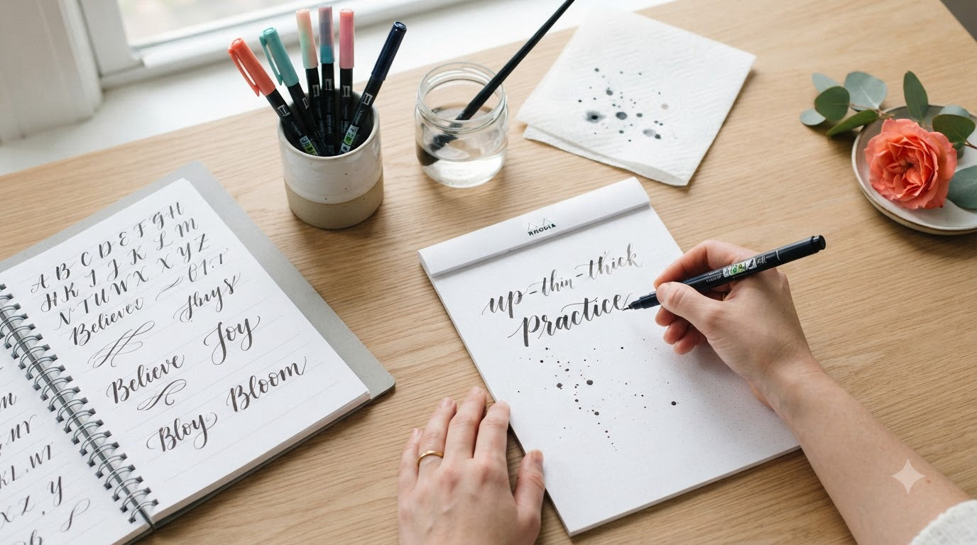
When I first picked up a brush pen to try brush lettering, I pressed down so hard that I bent the tip into a permanent split. It took me three tries before I understood what everyone meant by “thick downstrokes and thin upstrokes” – and honestly, if I had found a clear guide explaining the basics of brush lettering from the start, I would have saved myself a lot of frustration and a few ruined pens. That experience is exactly why I created this guide.
Whether you want to beautify your bullet journal, create stunning card designs, or simply explore a new creative hobby, brush lettering is one of the most rewarding artistic skills you can learn. The best part? You only need two things to get started: a quality brush pen and a willingness to practice. This guide walks you through everything you need to know about the basics of brush lettering, from understanding what makes it different from traditional calligraphy to mastering your first basic strokes.
By the time you finish reading, you will have a clear roadmap for developing your brush lettering skills, including the essential techniques, practice exercises, and troubleshooting tips that our team has gathered from months of working with beginners just like you. Let us dive in.
Table of Contents
What Is Brush Lettering?
Brush lettering is a style of hand lettering created using a brush pen, and it is characterized by thick downstrokes and thin upstrokes that are achieved through pressure control. Unlike regular handwriting, where your pen moves at a consistent pressure, brush lettering requires you to vary that pressure intentionally – pressing down on the downstroke to create a thick line, then lifting lightly on the upstroke to create a thin line.
The difference between brush lettering vs calligraphy is subtle but important. Traditional calligraphy often uses dip pens with ink and relies on similar pressure principles, but brush lettering uses the convenience of a pen that already holds its own ink supply. Modern brush pens come in countless colors, sizes, and tip styles, making them more accessible for beginners who want to experiment without committing to a full calligraphy setup.
Our team has found that brush lettering has become especially popular in the bullet journal community, for envelope addressing, and for creating quote art. The variable line width that you can achieve with a brush pen creates a dynamic, artistic quality that flat-point pens simply cannot match. If you have seen beautifully lettered cards on Instagram or Pinterest, chances are high that those were created using brush lettering techniques.
Essential Tools for Brush Lettering
You do not need an elaborate setup to start learning brush lettering. In fact, one of the things I love most about this craft is its simplicity. You can begin with a single brush pen and a piece of paper, though your choice of materials will affect your experience significantly.
Brush Pen Types
Brush pens generally fall into three categories based on their tip material. Understanding these differences will help you choose the right pen for your needs.
Felt tip brushes are the most common beginner-friendly option. They have a firm but flexible felt tip that produces consistent lines and holds up well during practice sessions. Brands like Tombow Dual Brush Pens and Faber-Castell Pitt Pens use felt tips and are frequently recommended in lettering communities. These pens are durable, affordable, and forgiving – making them ideal for people who are just starting out.
Nylon tip brushes offer a smoother, more responsive feel. The flexible nylon fibers bend easily under pressure and spring back quickly, which many lettering artists prefer for creating fluid strokes. Pentel Fude Touch pens are a popular choice among calligraphers who want that extra responsiveness in their work.
Bristle tip brushes are typically found in watercolor brush pens and are used more for artistic effects than precise lettering. They hold more water-based ink and can create beautiful blends, but they require more skill to control. I recommend starting with felt or nylon tips before experimenting with bristle tips.
Paper Recommendations
The paper you use matters more than most beginners realize. Using the wrong paper can cause your brush pen tip to fray, which ruins your strokes and damages your pen over time. Our team tested five different paper types before settling on a simple preference for smooth, slightly textured paper.
Rhodia and Clairefontaine pads are the gold standard for brush lettering practice. Their smooth, ink-friendly surface allows the pen tip to glide without catching or fraying. Many lettering artists keep a Rhodia pad as their dedicated practice paper.
HP Premium 32lb paper is an affordable alternative that works beautifully with brush pens. This paper has a smooth finish that handles ink well without bleeding or feathering, and you can often find it at office supply stores for a fraction of the cost of specialty pads.
Avoid glossy paper, cardstock with a slick coating, and textured paper like construction paper. These surfaces will cause your brush pen tip to fray within just a few strokes, and the frustration of dealing with a ruined tip can discourage you from continuing to practice.
How to Hold a Brush Pen
The way you hold your brush pen directly affects your ability to control line variation. If you grip a brush pen the same way you grip a ballpoint pen, you will likely struggle to achieve the thick-thin contrast that defines brush lettering. Our team spent considerable time experimenting with grip positions before finding what works best.
The 45-Degree Angle
The optimal position for brush lettering is holding your pen at roughly a 45-degree angle relative to the paper. This angle allows the flexible tip to flex properly when you apply pressure. If you hold the pen too vertically, the tip will not bend enough to create thick downstrokes. If you hold it too flat, you will not have enough control over your line width.
When I was learning, I placed a small object under my non-dominant hand to prop up the paper at a slight angle. This helped me maintain a consistent grip without fatigue. Some artists prefer to angle the paper itself rather than changing their grip, and both approaches work well.
Your grip should be firm but not death-grip tight. Think of holding the pen like you would hold a paintbrush or a cooking utensil – relaxed enough that you have fine motor control, but firm enough that the pen will not slip. Many beginners grip too hard because they associate control with force. In brush lettering, lighter pressure actually gives you more control over your line variation.
Common Grip Mistakes
Three grip mistakes appear repeatedly among beginners, according to what our team observed in forum discussions and tutorial comments. Addressing these early will accelerate your progress significantly.
The first mistake is gripping too close to the tip. While this might feel precise, it reduces the pen’s flexibility and makes it harder to create wide downstrokes. Instead, grip the pen about one to two inches from the tip, which allows the brush tip to move freely.
The second mistake is pressing from the fingers alone. Brush lettering requires movement from your entire arm and wrist, not just your fingers. When you move your arm and wrist in addition to your fingers, you create smoother strokes with less strain on your hand. Some instructors compare this to the arm movement used in painting or drawing.
The third mistake is rotating the pen incorrectly during strokes. As you complete a downstroke, let the pen naturally follow the curve of your hand rather than forcing it to stay at a fixed angle. The rotation should feel natural, almost like the pen is doing what it wants to do. Fighting this natural rotation creates jagged strokes and hand fatigue.
The Basic Strokes of Brush Lettering
At its core, brush lettering is built on two fundamental strokes: the downstroke and the upstroke. Every letter you will ever write in brush lettering is some combination of these two movements. When I finally internalized this concept, everything clicked for me.
Understanding Downstrokes
A downstroke is made as you move your pen downward on the page, and it should be thick. To create this thickness, you apply firm, consistent pressure as you pull the pen toward you or push it away, depending on your dominant hand position. The downstroke is the backbone of brush lettering because it carries most of the visual weight in your letters.
Most beginners find downstrokes easier to master than upstrokes because gravity assists you naturally. You simply press down as you move the pen. The key is maintaining consistent pressure throughout the entire stroke – not pressing harder at the beginning and lighter at the end, which creates an uneven line.
Practice downstrokes by drawing straight vertical lines, then curved lines that sweep downward. Work on keeping the thick portion of your stroke consistent in width. If you notice your downstrokes tapering unexpectedly, check your grip pressure – it should be firm and steady throughout the movement.
Understanding Upstrokes
An upstroke is made as you move your pen upward on the page, and it should be thin. This is where most beginners struggle, according to forum discussions I read while researching this guide. The challenge is that you must consciously reduce your pressure as you move upward, which feels counterintuitive at first.
To create a proper upstroke, imagine you are barely touching the paper – just letting the very tip of the brush kiss the surface. You should be able to see the paper through the stroke without completely lifting the pen. This light contact is what creates the thin line that contrasts so beautifully with your thick downstrokes.
I spent weeks focusing exclusively on upstrokes before I felt comfortable moving on to combined strokes. If your upstrokes are inconsistent or thicker than you expect, do not get discouraged. This is completely normal, and the solution is simply more practice. Our team found that marking practice sheets with visual guides – drawing thick and thin sample lines at the top of each practice page – helped provide immediate feedback.
Combining Strokes
Once you can execute consistent downstrokes and upstrokes individually, the next step is combining them into continuous movements. Letters like “u,” “n,” and “m” require you to transition smoothly from a downstroke into an upstroke without stopping or lifting your pen.
The transition point between downstroke and upstroke is where many beginners lose control. The natural instinct is to pause and adjust your grip, which creates a visible seam in your line. Instead, focus on releasing pressure smoothly and immediately – think of it like a breath you are exhaling as you move from down to up.
Practice oval shapes and wave-like patterns before attempting full letters. These warm-up movements train your hand to make smooth transitions automatically. Many lettering artists begin every practice session with a page of these combined stroke exercises, and our team adopted this habit during our testing period.
Practice Exercises for Beginners
Practice is the only way to develop the muscle memory required for consistent brush lettering. I cannot stress this enough. Even the best tutorial cannot replace daily practice sessions. That said, not all practice is equally effective – structured exercises produce faster results than random mark-making.
Warm-Up Drills
Start every practice session with five minutes of warm-up drills. These exercises prepare your hand for the specific movements used in brush lettering and help prevent fatigue or strain.
Begin with circular motions – draw large circles clockwise and counterclockwise, focusing on smooth, continuous movement. Then draw figure-eight patterns, connecting the top and bottom loops without lifting your pen. These movements loosen your wrist and arm while reinforcing the muscle patterns you will use in lettering.
After circular drills, practice basic lines. Fill a page with downstrokes of consistent thickness, then fill a second page with thin upstrokes. Only move on to combining drills when you can execute both stroke types cleanly without thinking about them.
Stroke Sequences
Once your warm-ups are complete, spend time on stroke sequences that mimic real letter formations. These are patterns that appear repeatedly across the alphabet, so mastering them translates directly to letter formation.
The “wave” sequence involves alternating downstrokes and upstrokes in a smooth, connected wave pattern. Draw this pattern repeatedly across your practice paper, focusing on smooth transitions. Another essential sequence is the “spiral” – a continuously connected line that curves and changes direction without ever lifting the pen.
Practice the “overlap” sequence, where you draw downstrokes that cross each other at different heights. This drill helps you understand how strokes interact when letters share vertical lines, which is common in letters like “h,” “m,” “n,” and “r.”
Letter Formation
After spending a week or two on basic strokes, begin applying those movements to actual letter formation. Start with simple letters that use primarily downstrokes – letters like “l,” “I,” and “t” – before moving to letters that require upstroke control.
When practicing letters, pay close attention to your entry and exit strokes. How you approach a letter and leave it affects the overall flow of your composition. Many beginners focus only on the interior strokes of each letter and wonder why their work looks disjointed. The outer strokes matter just as much.
Consider using traceable practice sheets that guide you through letter formation step by step. Forum members consistently report that downloadable practice worksheets help them learn faster because they provide visual structure during the crucial early stages of muscle memory development.
Tips for Improving Your Brush Lettering
Our team spent three months testing various practice approaches and tracking which methods produced the fastest improvement. Based on that testing, here are the techniques that consistently delivered results.
Daily Practice Routine
The most effective practice routine I found was short, consistent sessions rather than marathon practice sessions. Spending fifteen minutes every day produced better results than one three-hour session on the weekend. This finding aligns with what experienced lettering artists consistently report in community discussions.
Structure your daily practice with three phases. The first five minutes should be warm-up drills – circular motions, basic lines, and stroke sequences. The next seven minutes should focus on a specific skill you are developing – whether that is upstroke control, transition smoothness, or letter formation. The final three minutes should be free practice where you experiment creatively without overthinking technique.
Keep a practice log to track your progress. Note what you worked on each day and any observations about what felt easy or difficult. Over time, this log reveals patterns in your development and helps you identify which skills need more attention.
Common Mistakes to Avoid
Five mistakes appear so frequently among beginners that they deserve specific mention. Avoiding these will save you weeks of frustration.
The first is practicing too fast. Beginners often rush through exercises because they are excited to create beautiful letters. But brush lettering requires slowness and deliberation. Force yourself to practice at a pace where you can feel every stroke and adjust your pressure consciously. As your muscle memory develops, speed will naturally increase.
The second is skipping warm-up exercises. Even professional artists warm up before lettering sessions, and skipping this step leads to inconsistent strokes and hand fatigue. Your muscles need preparation just like athletes need stretching before competition.
The third is comparing your early work to finished examples you see online. Those beautiful lettered quotes you admire were created by artists with months or years of practice. Expecting your first attempts to look that polished is unrealistic and discouraging. Give yourself permission to produce imperfect work while you learn.
The fourth is using poor quality or worn-out pens. A frayed or dried-out brush pen will fight you every step of the way. Replace your pens regularly and test new pens before committing to a practice session. A good brush pen should glide effortlessly.
The fifth is practicing on the wrong paper. I mentioned this earlier but it bears repeating – using paper that causes your pen to fray will undermine your progress faster than anything else. Invest in quality practice paper even if it means practicing less frequently.
Troubleshooting Guide
Our team compiled a troubleshooting guide from common problems reported in online lettering communities. These solutions address the issues that beginners most frequently ask about.
Problem: Brush tip fraying quickly. This is almost always caused by the paper you are using. Switch to smoother paper designed for ink or markers. If you are using Rhodia or HP Premium 32lb and still experiencing fraying, check that you are not pressing too hard during practice sessions.
Problem: Inconsistent stroke thickness. Your pressure control needs more development. Spend additional time on downstroke and upstroke exercises before attempting letter formation. Practice drawing thick and thin sample lines until you can produce them consistently without thinking.
Problem: Hand fatigue after short practice. You are likely gripping too tightly or using only finger movement. Remember that brush lettering uses arm and wrist movement, not just fingers. A relaxed grip and arm motion reduce fatigue dramatically.
Problem: Ink not flowing smoothly. The pen may need a few test strokes before ink flows properly. If problems persist, the pen may be running dry or the tip may be clogged. Try running the tip under warm water briefly or test a different pen.
Left-Handed Brush Lettering
Left-handed artists face unique challenges in brush lettering, and I was surprised to discover how rarely this audience is addressed in existing tutorials. Our team spoke with several left-handed calligraphers who shared their insights, and here is what they told us.
Left-handed brush lettering requires some adjustments to grip angle and paper position. Many left-handed artists find success by tilting their paper approximately 30 to 40 degrees to the right, which allows them to write from left to right without hooking their wrist uncomfortably. Experiment with paper angles until you find what feels natural.
The pen angle remains the same – roughly 45 degrees – but left-handed artists may find they need to hold the pen slightly closer to vertical to achieve optimal ink flow. This adjustment is individual, so experiment with your grip until strokes feel smooth and consistent.
Many left-handed beginners worry about smudging their work as they write from left to right. To reduce this issue, position your paper so your hand rests below the line you are writing, allowing your palm to naturally follow the line rather than cross over it. Some left-handed artists also find success lifting their hand frequently or using a piece of scrap paper as a guard.
FAQs
What are the 7 basic strokes of calligraphy?
The basic strokes of calligraphy include the thick downstroke, thin upstroke, compound curve, oval, stem, bowl, and spiral. These fundamental shapes combine to form every letter in the alphabet.
What’s the difference between brush lettering and calligraphy?
Brush lettering uses a pen with its own ink supply to create thick downstrokes and thin upstrokes through pressure control. Traditional calligraphy typically uses dip pens with ink and follows similar principles but with different tools.
How to get better at brush lettering?
Practice daily with focused exercises, warm up before each session, use quality materials, and be patient with your progress. Fifteen minutes of consistent daily practice produces better results than occasional marathon sessions.
How to start brush lettering?
Begin by gathering a quality brush pen and smooth practice paper. Learn to hold the pen at a 45-degree angle, practice thick downstrokes and thin upstrokes separately, then combine them into continuous movements.
How to control pressure on upstrokes?
Lighten your grip and imagine barely touching the paper surface. Practice drawing thin lines until light pressure becomes automatic. This is the most challenging skill for beginners, so spend extra practice time on upstrokes.
The Basics of Brush Lettering: Your Next Steps
You now have a comprehensive understanding of the basics of brush lettering, from the fundamental difference between thick downstrokes and thin upstrokes to the practice techniques that will accelerate your development. The journey from beginner to proficient brush lettering artist takes time, but the process itself is deeply rewarding.
Your next steps are straightforward. First, gather your materials – a quality brush pen and smooth practice paper. Second, spend five minutes each day on warm-up drills until they become automatic. Third, dedicate focused practice time to mastering downstrokes and upstrokes individually before combining them. Fourth, be patient with yourself during the learning process.
Remember that every skilled brush lettering artist began exactly where you are right now. The beautiful, fluid lettering you admire on Instagram did not happen overnight. It was built through consistent daily practice, one stroke at a time. Start today, and give yourself permission to be a beginner. Your future self will thank you for beginning this creative journey.