
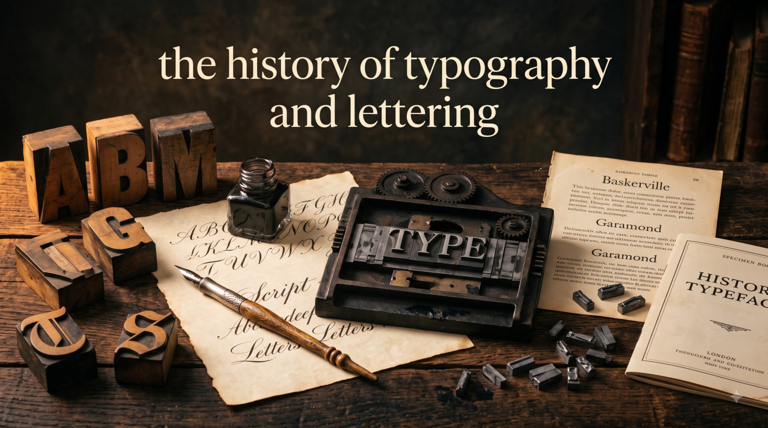
Every time you read a book, scan a website, or glance at a street sign, you encounter the invisible work of thousands of years of design. Typography shapes how we absorb information, whether we notice it or not. The history of typography and lettering stretches back over 5,000 years, from hand-carved symbols on clay tablets to the variable fonts rendering on your screen right now.
I have spent years studying type design, and the deeper I dig, the more I realize that every curve, stroke, and serif carries a story. The letterforms we use today did not appear out of nowhere. They evolved through cultural shifts, technological breakthroughs, and the patient work of countless scribes, punchcutters, and designers. Understanding that lineage changes how you see every piece of text you encounter.
This guide walks you through that entire journey. You will learn where our alphabet came from, how medieval monks shaped the lowercase letters we use daily, and why a German goldsmith named Johannes Gutenberg changed the world forever. We will also explore the difference between typography and lettering, two crafts that are often confused but remain distinct in their tools, techniques, and traditions.
Whether you are a graphic design student building your first type specimen, a typography enthusiast who wants deeper context, or simply curious about why letters look the way they do, this article has something for you. The roots of type design connect to politics, religion, commerce, and art. Understanding those roots helps you make better design choices and appreciate the craft behind every character on the page.
Our team researched primary sources, scholarly references, and community discussions from forums like Typography.Guru and TypeDrawers to build this timeline. What emerged is a story not just about letters, but about human communication itself.
Table of Contents
Typography vs Lettering: Understanding the Difference
Before we trace the timeline, we need to clear up a common source of confusion. Typography and lettering are related but fundamentally different disciplines, and mixing them up muddies the entire conversation.
Typography is the art and technique of arranging pre-made letterforms. A typographer works with type, selecting, sizing, spacing, and composing characters that have already been designed and produced in a consistent system. Whether those letters come from a wooden case of metal type or a dropdown menu in design software, the principle is the same: you are arranging existing forms to communicate a message clearly and effectively.
Lettering, on the other hand, is the art of drawing or painting letters by hand. Each character is created as a unique piece, tailored to its specific context. A signwriter painting a shopfront, a calligrapher writing a wedding invitation, and a muralist spraying a wall are all doing lettering. No two letters need to be identical, and that freedom is the whole point. The letterer adjusts spacing, weight, and proportions intuitively as they work, responding to the specific needs of each word and composition.
Calligraphy sits between the two. It is writing, not drawing, and it follows structured strokes and tools. But each execution is one-of-a-kind, like lettering. The calligraphic tradition directly fed the development of typographic letterforms. When early type designers like Nicolas Jenson cut their first punches in 15th-century Venice, they looked to calligraphic models for inspiration. The pen strokes of Renaissance scribes became the basis for some of the most enduring typeface designs ever created.
In the digital era, the boundary has blurred further. A designer might draw a custom alphabet in Illustrator, convert it into a font file, and then typeset with it. That process spans both lettering and typography. Still, understanding the distinction helps you appreciate why certain historical forms look the way they do and what craft traditions they draw from.
Forum discussions among working designers confirm this matters. Members of communities like Typography.Guru and TypeDrawers regularly point out that understanding the difference between drawing a single letter and designing a full type family is essential for anyone serious about type. The two disciplines require different skills, different thinking, and different approaches to problem-solving.
Type design itself is yet another discipline. A type designer creates the reusable system of letterforms that typographers then arrange. This distinction, between creating the letterforms and arranging them, is what separates type design from typography proper. All three crafts, lettering, type design, and typography, share common roots but diverge in their execution.
The History of Typography and Lettering: Ancient Origins
The story begins not with letters at all, but with pictures. The earliest known writing systems emerged around 3400 BC in Mesopotamia, where Sumerian scribes pressed wedge-shaped marks into soft clay tablets. This system, called cuneiform, started as a way to track trade goods, record agricultural yields, and manage temple inventories. Over centuries, it evolved into a full writing system used across the ancient Near East for over 3,000 years.
Cuneiform was not an alphabet. It used hundreds of signs, each representing a syllable or a concept. Learning it took years of specialized training in scribal schools called edubba. But it established a crucial idea: that spoken language could be captured in visual marks on a surface. That principle underpins every form of typography and lettering that followed.
Shortly after cuneiform appeared, ancient Egypt developed its own writing system: hieroglyphs. First appearing around 3000 BC, Egyptian hieroglyphs were painted onto temple walls, carved into stone monuments, and written on papyrus scrolls. Some hieroglyphs represented sounds (phonograms), others represented objects (logograms), and some served as determinatives that clarified meaning.
Hieroglyphic writing was deeply connected to art and architecture. The letterforms were not just functional symbols. They were decorative elements integrated into the design of temples, tombs, and public monuments. A single inscription might combine text, image, and architectural form into a unified visual composition. This integration of text and visual design foreshadows what we now call typographic design.
Egypt also developed simplified scripts for everyday use. Hieratic, a cursive form of hieroglyphs, was used by priests and scribes for religious texts and administrative documents. Demotic, an even more simplified script, emerged around 650 BC for legal, commercial, and literary purposes. These practical scripts show how writing has always balanced formality with efficiency.
The next major leap came from the Phoenicians around 1050 BC. They created what is widely regarded as the first true alphabet: a set of 22 consonant symbols, each representing a single sound. Unlike cuneiform or hieroglyphs, the Phoenician alphabet was relatively simple to learn. That simplicity made it highly portable, and it spread rapidly across the Mediterranean through trade routes. Phoenician merchants carried their letters to ports from Carthage to Cyprus, and local cultures adapted the system for their own languages.
The Greeks adapted the Phoenician alphabet around 800 BC, making one critical addition: vowels. The Greek alphabet was the first to represent both consonant and vowel sounds with separate symbols. This innovation made writing more precise and readable. Greek letterforms also introduced more geometric, balanced proportions that influenced Roman lettering centuries later. The Greek alphabet also introduced the concept of letter names (alpha, beta, gamma) that evolved into the word “alphabet” itself.
From the Greeks, the alphabet passed to the Etruscans, who inhabited the Italian peninsula before the Romans rose to power. The Etruscan alphabet was a direct adaptation of the Greek, with some modifications to suit their language. When Rome began its ascent, it adopted and refined the Etruscan letters, setting the stage for the Latin alphabet that most of the Western world uses today.
Each of these transitions involved practical adaptation. Letters were simplified, rotated, or redesigned to work with available writing tools and materials. The Phoenicians wrote primarily on papyrus and wax tablets. The Greeks carved letters into stone and painted them on pottery. The Romans would push stone carving to extraordinary levels of precision.
Roman Capitals and the Foundation of Western Letterforms
The Roman Empire did more than conquer territory. It established the visual vocabulary of Western letterforms that persists to this day. The basic shapes of our capital letters, A through Z, were largely fixed by the 1st century AD, carved into stone monuments across the empire.
Roman square capitals, or capitalis monumentalis, represent the pinnacle of Roman lettering. These were the formal, carefully proportioned letters inscribed on public buildings, triumphal arches, and memorials. The most famous example is the inscription at the base of Trajan’s Column in Rome, completed around 114 AD. Typographic scholars consider it one of the finest examples of carved lettering ever created. Type designers still study its proportions when creating new serif typefaces.
What makes Trajan’s inscription so remarkable is its geometry. The letters follow careful proportional rules based on a square grid. Thick and thin strokes create visual contrast that guides the eye along each line. Serifs, the small extensions at the ends of strokes, helped the carver finish each stroke cleanly and added visual stability. These same serifs became a defining feature of an entire category of typefaces for the next two millennia.
The proportions of Roman capitals also established key typographic measurements that we still reference. The concepts of cap height, the relationship between thick and thin strokes, and the optical adjustments needed to make letters appear balanced were all worked out by Roman stonecutters. They discovered, for example, that a perfectly round O looks smaller than a rectangular H of the same height, so the O must be slightly oversized to appear equal.
The Romans also used more casual scripts for everyday writing. Rustic capitals were a compressed, faster version of square capitals, written with a broad-nib pen on papyrus or wax tablets. They were less formal but more practical for correspondence, record-keeping, and literary works. Roman cursive, an even more rapid hand, was the daily writing style of merchants, soldiers, and administrators across the empire.
Roman writing masters like Quintilian documented the principles of good lettering in their rhetorical treatises. The idea that letterforms should be beautiful as well as functional was established early. This concern for both legibility and aesthetics runs through the entire history of typography and lettering, from Roman inscriptions to modern web design.
The legacy of Roman lettering is difficult to overstate. When Renaissance type designers searched for models to base their typefaces on, they looked to Roman inscriptions. When typographic classification systems were developed, an entire category was named “roman” to honor this tradition. The proportions, stroke contrasts, and serif treatments established in 1st-century Rome still inform serif typeface design in 2026.
Medieval Calligraphy and the Manuscript Tradition
When the Western Roman Empire declined, the organized system of Roman writing fragmented along with it. Regional scripts multiplied across Europe as different monasteries, regions, and kingdoms developed their own lettering styles. But out of this fragmentation came some of the most beautiful lettering ever created, along with one of the most important innovations in the entire history of written language: the lowercase letter.
The story begins with uncial and half-uncial scripts. Developed between the 3rd and 5th centuries AD, these scripts used rounded, flowing letterforms suited to writing with a broad-nibbed pen on parchment and vellum. Unlike the angular, geometric Roman capitals, uncial letters were softer and more organic. For the first time, letterforms like a, d, g, h, and q took shapes recognizably close to what we write today. The development of uncial was driven partly by the shift from papyrus rolls to parchment codices, which allowed for bound books with pages that could be written on both sides.
In the British Isles, Irish monks developed an even more elaborate style called insular script. Working in monasteries like Iona and Lindisfarne, these scribes created letterforms of extraordinary intricacy. The Book of Kells, created around 800 AD, stands as the supreme achievement of this tradition. Its pages feature intricately decorated initials, interlacing patterns, and letterforms of astonishing complexity. Some initials span entire pages, transforming text into visual art that rivals any painting or sculpture of the period.
Then came the reform that changed everything. Under Charlemagne, the Holy Roman Emperor, the scholar Alcuin of York oversaw the development of Carolingian minuscule in the late 8th and early 9th centuries. This script was designed to be clear, consistent, and easy to read across the vast Carolingian Empire. It standardized letterforms, introduced consistent word spacing, and established the distinction between uppercase and lowercase letters that we still use. Carolingian minuscule also introduced punctuation marks like the question mark and the exclamation point in their early forms.
Carolingian minuscule was, in many ways, the first standardized writing system in Western Europe. Scribes trained in different monasteries could produce visually consistent manuscripts because the script followed clear rules. This consistency made texts far more legible, which in turn made knowledge more accessible within the monastic and scholarly communities that preserved learning through the medieval period. The script was so successful that it effectively replaced the patchwork of regional hands that had made cross-regional communication difficult.
By the 12th century, however, tastes and needs had shifted. The demand for books was growing, and scribes needed a script that could pack more text onto expensive parchment. The result was Gothic black letter, also known as Textura. Black letter is dense, angular, and vertical, with narrow letterforms squeezed tightly together. It looks dramatically different from the rounded Carolingian minuscule that preceded it. The angular forms were partly a response to the broad-nibbed pen, which naturally produced thick vertical strokes and thin horizontal ones when held at a steep angle.
Black letter was not a single style. It evolved into regional variants: Textura in England and France, Schwabacher in southern Germany, and Fraktur in the German-speaking world. Each variant had distinct characteristics. Textura was the most rigid and angular. Schwabacher was somewhat rounder and more open. Fraktur, which emerged in the early 16th century, combined angular and curved elements in a distinctive way. Fraktur remained the dominant type style in Germany well into the 20th century, long after roman typefaces had taken over elsewhere in Europe.
The medieval period also saw the rise of secular scribes and professional writing masters, particularly in the growing cities of the late medieval period. Guilds of scribes produced legal documents, merchant records, and literary manuscripts. Universities created enormous demand for textbooks and reference works, spawning a commercial manuscript trade. The tradition of the written letter as both a functional tool and an art form was firmly established by the time a new technology arrived to disrupt everything.
Gutenberg, Moveable Type, and the Printing Revolution
The history of typography was forever altered in the 1440s when Johannes Gutenberg, a goldsmith from Mainz, Germany, developed a practical system of printing with moveable metal type. But Gutenberg was not the first to conceive of moveable type. That distinction belongs to Bi Sheng, a Chinese artisan who created ceramic moveable type characters between 1039 and 1048 during the Song Dynasty. Bi Sheng’s characters were fired in clay and used for printing, but the system was fragile and the vast number of Chinese characters (tens of thousands) limited its practicality for widespread use.
In Korea, metal moveable type was developed even earlier than Gutenberg’s system. The Jikji, a Korean Buddhist document printed with metal type, dates to 1377, nearly 80 years before Gutenberg’s press. Korean printers also developed sophisticated type-casting and typesetting techniques. These non-Western innovations were significant, but it was Gutenberg’s system that had the most direct impact on the Western typographic tradition and the global spread of printed communication.
Gutenberg’s genius was not just the idea of moveable type. It was the complete system he built around it. He developed a durable metal alloy (lead, tin, and antimony) for type that could withstand repeated impressions. He created a hand mold for casting individual letters quickly and consistently, ensuring that each piece of type was uniform. He adapted the screw press, already used for wine and olive oil production, to apply even pressure to inked type on paper. And he formulated an oil-based ink that adhered properly to metal type, unlike the water-based inks used for woodblock printing.
The result was a system that could produce books at a speed and consistency impossible for even the fastest scribes. Gutenberg’s most famous work, the 42-line Bible (also called the Gutenberg Bible), was completed around 1455. It is a masterpiece of early printing, with careful attention to the spacing, alignment, and visual quality of each page. Gutenberg designed his type to mimic the black letter handwriting of German scribes, making printed books look familiar to readers accustomed to manuscripts. The type even included ligatures and abbreviations common in handwritten text.
The impact was immediate and far-reaching. Within 50 years of Gutenberg’s first press, printing had spread to every major European city. By 1500, an estimated 20 million volumes had been printed, an astonishing number considering that a single monastery might have produced only a few dozen manuscripts per year. The cost of books plummeted, literacy rates began to climb, and the monopoly on knowledge held by monasteries and universities was broken forever.
For typography specifically, the printing press standardized letterforms in a way that handwritten manuscripts never could. When a punch was cut and a matrix made, hundreds or thousands of identical impressions could be cast from it. This forced type designers to think systematically about letter proportions, spacing, and visual harmony in ways that scribes never had to. The concepts of kerning (adjusting space between specific letter pairs), leading (space between lines), and consistent letter spacing all became formal concerns with the rise of printing. Typography, as a distinct discipline, was born.
The first generation of printers were also editors, publishers, and booksellers. Figures like William Caxton in England, who established the first English printing press in 1476, helped standardize language as well as letterforms. The choices printers made about spelling, punctuation, and layout had lasting effects on the development of European languages.
From Renaissance to Industrial Era: The Evolution of Roman Typefaces
Once printing took hold, the evolution of typefaces accelerated rapidly. The story of type design in the centuries after Gutenberg is largely a story of refinement and diversification, as punchcutters across Europe developed increasingly sophisticated roman and italic letterforms.
The shift away from black letter began in Italy. In the 1460s and 1470s, German printers working in Italy, including Conrad Sweynheym and Arnold Pannartz, began experimenting with typefaces modeled on the humanist handwriting of Italian scholars. This writing was based on Carolingian minuscule, which Renaissance scholars mistakenly attributed to ancient Rome (hence the name “roman” type). The humanist connection to classical antiquity made these letterforms culturally appealing to Renaissance intellectuals.
Nicolas Jenson, a Frenchman working in Venice, created what many consider the first truly excellent roman typeface around 1470. Jenson’s type is warm, readable, and gracefully proportioned. Its letterforms have an organic quality that reflects their calligraphic origins, and it remains influential among type designers to this day. Jenson’s type was so well regarded that it was still being imitated and revived centuries later by designers like William Morris and Bruce Rogers.
Aldus Manutius, another Venetian printer, made a different kind of contribution. Around 1500, he introduced the italic type style, based on the cursive handwriting of Italian humanists. Italic was originally conceived not as an accent style, but as a way to fit more text onto a page. Aldus used it for small, affordable pocket editions of classical texts that scholars could carry with them. Over time, italic evolved into a companion style to roman, used for emphasis, citations, and foreign words. The Aldine Press also introduced the semicolon to wider European use.
In France, Claude Garamond became one of the first independent type designers, selling type to multiple printers rather than working exclusively for one publishing house. His roman typefaces, created in the 1530s and 1540s, set a new standard for elegance and readability. Garamond’s types were so well regarded that they continued to be used, copied, and revived for centuries. Fonts bearing his name remain popular in 2026, and his typefaces are often the first serif recommendation for book designers.
Type designers began to classify typefaces into categories based on their characteristics. Old style typefaces, like those of Jenson and Garamond, feature gentle stroke contrast, angled stress (the thinnest part of round letters tilts slightly), and relatively thick, bracketed serifs. Transitional typefaces, exemplified by the work of William Caslon in England and Pierre Simon Fournier in France, show more contrast between thick and thin strokes and more vertical stress. Fournier also introduced the point system for measuring type size, which evolved into the system still used today.
John Baskerville’s types in the mid-18th century pushed the transitional trend further with sharper, crisper letterforms and higher contrast. Baskerville was a perfectionist who also developed new paper-making and ink-making techniques to complement his type designs. His work influenced the next generation of type designers on the continent.
The modern classification emerged in the late 18th century with the work of Firmin Didot in France and Giambattista Bodoni in Italy. Their typefaces featured extreme contrast between thick and thin strokes, thin hairline serifs, and perfectly vertical stress. These “modern” typefaces looked dramatically different from the organic old style letterforms of earlier centuries, and they reflected the precision, rationalism, and neoclassical taste of the Enlightenment era. Bodoni alone designed over 300 typefaces, making him one of the most prolific type designers in history.
The Industrial Revolution, Sans-Serif, and Modern Typography
The 19th century brought massive social and technological change, and typography reflected all of it. The Industrial Revolution created new demands for advertising, posters, packaging, and signage. Type founders responded with an explosion of new styles that transformed the visual landscape of cities and commerce.
One of the most notable developments was the “fat face,” an extreme version of the modern typeface with dramatically thick strokes designed to grab attention on posters and advertisements. Fat faces could be seen on playbills, auction notices, and commercial broadsides throughout growing industrial cities. Display typefaces became a booming market, and type founders competed to produce the most eye-catching, unusual, and attention-grabbing designs, leading to a wild diversity of decorative styles including three-dimensional letters, shaded faces, and ornamental types.
But the most consequential development was the rise of sans-serif typefaces. Sans-serif letters, without the terminal strokes that had defined Western letterforms since Roman times, initially appeared in the early 19th century. They were sometimes called “grotesque” or “Gothic,” reflecting how unusual and even ugly they seemed to eyes accustomed to serifs. The first commercially available sans-serif typeface is generally credited to William Caslon IV, who issued a specimen around 1816. Early sans-serifs were used primarily for display purposes, not body text.
Sans-serif typefaces gained wider acceptance and theoretical backing through the work of the Bauhaus school in Germany during the 1920s. Bauhaus designers embraced sans-serif forms for their simplicity, geometric clarity, and alignment with modernist principles of functional design. Herbert Bayer even designed a universal alphabet that eliminated uppercase letters entirely, arguing that they were unnecessary and wasteful. Jan Tschichold’s influential 1928 book “Die Neue Typographie” argued that sans-serif typefaces were the only appropriate choice for modern communication design.
In 1957, the Haas Type Foundry in Switzerland released Neue Haas Grotesk, designed by Max Miedinger with input from Eduard Hoffmann. Renamed Helvetica for international distribution by the Stempel foundry, it became perhaps the most widely used typeface in the world. Its clean, neutral forms embodied the Swiss Typographic Style, also known as the International Typographic Style, which emphasized clarity, grid-based layouts, and objective communication. Helvetica’s influence on corporate identity, signage systems, and public communication is difficult to overstate.
The 19th century also saw major advances in typesetting technology that changed how type was produced. The Linotype machine, invented by Ottmar Mergenthaler in 1884, and the Monotype machine, developed by Tolbert Lanston, mechanized the process of setting type. Instead of selecting individual metal letters by hand (a skilled but slow process), operators could type on a keyboard and the machine would automatically assemble, cast, and distribute type. This dramatically increased the speed and reduced the cost of producing newspapers, books, and other printed matter, making printed information accessible to mass audiences for the first time.
Meanwhile, the Arts and Crafts movement, led by figures like William Morris, pushed back against industrialization’s effects on design and craftsmanship. Morris established the Kelmscott Press in 1891, producing handmade books with elaborate typography, illustration, and binding. The private press movement that followed, including the Doves Press, Ashendene Press, and others, emphasized craftsmanship, quality materials, and careful attention to typographic detail. Values like appropriate type selection, generous margins, and harmonious page layout that were championed by the private press movement continue to resonate in the design world in 2026.
Digital Typography and the Modern Era
The second half of the 20th century brought a transformation as dramatic as Gutenberg’s press: the shift from physical type to digital type. This transition happened in stages, each one expanding who could create, set, and distribute typography.
Phototypesetting emerged in the 1950s and 1960s as the first major alternative to hot metal type. Instead of casting physical letters in lead, phototypesetting machines projected images of characters onto light-sensitive paper or film through a lens system. This allowed for more flexible sizing, easier corrections, and faster production. Typefaces stored on film strips or glass disks could be scaled optically, freeing designers from the rigid size increments of metal type. Machines like the Compugraphic and Berthold systems became standard in the publishing industry.
The real revolution came with the personal computer. In 1984, Apple introduced the Macintosh with a graphical interface that displayed type on screen for the first time in a consumer product. Adobe’s PostScript page description language, also released in 1984, provided a way to describe letterforms mathematically as bezier curves rather than physical objects. This meant a single font file could produce crisp output at any size, on screen or in print, without the need for separate physical matrices for each size.
Apple and Microsoft later developed TrueType as a competing font format, and eventually OpenType emerged as a standard that combined the best features of both PostScript and TrueType. These digital font formats made it possible for anyone with a computer to work with professional-quality type. Desktop publishing, once the exclusive domain of trained typographers and compositors who had spent years learning their craft, became accessible to millions of people overnight. The combination of Aldus PageMaker, the Apple LaserWriter, and PostScript fonts in the mid-1980s is often credited with launching the desktop publishing revolution.
The web brought yet another shift. In the early days of web design, designers were limited to a handful of “web-safe” fonts like Arial, Times New Roman, Verdana, and Georgia. But the introduction of web font services like Typekit (now Adobe Fonts) and the CSS @font-face rule changed everything. By 2026, designers can choose from thousands of typefaces for web use, and tools like Google Fonts have made quality typography freely available to anyone with an internet connection. Web typography has evolved from a constraint into a creative opportunity.
Variable fonts represent the latest frontier in digital type. Introduced as part of the OpenType 1.8 specification in 2016, variable fonts pack an entire family of weights, widths, and styles into a single file. Instead of loading separate font files for regular, bold, italic, and other variants, a variable font lets the browser interpolate between defined axes (weight, width, slant, optical size, and custom axes). This reduces file sizes, improves performance, and opens new possibilities for responsive typography that adapts fluidly to different screen sizes and viewing conditions.
Alongside these digital developments, a hand-lettering renaissance has flourished. Social media platforms like Instagram and Pinterest have fueled a renewed interest in hand-drawn letterforms, brush calligraphy, and sign painting. Artists and designers are rediscovering the tactile, human quality of lettering as a counterpoint to the precision of digital type. This contemporary movement connects directly back to the craft traditions that existed long before printing, reminding us that the hand-drawn letter has never truly disappeared.
Non-Western Typography Traditions
Most histories of typography focus almost exclusively on the Latin alphabet and the European printing tradition. But the story of letterforms is global, and several non-Western traditions have made essential contributions to the way we communicate visually. Understanding these traditions provides a more complete picture of how humans have solved the problem of encoding language in visual form.
China has one of the richest printing histories in the world. Woodblock printing was practiced in China centuries before Gutenberg, with some examples dating to the Tang Dynasty (618-907 AD). The Diamond Sutra, dated to 868 AD, is the oldest known dated printed book. Bi Sheng’s ceramic moveable type, created in the 11th century, was followed by Wang Zhen’s wooden moveable type system around 1298. The enormous number of Chinese characters (a comprehensive dictionary might include over 40,000) made moveable type less practical than in alphabetic writing systems, but Chinese printers developed sophisticated techniques for organizing and managing large character sets.
Japanese typography drew on both Chinese and Western influences. Japanese writing uses a combination of kanji (characters borrowed from Chinese), hiragana, and katakana, two syllabic scripts developed in Japan during the 9th century. Designing typefaces for this mixed system requires balancing the visual weight and proportions of fundamentally different character sets so they read harmoniously together. Japanese type design reached extraordinary levels of refinement in the 20th century, with foundries like Morisawa and Fontworks creating beautifully crafted type families used across publishing, advertising, and digital media.
Arabic script presents unique typographic challenges. It is cursive by nature, meaning letterforms change shape depending on their position in a word (initial, medial, final, or isolated). Arabic calligraphy is one of the world’s great art forms, with styles like Naskh, Thuluth, Nastaliq, and Kufic developing over centuries of practice. Translating these fluid, connected letterforms into a system of discrete typographic units required significant ingenuity from early type designers. Arabic typography continues to evolve rapidly as designers develop new approaches to this ancient script, and variable font technology has opened particularly exciting possibilities for Arabic type design.
Korean hangul deserves special mention as one of the few writing systems designed deliberately from scratch rather than evolving gradually. Commissioned by King Sejong the Great in the 15th century, hangul was created by a committee of scholars to be logical, easy to learn, and scientifically organized. Its letterforms are constructed from basic geometric elements representing the shape of the mouth and tongue during pronunciation. Hangul is widely considered one of the most logical and well-designed alphabets in the world, and its creation story is unique in the history of writing systems.
These global traditions remind us that typography is not a single story. It is a collection of parallel stories, each shaped by distinct cultural values, materials, and communication needs. As design becomes more globally connected, understanding these diverse traditions becomes increasingly important for creating work that communicates effectively across cultures and languages.
FAQs
What is the history of typography?
Typography originated with the earliest writing systems, including Sumerian cuneiform (around 3400 BC) and Egyptian hieroglyphs (around 3000 BC). The Latin alphabet that forms the basis of Western typography evolved through Phoenician, Greek, and Etruscan adaptations. Medieval scribes developed lowercase letterforms, and Johannes Gutenberg’s invention of moveable metal type in the 1440s launched modern typography. Since then, typeface design has evolved through the Renaissance, Industrial Revolution, and digital era, with each period introducing new styles, technologies, and approaches to arranging letterforms for communication.
What is the most despised font?
Comic Sans MS is widely considered the most despised font in the design world. Created by Vincent Connare for Microsoft in 1994, it was originally designed for comic-book-style speech bubbles in Microsoft Bob. Its casual, uneven letterforms have been misused in formal contexts like business presentations, legal documents, and public signage, leading to widespread criticism from designers. Other commonly criticized fonts include Papyrus, Curlz, and Hobo, often due to overuse or inappropriate application in serious or formal contexts.
What is the 3 font rule?
The 3 font rule is a design guideline suggesting that you should use no more than three different fonts in any single project or document. The idea is to maintain visual consistency and hierarchy while avoiding clutter. A common approach is to use one font for headings, one for body text, and one for accents or special purposes. Some designers simplify further to two fonts, combining a serif with a sans-serif for contrast. The rule is flexible, but the principle of restraint remains important in effective typographic design.
What is the history of lettering fonts?
Lettering fonts trace their roots to hand-drawn and hand-painted letterforms used by scribes, signwriters, and calligraphers throughout history. Ancient Roman brush-written capitals, medieval illuminated manuscripts, and Renaissance writing manuals all contributed to the development of lettering styles. The signwriting trade of the 18th and 19th centuries produced a rich tradition of hand-lettered commercial type. In the 20th and 21st centuries, digital tools allowed designers to convert hand-lettered alphabets into usable fonts, leading to the wide variety of script, brush, and hand-lettered fonts available today.
The Story Continues: Typography and Lettering in 2026
Looking back over 5,000 years, the history of typography and lettering reveals a clear pattern. Each major leap in technology, from clay tablets to papyrus, from manuscripts to the printing press, from hot metal to digital type, has expanded who can create written communication and how widely it can spread. But through every transformation, the fundamental concerns of the craft remain the same: legibility, beauty, and effective communication.
The major milestones along this journey tell the story. Sumerian cuneiform gave us the concept of encoding language in visual marks. Egyptian hieroglyphs integrated text with visual design and architecture. The Phoenician alphabet gave us the principle of one symbol per sound. Greek additions brought vowels. Roman inscriptions established the proportions, serif structures, and optical adjustments we still use. Medieval scribes created the lowercase letters and standard writing systems that made text accessible. Gutenberg made reproducible type possible and democratized knowledge. Renaissance designers refined roman and italic forms into the versatile system we know today.
The Industrial Revolution introduced sans-serif typefaces, display types, and mechanized production. The 20th century brought modernism, Helvetica, and the Swiss school’s emphasis on clarity and grid-based design. And the digital era put professional typography in the hands of anyone with a computer and an internet connection, while simultaneously sparking a revival of hand-lettering and calligraphic traditions.
Understanding this history is not just an academic exercise. Designers who know where their letterforms come from make better choices. Knowing that Garamond was cut in the 1530s for a specific French publishing context helps you understand why it works beautifully for long-form book text. Knowing that Helvetica was designed to be neutral helps you recognize when it is the right choice for wayfinding systems and corporate communications, and when something with more personality is needed.
The typographic concepts we use daily have deep roots. Kerning, the adjustment of space between specific letter pairs, was practiced by Roman stonecutters. Leading, the space between lines, takes its name from the strips of lead placed between lines of metal type. X-height, ascenders, and descenders were all formalized in medieval manuscripts. Understanding these origins gives you a richer relationship with the tools of your craft.
Forum communities and professional organizations consistently reinforce this point. Members of r/typography, TypeDrawers, and similar groups frequently advise newcomers that studying type history deepens design intuition. It gives you a vocabulary for understanding why certain forms feel right and others feel wrong. It connects the work you do on a screen today to a craft tradition that stretches back millennia.
The history of typography and lettering is not finished. Variable fonts, artificial intelligence-assisted type design, and the ongoing fusion of global script traditions are all writing the next chapter. But the foundations laid by ancient carvers, medieval monks, Renaissance punchcutters, and industrial type founders continue to support everything new that is built. The best way to contribute to this living tradition is to understand it deeply and build on it thoughtfully.