
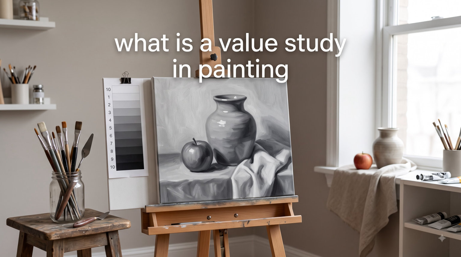
A value study in painting is a simplified, monochromatic sketch that breaks your subject into light, medium, and dark shapes before you touch color. Think of it as a map for your painting. It tells you where the brightest highlights live, where the deepest shadows fall, and how the overall composition holds together before you invest hours mixing paint. I have used value studies for years across watercolor, oil, and acrylic, and they have saved me from more muddy, flat paintings than I can count.
If you have ever stared at a blank canvas feeling unsure where to begin, a value study solves that problem. It removes color from the equation entirely so you can focus on the backbone of every strong painting: light and dark relationships. In this guide, we will walk through exactly what a value study is, why professional painters swear by them, and how to create one from scratch.
Table of Contents
What Is a Value Study in Painting?
A value study in painting is a small, quick sketch that simplifies your subject into just a few shades of gray, usually three or four. Instead of worrying about hues, saturation, or color mixing, you focus purely on how light or dark each area of your scene is. The goal is to plan your composition and establish a strong pattern of lights and darks before committing to a full painting.
Value refers to how light or dark something appears on a scale from pure white to pure black. Every color you see has an underlying value. A bright yellow and a medium blue might look completely different in color, but they could share a similar middle value. When you strip away the color and look only at the value underneath, you can see the structure of your subject much more clearly.
Most value studies are small thumbnail sketches, roughly 3 by 5 inches, done in pencil, marker, or a single paint color like burnt umber or Payne’s gray. They take just a few minutes to complete but give you a blueprint for your entire painting. Some artists also create digital value studies using apps or photo editors that convert reference photos to grayscale.
The beauty of a value study is its simplicity. You are not rendering details. You are not matching colors. You are making fast decisions about where the big shapes of light, middle, and dark values go on your page. Those decisions shape everything that follows.
Why Value Studies Matter for Every Painter
Value does the heavy lifting in a painting. It is what makes a subject look three-dimensional, what creates a sense of depth and atmosphere, and what draws the viewer’s eye to the center of interest. Color gets all the attention, but value does all the work. This is something I remind myself of every time I sit down to paint.
Without a value study, you are essentially guessing. You might start with good intentions but gradually lose track of where your darks should be. The painting becomes flat, the contrast disappears, and nothing stands out. A value study prevents this by forcing you to make all the hard compositional decisions upfront, when changes cost nothing.
Here is what value studies help you accomplish:
Plan strong compositions: By seeing your subject as abstract shapes of light and dark, you can arrange them for maximum impact before you start painting.
Establish a center of interest: Value contrast naturally draws the eye. A value study shows you where the highest contrast occurs so you can place your focal point there.
Paint with confidence: When you already know where your darks, midtones, and lights go, the actual painting process becomes faster and more decisive.
Avoid muddy results: Many muddy paintings happen because values are too similar across the canvas. A study reveals this problem early.
David Kessler, a well-known painting instructor, puts it this way: after you complete a thorough value study, your painting is already 85% done because the design work is complete. I have found this to be true in my own work. The painting almost paints itself once the value plan is locked in.
How to Create a Value Study: Step-by-Step
Creating a value study is straightforward. You do not need expensive materials or special tools. Here is the process I follow every time I start a new painting.
Step 1: Choose Your Reference and Squint
Start by looking at your subject or reference photo. Now squint at it until the details blur away and you can only see the big shapes of light and dark. This squinting technique is one of the most important skills you can develop as a painter. It shuts down your brain’s tendency to label things (“that is a tree, that is a building”) and forces you to see only abstract value shapes.
If squinting is difficult, try taking off your glasses if you wear them, or blur your vision by looking slightly past the subject. Some artists use a piece of red or green acetate over their eyes to neutralize color and isolate values. A grayscale filter on your phone camera works too.
Step 2: Identify the Big Value Shapes
While squinting, count the major value shapes you see. You should find somewhere between three and seven big shapes. If you see more than that, you are probably not squinting enough. Group similar values together. Two trees in similar shadow? One dark shape. A sky and a sunlit wall? One light shape.
This is where beginners often go wrong. They try to capture every subtle value shift instead of simplifying. Resist that urge. A value study is about the big picture, literally. You want broad, simple shapes that capture the overall structure of light and dark.
Step 3: Choose Your Value System
Decide whether you will use a three-value or four-value system. For beginners, I recommend starting with three: light, middle, and dark. Assign each of the big shapes you identified to one of these three values. If you want more nuance, use four values: white, light middle, dark middle, and black. We will compare both systems in detail in the next section.
Step 4: Sketch Your Thumbnail
Draw a small rectangle on scrap paper, roughly proportional to your final canvas. Using a pencil, marker, or single paint color, fill in each shape with the value you assigned it. Work quickly, spending no more than five minutes on this step. The study should feel loose and fast, not precious or detailed.
Some artists like to create two or three different value studies for the same subject, trying different arrangements of dark and light shapes. This is a great habit. It lets you compare compositions and choose the strongest one before you commit to the final painting.
Step 5: Evaluate and Adjust
Step back and look at your value study. Ask yourself: Does the composition feel balanced? Is there a clear area of highest contrast where I want the viewer’s eye to go? Are the dark shapes connected in a way that moves the eye through the painting? If something feels off, adjust it now. Erase, redraw, or paint over. This stage costs you seconds. Fixing the same problems in a full-size painting costs hours.
Three-Value vs Four-Value Systems
Most painters use one of two approaches when creating value studies. Both work well, and the best choice depends on your subject and experience level.
The Three-Value System
The three-value system is the simplest approach. You divide your entire scene into just three values: light, middle, and dark. This is sometimes called the “lights, mids, and darks” method. It forces radical simplification, which is exactly why it works so well for beginners and for planning bold compositions.
With only three values to work with, you cannot get lost in subtleties. Every shape must be clearly light, clearly middle, or clearly dark. This creates paintings with strong, readable contrast. The Tucson Art Academy recommends this approach specifically for watercolor painters who want to loosen up their work and avoid overworking details.
The Four-Value System
The four-value system adds one more level of nuance. You work with white, light middle, dark middle, and dark. David Kessler popularized this approach, and it gives you slightly more control over subtle transitions while still keeping things manageable.
The four-value system works particularly well for landscapes where you need to separate foreground, middle ground, and background values. It also helps when your subject has a lot of middle-value areas that need to be differentiated from each other.
Understanding Notan
Related to value studies is the Japanese concept of notan, which means “light-dark harmony.” Notan studies push simplification even further by reducing a composition to just black and white, with no middle values at all. This extreme simplification reveals whether your underlying composition is strong. If a painting’s notan design is visually compelling, the final painting will likely be strong too, regardless of color choices.
Notan is not a replacement for a full value study, but it is a powerful companion exercise. I sometimes start with a notan sketch (just black and white), then move to a three-value study, and then begin my painting. Each step adds a layer of information while keeping the underlying design intact.
Common Mistakes Beginners Make with Value Studies
Over the years, I have seen artists in forums and classes struggle with the same recurring problems. These mistakes can make value studies feel like a waste of time, which is frustrating because the studies themselves are simple. The issue usually lies in how the study is created or how it gets translated into the final painting.
Mistake 1: Too much detail. A value study should capture big shapes only. If you find yourself rendering individual leaves, eyelashes, or window panes, stop. Squint harder and simplify more. The study should be done in five minutes or less.
Mistake 2: Values that are too similar. If your light, middle, and dark values are hard to tell apart, the study will not help you. Make sure there is clear, visible contrast between each value. Your darks should be noticeably dark, your lights noticeably light.
Mistake 3: Not using the study while painting. This is the biggest complaint I see in art forums. Artists do a value study, then set it aside and paint from the reference photo alone, ignoring their own plan. Keep your value study right next to your canvas and refer to it constantly. Every time you are unsure what value to paint an area, check the study.
Mistake 4: Skipping the squinting step. Trying to identify values with your eyes wide open means your brain will label objects instead of seeing values. Squinting is not optional. It is the core technique that makes value identification possible.
Tips for Getting More from Your Value Studies
Here are practical techniques that have helped me and other artists I know get real results from value studies, not just check them off a list.
Create multiple studies for the same subject. Do not settle for your first attempt. Try three different arrangements of values. Flip the composition. Move the center of interest. You will often discover that your second or third attempt is much stronger than the first.
Use a value scale or value finder. A printed grayscale value scale is a simple tool that helps you match what you see to a specific value number. Hold it up to your subject, squint, and compare. Some artists punch a small hole in each value swatch so they can look through it at the subject for a direct comparison.
Practice seeing values without painting. Walk through your day and mentally assign values to everything you see. That white car in shadow? It is a middle value. That dark tree against a bright sky? High contrast. This daily practice trains your eye faster than any exercise I know.
Translate your study to the painting in layers. When you start the actual painting, begin by laying in your darkest darks and lightest lights first, following the value study. Then fill in the middle values. This layer-by-layer approach, matching each layer to your study, keeps the painting on track. Do not jump into color until the value structure is established.
Work in your painting medium for the study. If you are painting in watercolor, try doing your value study in watercolor using a single dark pigment. If you work in oils, use oils. This way you practice the same brush control and paint handling you will use in the final piece. Pencil studies are fine for planning, but paint studies give you more transferable skills.
FAQs
What is a value study in painting?
A value study in painting is a small, quick monochromatic sketch that simplifies your subject into three or four shades of gray. It helps you plan where lights, midtones, and darks will go in your final painting before you commit to color.
How do you do a value study in painting?
Squint at your subject to blur details and see only big shapes of light and dark. Assign each shape a value (light, middle, or dark) using a three- or four-value system. Sketch these shapes as a small thumbnail in pencil, marker, or single-color paint, spending no more than five minutes. Evaluate the composition and adjust before starting your full painting.
What is the purpose of a value study?
A value study helps you plan your composition, establish contrast, create a clear center of interest, and avoid flat or muddy paintings. By working out the light and dark structure before adding color, you make stronger design decisions early when changes are easy.
How many values should a painting have?
Most painters use three to five values in a value study. Beginners should start with three (light, middle, dark) for maximum simplicity. More experienced painters may use four or five values for additional nuance. The key is keeping the number small enough to maintain clear contrast between values.
What is the difference between a value study and a sketch?
A regular sketch focuses on outlines, shapes, and proportions. A value study focuses exclusively on the lightness or darkness of areas, ignoring line work and color. Value studies use broad areas of tone rather than drawn details, and their purpose is compositional planning rather than rendering.
Start Seeing Values, Start Painting Better
Understanding what a value study in painting is might be the single most impactful thing you learn as an artist. It is not a complicated technique. You need a pencil, some scrap paper, and the willingness to squint at your subject for a few minutes. But the payoff is enormous: stronger compositions, clearer contrast, fewer wasted paintings, and a deeper understanding of why some paintings work and others do not.
Start small. Pick your next painting subject, spend five minutes creating a simple three-value thumbnail, and keep it next to your canvas as you work. Refer to it often. I think you will be surprised at how much more confident your painting becomes when the value plan is already in place. The more you practice seeing values, the more natural it feels, and eventually it becomes second nature in every painting you create.