
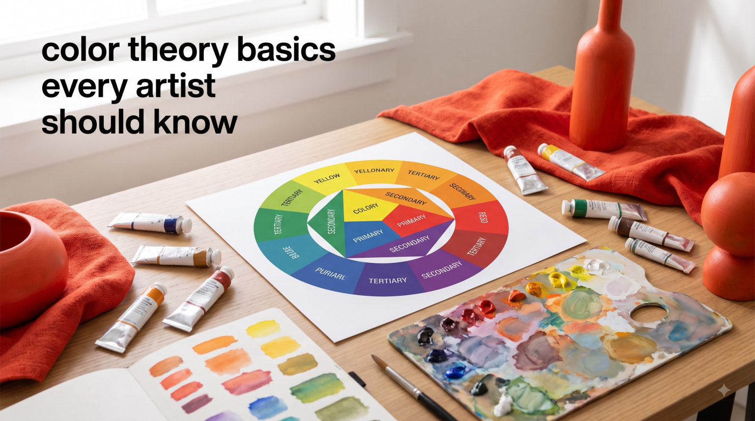
Color is the first thing viewers notice about your artwork. Before they analyze your brushwork or composition, their eyes register the colors you’ve chosen and how they interact. Understanding color theory basics every artist should know transforms your work from accidental to intentional. Whether you’re a beginner picking up your first brush or an experienced artist looking to strengthen your foundations, these principles will change how you see and use color.
When I started painting, I would choose colors based on what “looked right” without understanding why certain combinations worked while others fell flat. After studying understanding art theory and color principles, I realized that color theory isn’t about rigid rules. It’s a framework that helps you make informed decisions and express your artistic vision more effectively.
In this guide, you’ll learn the fundamental concepts that professional artists use every day. From the color wheel to color harmony schemes, from warm versus cool temperatures to practical mixing tips, we’ll cover everything you need to build a solid color foundation. Developing your artistic skills starts with mastering these basics.
Table of Contents
What is Color Theory and Why Does It Matter?
Color theory is a body of principles that explain how colors interact, relate to each other, and affect viewers emotionally and psychologically. These principles provide a logical framework for choosing and combining colors in ways that create visual harmony, contrast, and meaning.
The importance of color theory extends beyond technical knowledge. When you understand why certain color combinations evoke specific feelings, you gain control over the emotional impact of your work. You can create depth and dimension, guide the viewer’s eye through your composition, and communicate ideas that words cannot express.
Many artists worry that learning color theory will restrict their creativity. In reality, the opposite happens. Theory gives you a vocabulary and set of tools that expand your options. You can follow traditional harmony rules when you want cohesion, or deliberately break them when you want tension and surprise.
The 3 Basic Categories of Color Theory
Color theory organizes into three fundamental categories that work together to guide your color decisions. Understanding each category helps you approach color systematically rather than randomly.
The Color Wheel
The color wheel is the foundation of color theory. It arranges colors in a circular format that shows their relationships to one another. Sir Isaac Newton developed the first color wheel in 1666, and artists have used variations of it ever since.
The wheel organizes colors by their wavelength and visual relationships. Colors that sit opposite each other create maximum contrast. Colors next to each other share similar characteristics. This organization makes it easy to identify harmonious combinations at a glance.
Color Harmony
Color harmony refers to aesthetically pleasing color combinations. These harmonies follow specific geometric relationships on the color wheel. When colors harmonize, they create a sense of order and visual interest that feels satisfying to the eye.
Different harmony schemes produce different effects. Some create vibrant, energetic compositions while others feel calm and soothing. Understanding these schemes gives you options for every mood and subject you want to portray.
Color Context
Color context explains how colors appear to change based on their surroundings. The same red looks different when placed next to orange versus next to blue. This phenomenon, called simultaneous contrast, affects every color decision you make.
Context also includes cultural and psychological associations. Red means danger in Western cultures but luck and prosperity in Chinese culture. Understanding these contextual factors helps you communicate effectively with your audience.
Color Theory Terms Every Artist Must Know
Before diving deeper into color relationships, you need to understand the basic vocabulary. These terms appear constantly in art instruction, critiques, and your own color mixing practice.
Hue
Hue refers to the pure color itself, what we typically mean when we say “color.” Red, blue, yellow, green, orange, and purple are all hues. On the color wheel, each position represents a different hue. When artists talk about changing the hue, they mean shifting from one pure color to another.
Saturation (Chroma)
Saturation describes the intensity or purity of a color. Highly saturated colors appear vivid and bright. Desaturated colors look muted, grayish, or dull. A fully saturated red contains no gray or other color mixed in. As you add gray or the color’s complement, saturation decreases.
Understanding saturation helps you create focal points in your work. The human eye naturally moves toward areas of higher saturation. You can use this to guide where viewers look in your composition.
Value
Value refers to how light or dark a color appears. A color’s value exists independently from its hue or saturation. You can have a light blue or a dark blue, a light red or a dark red. Value creates form, depth, and dimension in your artwork.
Many artists consider value the most important element of painting. A composition with strong value relationships works even in grayscale. Weak value relationships make even colorful paintings feel flat and confusing.
Tone, Tint, and Shade
These three terms describe what happens when you modify a pure hue. Each creates a different effect and serves different purposes in your palette.
A tint is a hue mixed with white. Tints are lighter versions of the original color and feel airy, delicate, or pastel. Pink is a tint of red. Sky blue is a tint of blue.
A shade is a hue mixed with black. Shades are darker versions that feel moody, dramatic, or rich. Burgundy is a shade of red. Navy is a shade of blue.
A tone is a hue mixed with gray. Toning down a color reduces its saturation while maintaining a middle value. Tones feel sophisticated, neutral, or understated.
High Key and Low Key
High key paintings use predominantly light values with little contrast. These works feel bright, cheerful, and ethereal. Impressionist paintings often use high key palettes.
Low key paintings use predominantly dark values with strategic highlights. These works feel dramatic, mysterious, or somber. Baroque paintings and film noir cinematography often employ low key palettes.
The Color Wheel: Your Essential Reference Tool
The color wheel organizes colors in a way that reveals their relationships. Understanding these relationships helps you predict how colors will interact when mixed or placed side by side.
Primary Colors
The primary colors are red, yellow, and blue. These three colors cannot be created by mixing other colors together. Every other color on the wheel derives from some combination of primaries.
In traditional pigment mixing, primaries matter because they form the foundation of your palette. Most artists start with at least one version of each primary, though experienced painters often keep multiple versions to achieve different effects.
Secondary Colors
Secondary colors form by mixing two primaries together. Orange comes from red and yellow. Green comes from yellow and blue. Purple comes from blue and red.
Secondary colors sit halfway between their parent primaries on the color wheel. This positioning helps you identify complementary relationships and plan color schemes.
Tertiary Colors
Tertiary colors result from mixing a primary with an adjacent secondary. These six colors fill the gaps between primaries and secondaries on the wheel: yellow-orange, red-orange, red-purple, blue-purple, blue-green, and yellow-green.
Tertiary colors give you more nuanced options than pure primaries or secondaries alone. They help create subtle transitions and sophisticated palettes.
Understanding Color Harmony and Color Schemes
Color harmony creates pleasing visual experiences through balanced color relationships. Different harmony schemes produce different moods and effects. Learning to use them intentionally gives you powerful compositional tools.
Complementary Colors
Complementary colors sit opposite each other on the color wheel. Red and green, blue and orange, yellow and purple are the three classic complementary pairs.
When placed side by side, complements create maximum contrast and visual vibration. They make each other appear brighter and more intense. When mixed together, complements neutralize each other, creating browns and grays.
Using complementary colors effectively requires balance. Equal areas of complements can clash unpleasantly. Most artists use one color as dominant and the other as an accent, or they desaturate one or both colors.
Analogous Colors
Analogous colors sit next to each other on the color wheel. They share a common hue and create harmonious, cohesive compositions. Examples include yellow, yellow-orange, and orange or blue, blue-green, and green.
Analogous schemes feel calm, unified, and natural. They work well for peaceful scenes or when you want color to recede into the background. The key to success is including enough variation in value and saturation to prevent monotony.
Triadic Colors
Triadic color schemes use three colors equally spaced around the wheel, forming an equilateral triangle. The primary triad (red, yellow, blue) and the secondary triad (orange, green, purple) are the most common examples.
Triadic schemes feel vibrant, balanced, and playful. They offer strong visual contrast while maintaining harmony. When using a triad, choose one color as dominant and use the others as accents for best results.
Split-Complementary Colors
Split-complementary schemes use one base color and the two colors adjacent to its complement. Instead of red and green, you might use red, yellow-green, and blue-green.
This scheme offers the contrast of complements with less tension. It provides more color variation than a straight complementary scheme while maintaining visual interest. Split-complementary palettes work well for complex compositions.
Warm Colors vs Cool Colors: Understanding Color Temperature
Every color carries a temperature that affects how viewers perceive it. Warm colors advance toward the viewer while cool colors recede into space. Understanding temperature helps you create depth, atmosphere, and emotional impact.
What Makes a Color Warm or Cool
Warm colors include red, orange, yellow, and their variations. They remind us of fire, sunlight, and heat. These colors feel energetic, passionate, and attention-grabbing.
Cool colors include blue, green, purple, and their variations. They remind us of water, sky, and shade. These colors feel calming, distant, and refreshing.
Temperature isn’t absolute. A red can be warm-red (leaning toward orange) or cool-red (leaning toward purple). A blue can be warm-blue (leaning toward green) or cool-blue (leaning toward purple). These subtle variations matter when mixing colors and creating atmospheric effects.
Using Temperature in Painting
Color temperature helps create the illusion of three-dimensional space on a flat surface. Warm colors appear closer to the viewer while cool colors seem farther away. This principle applies to both landscape and figure painting.
In portraits, warm colors often describe areas catching light while cool colors describe shadowed areas. In landscapes, distant hills appear cooler and bluer than foreground elements. Understanding these patterns helps you create convincing depth.
Temperature also affects emotional content. A predominantly warm palette feels energetic and intimate. A predominantly cool palette feels calm and distant. Many artists use temperature shifts to guide the viewer’s emotional response.
Color Temperature and Light Sources
The apparent temperature of colors changes based on your light source. Sunlight at noon appears relatively neutral. Golden hour sunlight looks warm and orange. Shade and overcast light look cool and blue.
When painting from life or reference photos, observe how the light source affects the colors you see. Objects in warm light take on warm undertones. Objects in cool light take on cool undertones. Capturing these shifts makes your work feel authentic and alive.
12 Practical Color Theory Tips for Artists
Theory only matters when you apply it. These practical tips bridge the gap between knowing color principles and using them effectively in your artwork.
Tip 1: Start with a limited palette. Mastering a few colors teaches you more than struggling with many. Many professional artists work with just four to six tube colors plus white.
Tip 2: Mix your own grays and browns. Instead of buying tubes of gray and brown, mix complements to create rich, harmonious neutrals. These mixed neutrals harmonize better with your pure colors than pre-made tube colors.
Tip 3: Test colors before committing. Paint small swatches on scrap paper or canvas to see how colors interact before applying them to your main work. Colors look different in isolation than in context.
Tip 4: Pay attention to value first. Establish your light and dark pattern before worrying about exact hues. Strong value structure makes color choices more forgiving.
Tip 5: Keep your colors clean. Avoid mixing too many colors together, which creates mud. Most mixtures need no more than three colors plus white.
Tip 6: Use a gray scale and value finder. These simple tools help you identify the value of colors accurately. Squinting at your subject also helps you see value relationships more clearly.
Tip 7: Understand that colors change in context. The same color appears different depending on what surrounds it. Always evaluate colors in their final context, not in isolation.
Tip 8: Warm light creates cool shadows, cool light creates warm shadows. This principle helps you create convincing form and depth in your paintings.
Tip 9: Save your purest colors for focal points. Desaturate supporting areas to make your center of interest pop. The eye naturally moves toward areas of highest saturation.
Tip 10: Mix strings of colors. When you find a color you like, mix a range of tints and shades from it. This creates harmony and saves time while painting.
Tip 11: Don’t over-mix on the palette. Let colors blend slightly on the canvas for more vibrant, optical mixing. This technique, used by Impressionists, creates lively color effects.
Tip 12: Study master paintings. Analyze how great artists used color temperature, harmony, and value. Copying masterworks teaches you more than any written instruction.
Common Color Theory Mistakes and How to Fix Them
Every artist makes color mistakes. Recognizing common pitfalls helps you avoid them and fix them when they happen.
Mistake 1: Using every color at maximum saturation. This creates visual chaos and overwhelms the viewer. Solution: Choose one dominant color and desaturate supporting colors. Save your brightest saturation for small accents.
Mistake 2: Ignoring value relationships. Many beginners focus entirely on hue while neglecting value. Solution: Squint at your work frequently. If the composition falls apart when blurred, your values need adjustment.
Mistake 3: Mixing complements and getting mud. Accidentally neutralizing your colors happens when you don’t understand complement relationships. Solution: Learn the complements of your palette colors and mix them intentionally, not accidentally.
Mistake 4: Making everything the same temperature. Uniform temperature flattens your work. Solution: Identify your light source and use appropriate temperature shifts in lights and shadows.
Mistake 5: Using black straight from the tube. Pure black often looks dead and artificial. Solution: Mix your own darks from complements or use colors like ultramarine blue and burnt umber.
Color Theory for Digital vs Traditional Artists
The principles of color theory apply universally, but the practical application differs between traditional and digital media. Understanding these differences helps you adapt your knowledge across mediums.
Traditional artists work with subtractive color mixing. When you mix paint pigments, each new color absorbs more light wavelengths. Mixing all colors together creates black or brown. Your palette choices directly affect what mixtures are possible.
Digital artists work with additive color mixing. Screens emit light, and mixing colors adds light wavelengths. The digital primaries are red, green, and blue (RGB). Mixing all colors together creates white. Digital color offers infinite mixing possibilities without physical constraints.
Despite these differences, the color wheel, harmony principles, and temperature concepts remain identical. A complementary relationship works the same way whether you’re mixing oil paint or adjusting layers in Photoshop. Focus on learning the universal principles first, then adapt your technique to your medium.
FAQs: Common Questions About Color Theory Basics Every Artist Should Know
How do I start understanding color theory?
Start with the color wheel. Learn the primary, secondary, and tertiary color relationships. Study how complementary colors interact and practice mixing a limited palette. Focus on understanding hue, saturation, and value before moving to complex harmony schemes. Paint small studies exploring different color relationships. Over time, these basics become intuitive.
Do you have to know color theory to be a good artist?
Color theory helps but isn’t mandatory for artistic success. Many self-taught artists develop excellent color intuition through observation and practice. However, understanding color theory accelerates your learning and gives you tools to solve problems intentionally rather than by trial and error. Think of it as a shortcut to knowledge that might otherwise take years to discover alone.
Is color theory supposed to be hard?
Color theory concepts are actually straightforward. The challenge lies in applying them consistently in your work. Understanding complements intellectually takes minutes. Learning to identify and mix them accurately takes practice. Start with simple exercises and gradually tackle more complex color problems. Most artists find that color theory becomes easier with each painting.
How do I actually apply colour theory?
Apply color theory by making deliberate choices. Before starting a painting, decide on your color harmony scheme. Choose a dominant color temperature. Plan where you’ll place your most saturated accents. During painting, check that your values read correctly, your complements balance each other, and your temperature shifts follow your light source. Afterward, analyze what worked and what didn’t.
What is the easiest way to learn color theory?
The easiest way to learn color theory combines study with practice. Read about the basic principles, then immediately apply them through small painting exercises. Paint color wheels from memory. Create value scales for different hues. Mix complement pairs and observe the results. Study master paintings and identify the color harmony schemes they used. Consistent practice internalizes theory faster than reading alone.
What are the 3 basic categories of color theory?
The three basic categories are the color wheel, color harmony, and color context. The color wheel organizes colors by their relationships. Color harmony explains how to create pleasing combinations using geometric relationships on the wheel. Color context describes how surrounding colors affect how we perceive individual colors. Together, these categories provide a complete framework for understanding color.
Conclusion: Your Color Theory Journey Starts Now
Understanding color theory basics every artist should know opens doors to more confident, intentional artwork. The principles we’ve covered – from the color wheel to color harmony, from temperature shifts to practical mixing tips – form the foundation of every great painting you will create.
Remember that theory serves practice, not the other way around. Study these concepts, then apply them through consistent painting. Start with simple exercises like painting color wheels or limited-palette studies. Gradually tackle more complex subjects as your confidence grows. Learning art fundamentals happens through both study and hands-on experience.
The artists who master color aren’t necessarily those with natural talent. They’re the ones who study, practice, and pay attention to how colors behave. Every painting teaches you something new about color relationships. Keep a curious mindset, analyze your successes and failures, and celebrate the small victories along the way.
If you’re looking for art supplies and resources to support your color studies, quality paints and brushes make the learning process more enjoyable. But remember that understanding matters more than expensive materials.
Your color theory journey starts with your next painting. Choose your palette with intention. Plan your color harmony. Mix your colors thoughtfully. And most importantly, enjoy the process of discovering how colors work together to create something beautiful.