
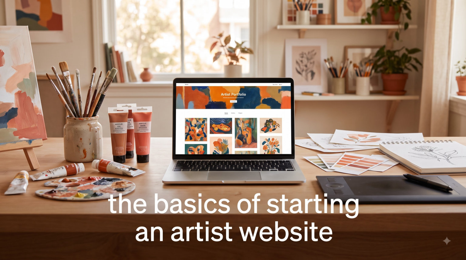
If you have been putting off building your own website because it feels overwhelming, you are not alone. Most artists I talk to assume they need coding skills, a big budget, or weeks of free time to get a professional site up and running. The truth is far simpler. The basics of starting an artist website come down to a handful of clear decisions: pick a platform, claim a domain name, upload your best work, and hit publish.
This guide walks you through every one of those steps in detail. I have helped artists at every level, from students building their first portfolio to established painters adding an online store to their practice, and the process is more approachable than most people expect. By the time you finish reading, you will know exactly what you need to do to get your artist website live and looking professional.
There are no coding requirements. No design degree needed. Just a clear plan and the willingness to spend an afternoon setting things up. Whether you are a painter, sculptor, photographer, illustrator, or mixed-media artist, the fundamentals covered here apply to every discipline.
We will walk through why a website matters, which platform to choose, how to pick a domain name, what pages your site needs, how to present your portfolio, design principles that work, basic SEO, selling options, and the common mistakes that trip people up. Let’s get into it.
Table of Contents
Why Every Artist Needs Their Own Website in 2026
Social media is great for sharing work, but it was never designed to serve as a real portfolio. Instagram posts disappear into a feed within hours. Algorithm changes can slash your visibility overnight. And you have almost no control over how your art is presented when it shows up in someone’s scroll.
A dedicated artist website fixes every one of those problems. Here is what you gain when you own your online space:
Complete control over presentation. Your work appears exactly how you want it, organized by series or medium instead of by posting date. No algorithm deciding what gets seen and what gets buried.
Professional credibility. Galleries, curators, and collectors expect to see a proper website. A yourname.com address signals that you take your practice seriously and makes you easier to find in professional contexts.
A stable home base. Unlike social platforms that change rules, revise their algorithms, or lose popularity, your website stays put. It is the one place that is entirely yours.
Direct contact with buyers. No middleman, no platform fees eating into your sales, and no limit on how you communicate with people who love your work.
Central hub for everything. Link your Instagram, your Etsy shop, your exhibition history, and your press coverage all in one place. Your website connects all the dots.
I hear from artists all the time who say they get most of their commissions through Instagram DMs. That works until it does not. Accounts get hacked. Platforms shift priorities. Features change without warning. Having your own website means you always have a backup plan that no one can take away from you.
There is also a practical dimension that many artists overlook. When you apply to galleries, residencies, or grants, the application almost always asks for a website URL. A link to your Instagram profile does not carry the same weight as a well-organized portfolio site where a curator can browse your work at their own pace, read your artist statement, and get a sense of your practice as a whole.
The right time to build your artist website is not after you land a gallery show or hit 10,000 followers. It is now. Even a simple one-page site with your contact info and a few strong images puts you ahead of artists who rely entirely on social media. You can always expand and improve it later. The important thing is to start.
What Exactly Is an Artist Website?
An artist website is a dedicated online space designed to showcase your artwork in a structured, professional way. It gives you full control over how your work is displayed, organized, and experienced by visitors, without the distractions of likes, comments, or algorithm-driven feeds.
Think of it as your digital gallery. Unlike social media, where posts appear in reverse chronological order and compete for attention alongside memes and ads, your website lets you curate the experience from start to finish. You decide which pieces get featured, how they are grouped, and what story your portfolio tells about your practice.
Artist websites generally fall into three categories:
Portfolio website: Focused on showcasing your work for galleries, grants, residencies, and commissions. This is the most common type and the best starting point for most artists.
Selling website: An online store where visitors can buy originals, prints, or digital downloads directly from you. Think of it as your personal gallery shop.
Hybrid website: Combines a portfolio with a shop, a blog, and other features. Most working artists end up here eventually because it serves multiple purposes in one place.
You do not need to pick one type and stick with it forever. Start with a portfolio, add a shop when you are ready, and layer in a blog whenever it makes sense for your practice. The beauty of owning your website is that it grows with you. Nothing is set in stone.
What sets an artist website apart from a generic business site is the emphasis on visual storytelling. Your site is not just an information source. It is an extension of your creative identity. Every design choice, from the fonts to the color palette to the way images transition, should reflect who you are as an artist while keeping the focus firmly on your work.
How to Choose the Right Website Builder for Your Art
This is the decision that stops most artists before they start. There are a lot of website builders out there, and the options can feel paralyzing when you are comparing feature lists and reading conflicting reviews. I have used most of the major platforms, and each one has genuine strengths. The right choice depends on what matters most to you.
Here is how the main options stack up for artists:
WordPress (Self-Hosted)
WordPress powers roughly 40% of all websites on the internet, and for good reason. It gives you more flexibility than any other platform. You can customize literally everything, from the layout of your gallery pages to the way your shopping cart works to the fonts used on your contact form.
The trade-off is that WordPress has a steeper learning curve than drag-and-drop builders. You will need to choose a hosting provider, install WordPress, pick a theme, and possibly use a page builder plugin like Elementor to design your pages without touching code. It takes more setup time upfront, but the result is a site that can grow with you indefinitely without hitting the ceiling of what a platform allows.
For artists specifically, WordPress offers some of the best portfolio plugins available. You can create filterable galleries, lightbox displays, before-and-after sliders, and password-protected client proofing areas. If you plan to sell art online, WooCommerce (WordPress’s free eCommerce plugin) is one of the most capable shopping platforms available.
Best for: Artists who want maximum control and plan to grow their site over time into a full professional hub.
Squarespace
Squarespace is the platform I recommend most often to artists who want a beautiful site without a steep learning curve. Their templates are designed with visual content in mind, and the portfolio layouts are genuinely stunning right out of the box. You can have a professional-looking artist website live within a few hours of signing up.
You get hosting included, an SSL certificate, and a drag-and-drop editor that is easy to learn in an afternoon. The design options are more limited than WordPress, but those constraints can actually be helpful if you tend to overthink layout decisions. Squarespace’s templates are already optimized for visual portfolios, so you are starting from a strong foundation.
Squarespace also includes built-in eCommerce, email campaign tools, and scheduling features. For an artist who wants everything in one place without managing plugins or integrations, it is hard to beat.
Best for: Artists who want a polished, professional site quickly and do not need heavy customization or complex features.
Wix
Wix is similar to Squarespace in that it is an all-in-one platform with hosting included. Where it differs is in the editor. Wix gives you pixel-level control over where every element goes on the page, which some artists love because it feels like designing a layout and others find overwhelming because there are almost too many options.
Wix also has an AI website builder that can generate a basic site for you based on a few questions about your practice. It is a decent starting point if you want to get something live fast and then refine it over time. The free plan is one of the most generous available, though it does come with Wix branding and a subdomain.
Wix offers a dedicated “Wix Art Store” feature for selling prints and originals, and it integrates with print-on-demand services. The app market includes portfolio-specific tools like client proofing galleries and image protection features.
Best for: Beginners who want a free plan option, artists who prefer drag-and-drop freedom, or anyone who wants AI help getting started.
Format and Adobe Portfolio
These platforms are built specifically for creatives, and it shows. Format is a dedicated portfolio builder with features like client proofing galleries, contract templates, and invoicing tools that go beyond what general-purpose website builders offer. Adobe Portfolio is free with a Creative Cloud subscription, which makes it an attractive option if you already pay for Photoshop, Illustrator, or other Adobe tools.
Both are simpler than WordPress or Squarespace, which means they are faster to set up but also more limited in what you can do. If you want to add a blog, a full online store, or advanced features down the road, you might find yourself outgrowing these platforms and needing to migrate.
Best for: Artists who want a portfolio-focused site and already pay for Adobe Creative Cloud, or who need specific features like client proofing and invoicing.
Free vs. Paid: What You Need to Know
Almost every platform offers a free tier, but free plans come with real limitations that affect how professional your site looks. You will usually get a branded subdomain (like yourname.wixsite.com instead of yourname.com), platform ads displayed on your site, and restricted storage that limits how many images you can upload. For a hobby portfolio that only friends and family see, that might be fine. For a professional artist website that galleries and collectors will visit, the paid plan is worth every penny.
Most paid plans from the major builders run between $10 and $30 per month, and that typically includes hosting, a free domain name for the first year, an SSL certificate, and removal of platform branding. That is a reasonable cost for what amounts to your most important marketing tool. Think of it as the digital equivalent of renting studio space, but a fraction of the cost.
Picking Your Domain Name and Setting Up Hosting
Your domain name is your address on the internet. It is what people type into their browser to find you, and it appears on your business cards, your email signature, your exhibition postcards, and your social media profiles. Getting it right matters more than most artists realize.
Choosing a Domain Name
For most artists, the best domain name is simply your own name: janedoe.com or johnsmithart.com. Here is why this works so well:
It is easy to remember and easy to share verbally.
It stays relevant even if your artistic style, medium, or focus changes over the years.
It works across all social media platforms as a consistent identifier.
Galleries and collectors will naturally search for you by name.
It looks clean and professional on printed materials.
If your exact name is already taken, try adding “art,” “studio,” “fineart,” or “artist” to the end. Avoid hyphens, numbers, or unusual spellings. Keep it short, clean, and easy to say out loud. If you have to spell it letter by letter for someone at a gallery opening, it is too complicated.
Another option is to use your studio name or a creative alias if that is how you are known in the art world. The key is consistency. Whatever domain you choose should match the name you use on your social profiles, your email address, and your exhibition materials.
You can register a domain through your website builder (most include a free domain for the first year) or through a dedicated registrar like Namecheap, Google Domains, or Cloudflare. Either approach works fine for a first website. The advantage of registering through your builder is that everything is managed in one place, which simplifies the technical setup.
What About Web Hosting?
Web hosting is the service that stores your website files on a server and makes them available to visitors around the clock. If you use an all-in-one platform like Squarespace, Wix, or Format, hosting is included automatically and you never need to think about it. It is handled behind the scenes.
If you go with self-hosted WordPress, you will need to pick a hosting provider separately. Some reliable options for artist websites include SiteGround, Bluehost, and Hostinger. Most offer a basic plan that works perfectly for a portfolio site, and many include one-click WordPress installation that takes the technical guesswork out of the process.
When choosing a hosting provider, look for SSD storage (faster page loads), a free SSL certificate, automatic backups, and at least 99.9% uptime. These are table stakes for any reputable host. If a provider does not offer all four, look elsewhere.
SSL Certificates Explained
An SSL certificate is what puts the padlock icon next to your URL in the browser bar. It encrypts data between your website and your visitors, which is essential if you are collecting contact form submissions, running a newsletter signup, or selling anything through your site.
The good news is that nearly every modern platform and hosting provider includes SSL certificates for free. If yours does not, that is a red flag. Switch to one that does. Browsers now warn visitors when a site does not have SSL, and that warning is enough to make potential collectors click away.
Essential Pages Every Artist Website Needs
A strong artist website does not need dozens of pages. In fact, most successful artist sites have just four or five core pages that cover everything a visitor might be looking for. Here is what each one should include and why it matters.
Homepage: Your First Impression
Your homepage is the most visited page on your site, and it needs to accomplish three things fast. Show a striking image of your work immediately. Make it obvious who you are and what kind of art you create. Give visitors a clear path to explore more.
A large hero image at the top of the page works well for artists. Below that, include a brief introduction of two or three sentences about your art, a small selection of featured pieces (four to six works), and clear navigation links to your portfolio, about page, and contact.
Think of your homepage as the front window of a gallery. You would not leave the window empty or cluttered with random pieces. You would choose a few strong works that represent your practice and entice people to come inside and see more.
About Page: Your Story
This is where visitors go to learn about the person behind the work. Write in your own voice, not in the third person unless that genuinely feels more natural to you. Share where you are from, what inspires your art, what materials or techniques you use, and anything else that helps people connect with you as a person rather than just a name on a screen.
Include a professional-looking photo of yourself or your studio. People buy art from people, and a good about page builds the kind of trust that turns casual browsers into collectors. If you have exhibition history, press coverage, or education credentials worth highlighting, list those here or create a separate CV page that links from your about section.
A common mistake artists make on their about page is writing something so vague and abstract that it tells the reader nothing concrete. Avoid statements like “I explore the human condition through color.” Instead, be specific: “I paint large-scale oil portraits of strangers I photograph on the subway in New York City.” The second version tells a visitor exactly what you do and makes them want to see the work.
Portfolio or Gallery Page: Your Work
This is the heart of your artist website and the page that matters most. Organize your work in a way that makes sense for your practice. If you work in distinct series, create a separate page or section for each one. If you work across multiple media, organize by medium. The goal is to help visitors understand your body of work as a whole, not just see individual pieces in isolation.
Every artwork should include the title, medium, dimensions, and year. If a piece is available for purchase, note that clearly. If it has been sold or is in a private collection, say so. This context matters to collectors and curators who use your portfolio to evaluate your practice.
Consider adding a brief artist statement or series description at the top of each gallery section. This gives visitors a frame of reference before they start browsing and helps them understand the thinking behind the work.
Contact Page: Make It Easy to Reach You
This seems obvious, but I have visited artist websites where the only way to get in touch is by hunting for an email address buried in a footer or hidden on a subpage. Do not make people work to contact you.
Include a simple contact form (most website builders have one built in or offer a plugin), your email address displayed as text, and links to your active social media profiles. If you accept commissions, say so clearly on this page with a brief description of how your commission process works, typical timelines, and what information you need from the client.
Optional Pages to Consider Adding
Blog: Share process photos, exhibition announcements, studio updates, and behind-the-scenes content. A blog is excellent for SEO and for building an ongoing connection with your audience.
Shop: Sell originals, prints, or digital downloads directly from your site. Adds a revenue stream without relying on third-party platforms.
CV or Resume: A clean, well-formatted list of your exhibitions, education, awards, and publications. Essential if you are applying to galleries, residencies, or grants.
Press: Collect articles, reviews, and features about your work in one easily scannable page. Builds credibility and saves curators time when researching you.
Services: If you offer commissions, murals, workshops, or teaching, a dedicated services page makes it easy for potential clients to understand what you offer.
Navigation Best Practices
Keep your main navigation simple and consistent. Five or six items at most. Use clear, descriptive labels: “Portfolio” instead of “Gallery 1,” “About” instead of “The Artist.” Every page on your site should be reachable from the main navigation in one click. If visitors have to hunt for your portfolio, they will leave before they find it.
Place your navigation in the same location on every page. This sounds obvious, but I have seen artist websites where the navigation menu changes position or labeling depending on which page you are on. Consistency reduces cognitive load and lets visitors focus on your work instead of figuring out how to get around your site.
Building a Portfolio That Actually Gets Noticed
Your portfolio page is where browsers become collectors and casual visitors become genuine fans. But a portfolio that gets noticed is not just about having great art. It is about presenting that art in a way that does it justice and makes a lasting impression on the people who matter most to your career.
Photographing and Scanning Your Artwork
This is the step where most artists cut corners, and it shows immediately. A beautiful painting photographed under harsh overhead lighting with a phone camera looks mediocre on screen, no matter how good the original is. You do not need professional equipment, but you do need decent lighting, a steady hand, and attention to detail.
If you work in 2D, scan your pieces at 300 DPI whenever possible. Scanners capture accurate color and flat detail better than most cameras at the consumer level. For larger works that do not fit on a scanner bed, photograph them in even, natural lighting. Overcast days are ideal for outdoor shots because the cloud cover acts as a natural diffuser. Position your camera parallel to the artwork to avoid perspective distortion. Avoid flash, which creates hot spots and washes out color.
For 3D work or installations, take multiple angles and include at least one detail shot that shows texture, surface quality, or material. The viewer should feel like they can walk around the piece and examine it closely. Consider including an environmental shot that shows the work in context, especially for sculptures and installations that relate to their surrounding space.
Color accuracy matters more than most artists realize. If you cannot photograph your work in perfectly neutral lighting, at least take a test shot with a color checker card or a white sheet of paper next to the artwork. This gives you a reference point for color correction in editing software later.
Image Resolution and File Size Guidelines
You need to balance image quality with page load speed. High-resolution images that take ten seconds to load will drive visitors away before they even see your work. Here are the guidelines I follow:
Resolution: Upload images at least 1500 pixels on the longest side. This allows for zoom and lightbox features without visible pixelation on most screens.
File format: JPEG for photographs, paintings, and any image with smooth color gradients. PNG for graphics with sharp edges, text, or transparency.
File size: Compress each image to under 200KB if possible. Tools like TinyPNG, Squoosh, or the image optimization built into most website builders handle this automatically without noticeable quality loss.
Watermarking: A subtle watermark in a corner can help prevent unauthorized use without ruining the viewing experience. Avoid large, center-placed watermarks that obscure the art.
Many website builders now offer automatic image optimization and lazy loading (where images load as the visitor scrolls rather than all at once). If your platform offers these features, turn them on. They make a significant difference in page speed without any effort on your part.
Organizing Your Work Effectively
There is no single right way to organize a portfolio, but there are definitely wrong ways. Throwing 200 pieces onto one page with no structure is the most common mistake I see. Instead, try one of these approaches:
By series: Group works that belong to the same body of work or explore the same theme. This shows thematic depth and intentionality, which is exactly what curators look for.
By medium: Separate paintings from drawings from sculptures from photographs. Useful if you work across multiple disciplines and want each one to shine on its own.
By period: Show your evolution over time. Best for established artists with a long exhibition history and a body of work that shows clear progression.
Curated highlights: Show only your 15 to 25 strongest pieces regardless of series or medium. Quality always beats quantity, and a tight selection makes a more powerful impression.
Whichever approach you choose, keep the total number of works manageable. A portfolio with 15 exceptional pieces will always make a stronger impression than one with 80 pieces of varying quality. Remember that gallery directors and curators often review dozens of artist websites in a single sitting. Make it easy for them to see your best work quickly.
Adding Context to Each Piece
Every artwork in your portfolio should have at minimum: the title, the medium, the dimensions, and the year it was created. This information is not optional for collectors, curators, or anyone evaluating your work seriously. Without dimensions, a collector cannot tell if a painting is 8 inches or 8 feet tall. Without medium, they cannot assess the physical qualities of the piece.
Consider adding a short statement about the series or body of work at the top of each gallery section. This gives visitors a frame of reference and helps them understand your creative intentions before they start browsing. It does not need to be long. Two or three sentences about what inspired the series or what you were exploring conceptually is enough.
Design Best Practices for Artist Websites
The design of your artist website should serve one purpose: making your art look as good as possible. That means the design itself should step back and let the work take center stage. The best artist websites are almost invisible in their design because the art does all the talking.
Keep It Clean and Minimal
White space is your friend. A simple, clean layout with generous margins and breathing room between images makes every piece feel more intentional and more valuable. Resist the urge to fill every pixel of the screen. Let the work breathe.
Use a neutral background color for your portfolio pages. White, off-white, or a very light gray works well. Dark backgrounds can create a dramatic effect for certain types of work, but they make accurate color assessment harder for collectors viewing your work on screen. Test both options with your actual artwork before committing.
Typography That Stays Out of the Way
Pick one or two fonts and stick with them throughout your entire site. A clean sans-serif font for headings paired with a readable serif or sans-serif for body text works well for most artist websites. Avoid decorative fonts, script typefaces, Comic Sans, and anything that draws attention to the letterforms rather than the content they display.
Keep font sizes readable. Body text should be at least 16px. Headings should create a clear visual hierarchy without being overwhelming or competing with your images for attention. Your typography should feel like a quiet, well-designed frame around your artwork.
Mobile Optimization Is Not Optional
Over half of all website traffic now comes from mobile devices, and that percentage is even higher for content shared on social media (which is where most artists drive traffic from). If your artist website looks great on a laptop but falls apart on a phone, you are losing more than half your potential audience.
Most modern website builders handle mobile responsiveness automatically, but you should still test thoroughly. Pull up your site on your phone after you launch. Make sure images resize properly, text remains readable without pinching and zooming, and navigation works with touch gestures. Check that your contact form is easy to fill out on a small screen.
Page Speed Matters More Than You Think
A slow-loading website kills visitor engagement. Research consistently shows that 53% of mobile visitors abandon sites that take more than three seconds to load. Since artist websites are image-heavy by nature, this is a real concern that requires attention.
To keep your site fast: compress every image before uploading using a tool like TinyPNG or ImageOptim, limit the number of images on any single page to around 20, use lazy loading if your platform supports it (images load as the visitor scrolls), and avoid excessive animations, autoplay videos, or large background videos that drag down performance.
Design Mistakes That Drive Visitors Away
Auto-playing music or videos: Nothing makes visitors reach for the back button faster than unexpected audio.
Flashy animations: Subtle fade-ins are fine. Anything more distracting takes attention away from your art.
Too many font styles or colors: A cohesive, restrained palette looks professional. A rainbow of competing fonts looks amateur.
Intrusive pop-ups: A well-timed newsletter signup is acceptable. A pop-up that appears before the visitor has even seen your work is not.
Inconsistent navigation: Your menu should be in the same place with the same labels on every single page.
Basic SEO for Artists: Helping People Find Your Website
Search engine optimization sounds technical, but for an artist website the basics are surprisingly straightforward. You do not need to become an SEO expert or understand complex algorithms. You just need to cover a few fundamentals that help Google understand what your site is about and who should see it.
Write Clear Page Titles and Meta Descriptions
Every page on your site has a title tag and a meta description. The title tag is what appears as the clickable blue link in search results. The meta description is the short text snippet underneath it. Both matter because they tell Google what the page is about and they convince real people to click when they see your listing.
For your homepage, your title might be “Jane Doe | Contemporary Oil Painter in Chicago.” For your portfolio page, it could be “Abstract Landscape Paintings | Jane Doe Artist Portfolio.” Both tell Google and potential visitors exactly what to expect. Keep titles under 60 characters so they do not get cut off in search results.
Use Alt Text on Every Single Image
Alt text is a short text description of an image that screen readers use for accessibility and that search engines use to understand what the image shows. For an artist website, this is critically important because the majority of your content is visual rather than text-based.
Write descriptive alt text for every artwork on your site. “Blue and gold abstract oil painting on canvas, 36 by 48 inches, 2025” is far more useful than “IMG_3847.jpg” or “painting” or leaving the field blank. This helps Google index your images and potentially show them in image search results, which is how many people discover artists online.
Include Your Name and Art-Related Keywords
Use your full name consistently across your site. Include it in your page titles, your headings, your image alt text, and your about page. If someone searches for your name, you want your website to be the first result, not your Instagram profile or someone else’s site that happens to mention you.
Also include descriptive terms related to your art naturally throughout your site. If you paint botanical watercolors, those words should appear in your about page, your portfolio descriptions, and your image alt text. Think about what a collector might type into Google to find work like yours: “contemporary portrait painter,” “abstract landscape artist Seattle,” or “ceramic sculpture artist.” Those terms should show up on your site in a natural, readable way.
Connect Google Analytics and Search Console
Google Analytics is free, and it tells you how many people visit your site, where they come from, and which pages they spend the most time on. Google Search Console is also free, and it shows you what search terms people use to find your site. Most website builders make it easy to add both tracking codes. Setting them up when you launch means you have data from day one, which is invaluable as your site grows and you want to understand what is working.
Selling Art and Growing Your Audience Online
Not every artist needs to sell work directly from their website, but if selling is part of your plan, the good news is that adding eCommerce to your site is far easier than it used to be. You can go from portfolio to online store in an afternoon.
Should You Sell Art on Your Website?
Selling directly from your website works well if you produce prints, smaller originals, or digital downloads at accessible price points. It gives you full control over pricing, presentation, and customer relationships. You keep more of the revenue because you are not paying marketplace fees or commissions to a gallery.
If you sell high-value originals, you might prefer to use your website as a portfolio that drives inquiry-based sales instead. List your work with “Contact for pricing” instead of a buy button. This approach gives you room to negotiate and discuss terms directly with collectors, and it avoids the awkwardness of displaying a price that might scare off a buyer who would happily pay it in a gallery context.
Simple eCommerce Options
Most website builders include built-in eCommerce features or integrate easily with shopping tools. Squarespace and Wix both have native store features that are straightforward to set up. WordPress users can add WooCommerce for free, which is one of the most capable shopping platforms available. Shopify is another option if selling products is the primary focus of your site.
For prints specifically, consider print-on-demand services like Printful, Society6, or Fine Art America. These services handle printing, packaging, and shipping automatically. You upload your high-resolution artwork, set your prices, and they produce and ship orders as they come in. No inventory, no upfront costs, no trips to the post office.
Building an Email List
An email list is one of the most valuable marketing tools an artist can have. Unlike social media followers, your email list belongs to you. No algorithm can reduce your reach. When you send an email, it lands directly in someone’s inbox. That level of direct access is powerful.
Add a simple signup form to your website with a clear incentive. “Get early access to new work and studio updates” is far more compelling than a generic “Join my newsletter.” Most website builders include email integration, or you can use a free tool like Mailchimp or ConvertKit to manage your list. Start collecting emails from day one, even if you only have a handful of subscribers.
Connecting Social Media the Right Way
Link to your social media profiles from your website, and consider embedding your Instagram feed on your homepage if it showcases your process well. But remember that your website is the anchor of your online presence. Social media should drive traffic to your site, not the other way around. Your website is where people go to see your full portfolio, read about your practice, and contact you about purchases or commissions.
Consider adding a blog to your website. Even posting once a month about your creative process, upcoming shows, or new work gives Google fresh content to index and gives visitors a reason to come back. Artists who blog consistently report better search visibility, more engagement, and more inbound inquiries from collectors who feel connected to their story.
Common Mistakes to Avoid When Starting Your Artist Website
I have reviewed hundreds of artist websites over the years, and the same problems show up again and again. Most of them are easy to fix once you know what to look for. Learning from other people’s mistakes is much faster than making them yourself.
Relying Only on Social Media
Instagram is not a website. Neither is DeviantArt, Behance, ArtStation, or any other third-party platform. These are rented spaces where you follow someone else’s rules, someone else’s character limits, and someone else’s algorithm. Your website is the only online space you truly own and control. If your entire online presence lives on social media, you are building on land you do not own and could lose access to at any time.
Overcomplicating the Design
Artists sometimes feel pressure to make their website as creative and visually striking as their artwork. Resist this impulse strongly. Your website’s job is to present your art clearly and professionally, not to compete with it. Unusual layouts, animated transitions, experimental navigation, and overly clever design almost always make your site harder to use. Simplicity wins every time.
Neglecting Mobile Visitors
I have seen beautiful artist websites that are nearly unusable on a phone. Tiny text that requires zooming, images that overflow their containers, and navigation menus that require a mouse pointer to hover over. Since more than half your visitors will likely be on mobile devices, testing your site on a phone is not optional. It is one of the most important things you can do before calling your site finished.
Using Low-Quality Images
Blurry, poorly lit, or tiny images of your artwork send the message that you do not value your own work enough to present it well. In the physical art world, presentation is everything. The same principle applies online. If you are going to spend time and effort on any single aspect of your website, make it the quality of your portfolio images. This is the one area where cutting corners is most visible and most damaging.
Making It Hard to Contact You
Hide your email address in a footer, fail to include a contact form, or require visitors to fill out five mandatory fields just to say hello, and they simply will not bother. Put a clear “Contact” link in your main navigation and keep the process as frictionless as possible. A name, an email address, and a message field are all you need.
Letting Your Site Go Stale
An artist website with a copyright date from three years ago and no recent work in the portfolio looks abandoned. Visitors will wonder if you are still active, still making art, or still worth contacting. Add new work regularly, update your exhibition history after every show, and keep your copyright notice current. Even updating once a quarter is enough to signal that your practice is alive and active. Set a calendar reminder if you need to. Just do not let your site gather digital dust.
FAQs
Do artists really need their own website?
Yes. A personal website gives you full ownership and control over how your art is presented, unlike social media platforms where algorithms decide who sees your work. Galleries, collectors, and curators expect to see a dedicated website when evaluating an artist. It serves as a stable, algorithm-free portfolio that is always accessible and organized on your terms.
How do I create my own website as an artist?
Start by choosing a website builder like Squarespace, Wix, or WordPress. Register a domain name using your own name whenever possible. Pick a template designed for visual portfolios. Add four essential pages: a homepage with a strong hero image, an about page with your story, a portfolio page with your best work, and a contact page. Upload high-quality images of your art with titles, dimensions, and medium listed for each piece. Most artists can have a basic site live within a single afternoon using drag-and-drop tools, no coding required.
What kind of website should an artist have?
Most artists need a portfolio website with four core pages: a homepage that makes a strong first impression with a hero image, an about page that tells your story and shows your face, a portfolio or gallery page that showcases your best work organized by series or medium, and a contact page with a simple form. From there, you can optionally add a shop for selling prints or originals, a blog for process updates and SEO, and a CV page for exhibition history and credentials.
What platform is best for artist websites?
Squarespace is the best overall choice for most artists because its templates are specifically designed with visual portfolios in mind and the editor is easy to learn in an afternoon. WordPress offers the most flexibility and customization but has a steeper learning curve and requires separate hosting. Wix is a solid beginner-friendly option with a generous free plan. Format and Adobe Portfolio are purpose-built for creative portfolios but offer fewer features for future growth.
How much does an artist website cost?
A professional artist website typically costs between $10 and $30 per month with all-in-one platforms like Squarespace or Wix, which includes hosting, an SSL certificate, and often a free domain name for the first year. Self-hosted WordPress can be slightly cheaper if you choose budget hosting at $5 to $15 per month but requires more technical setup. Domain names cost about $10 to $15 per year if purchased separately from your website builder. Free plans are available on most platforms but come with limitations like branded subdomains, platform ads, and restricted storage.
Getting Started With Your Artist Website
The basics of starting an artist website come down to five steps: choose a platform that fits your comfort level, claim a domain name with your name in it, build your four essential pages, upload your strongest work with proper images and descriptions, and hit publish. Everything else, from SEO optimization to eCommerce to blogging, can come later.
Do not wait until you have the perfect body of work or the ideal design. A simple, clean website with ten strong pieces and clear contact information is infinitely more useful than an imaginary perfect site that never gets built. The artists who succeed online are not the ones with the most polished websites. They are the ones who actually built something and then improved it over time.
Start now. Improve as you go. Your art deserves a home that you control.