
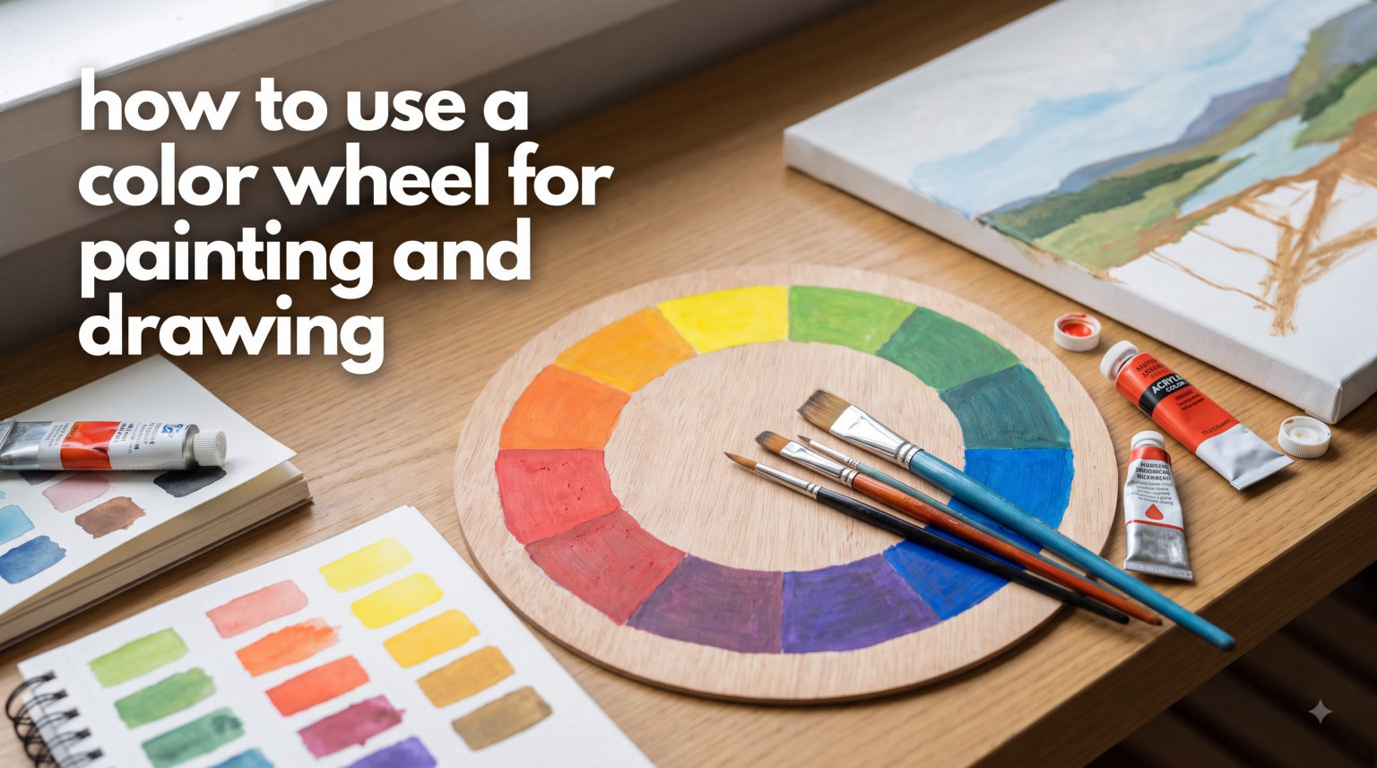
Learning how to use a color wheel for painting and drawing transformed my artwork from flat and lifeless to vibrant and harmonious. When I first started painting, I would randomly mix colors hoping for the best. Sometimes I got lucky. Most times I ended up with muddy browns that killed the energy of my piece.
The color wheel is not just a classroom tool. It is a practical map that shows you exactly which colors work together and how to mix them effectively. In this guide, I will walk you through everything you need to know to start using a color wheel like a professional artist.
Whether you work with watercolors, acrylics, oils, or colored pencils, these principles apply across all mediums. Let us dive into the fundamentals of color theory and put them into practice.
Table of Contents
What Is a Color Wheel and Why Artists Need One
A color wheel is a circular diagram that organizes colors by their chromatic relationship. Sir Isaac Newton created the first color wheel in 1666 by bending sunlight through a prism and arranging the resulting spectrum in a circle. This simple invention revolutionized how artists think about color.
The wheel organizes hues in a logical sequence. Red, yellow, and blue sit equally spaced around the circle. The colors between them show what happens when you mix those primaries. This visual organization helps you predict color relationships before you ever touch paint to canvas.
Why does this matter for your artwork? Because color choices make or break a piece. The right color harmony draws viewers in and creates emotional impact. The wrong choices create visual confusion or flatness. A color wheel gives you a reliable system for making those choices.
I keep a small printed color wheel pinned above my easel. When I am stuck on a palette decision, I glance up and let the wheel guide me. It takes seconds and saves me from hours of regret over poor color choices.
How to Use a Color Wheel: Understanding Primary, Secondary, and Tertiary Colors
Before you can use a color wheel effectively, you need to understand its three main categories of colors. These are the building blocks of every color mixture you will make.
Primary Colors: The Foundation
Primary colors are red, yellow, and blue. These three hues cannot be created by mixing other colors. They sit at equal distances around the color wheel, forming a triangle.
Every other color stems from some combination of these three. When you understand primaries, you understand the DNA of color itself. Here is what you need to know about each:
- Red: Warm, attention-grabbing, associated with energy and passion
- Yellow: The lightest primary, brings brightness and warmth
- Blue: Cool, receding, creates depth and calm
Not all primaries are created equal. A warm red leans toward orange. A cool red leans toward violet. These temperature variations affect your mixtures significantly. More on that later.
Secondary Colors: Mixing the Primaries
Secondary colors sit between the primaries on the wheel. They are orange, green, and violet. You create them by mixing two primaries in equal parts.
- Orange: Red + Yellow
- Green: Yellow + Blue
- Violet: Blue + Red
Secondary colors are the bridge between primaries. They add variety to your palette while maintaining harmony with their parent colors. In painting, secondaries often serve as focal points because they are naturally less common than primaries in nature.
Tertiary Colors: The In-Between Hues
Tertiary colors fill the gaps between primaries and secondaries. There are six of them: red-orange, yellow-orange, yellow-green, blue-green, blue-violet, and red-violet.
You create tertiary colors by mixing a primary with a neighboring secondary. For example, mix red with orange to get red-orange. These intermediate hues give you subtle gradations and prevent your paintings from looking cartoonish.
A standard 12-color wheel includes all three primaries, three secondaries, and six tertiaries. This is the version I recommend for most artists starting out.
Color Mixing Basics Using the Wheel
Now that you know the color categories, let us talk about how to actually mix colors using the wheel as your guide.
How to Read the Wheel for Mixing
The closer two colors are on the wheel, the more harmonious they are. Colors opposite each other create the most contrast. This spatial relationship tells you exactly what will happen when you mix paints.
When you mix two colors that sit close together, you get a clean, vibrant intermediate. Mix colors that are farther apart, and you start moving toward neutral browns and grays. Mix opposites directly, and you get a muddy neutral.
This is why understanding color temperature matters so much. A warm red mixed with a warm yellow gives you a clean, fiery orange. A cool red mixed with a cool blue gives you a clear, rich violet. But mix warm and cool versions, and you introduce gray into the mixture.
Practical Mixing Tips
Here are the techniques I use every time I mix colors:
Start with small amounts. It is easier to add more pigment than to fix an over-saturated mixture. Begin with a dab and build up gradually.
Mix thoroughly. Incomplete mixing leaves streaks of unblended color. Take the time to create a uniform hue.
Test on scrap paper. Colors look different wet versus dry. Test your mixture and let it dry before committing to your main piece.
Keep a mixing journal. I note down successful combinations with the exact pigments used. This becomes my personal reference library.
Warm vs Cool Primaries
This is where many beginners get tripped up. Every primary color has warm and cool versions:
Warm Red: Cadmium Red Light, Scarlet (leans toward orange)
Cool Red: Alizarin Crimson, Quinacridone Rose (leans toward violet)
Warm Yellow: Cadmium Yellow, Yellow Ochre (leans toward orange)
Cool Yellow: Lemon Yellow, Hansa Yellow Light (leans toward green)
Warm Blue: Ultramarine Blue, Cobalt Blue (leans toward violet)
Cool Blue: Phthalo Blue, Cerulean Blue (leans toward green)
Matching temperatures gives you cleaner mixtures. Warm red plus warm yellow equals pure orange. Cool blue plus cool yellow gives you a bright spring green. Mismatch temperatures, and you introduce the complementary color, which dulls the result.
Tints, Tones, and Shades: Expanding Your Palette
A color wheel shows you pure hues, but real painting requires variations in lightness and intensity. Understanding tints, tones, and shades triples your effective palette without buying more tubes of paint.
Tints: Adding White
A tint is any color mixed with white. It becomes lighter and cooler in appearance. Tints are essential for highlights, pastels, and creating atmospheric effects.
When you add white to red, you get pink. White plus blue gives you sky blue. White plus yellow creates a pale, creamy version perfect for sunlit areas.
Be careful with tints in watercolor. White comes from the paper, not from adding pigment. Adding white watercolor paint creates opacity, which changes the character of the medium.
Shades: Adding Black
A shade is any color mixed with black. It becomes darker and often cooler. Shades create depth, shadows, and dramatic contrast.
Mixing black with red creates maroon. Black plus blue gives navy. Black with yellow produces olive green rather than a true dark yellow.
Many artists avoid straight black paint because it can look flat. Instead, they mix dark neutrals from complementary colors. Blue and burnt orange create a rich, lively dark that has more depth than pure black.
Tones: Adding Gray
A tone is any color mixed with gray, which desaturates it without necessarily making it darker. Tones are muted, sophisticated colors that recede visually.
Tones are perfect for background elements that should not compete with your focal point. They also create the subtle color variations you see in skin tones, weathered wood, and stone.
To create a tone, mix your color with a neutral gray. Or mix it with its complementary color, which both neutralizes and darkens simultaneously.
Color Harmonies and How to Create Them
This is where the color wheel becomes truly powerful. Certain color combinations create natural harmony, while others clash. The wheel shows you exactly which combinations work.
Complementary Colors
Complementary colors sit opposite each other on the wheel. Red and green. Blue and orange. Yellow and violet. These pairs create maximum contrast and visual excitement.
When you place complementary colors side by side, they make each other appear more vibrant. This optical effect is called simultaneous contrast. It is a powerful tool for creating focal points.
When you mix complementary colors, they neutralize each other. Red plus green makes brown. Blue plus orange makes gray. This is how you create natural-looking earth tones.
I use complementary schemes when I want high energy and drama. A painting of a red barn against green grass automatically feels alive because of this relationship.
Analogous Colors
Analogous colors sit next to each other on the wheel. Yellow, yellow-orange, and orange form an analogous scheme. So do blue, blue-green, and green.
These combinations are inherently harmonious because they share a common color. They create unity and flow in your composition. The viewer’s eye moves smoothly across analogous colors without jarring stops.
I use analogous schemes for peaceful, cohesive scenes. A sunset painted in yellow, orange, and red-orange feels unified and serene. A forest scene in various greens feels natural and calming.
The risk with analogous schemes is monotony. To avoid this, vary the values and intensities. Include light tints and dark shades to create contrast within the harmony.
Triadic Colors
Triadic color schemes use three colors equally spaced around the wheel. The primary triad is red, yellow, and blue. The secondary triad is orange, green, and violet.
Triadic schemes are balanced and vibrant. They give you variety while maintaining harmony because the colors are evenly distributed. Children’s illustrations often use triadic schemes because they feel playful and complete.
When using a triadic scheme, choose one color as dominant and use the other two as accents. Equal amounts of all three can feel overwhelming. Let one color take up 60 percent of the piece, another 30 percent, and the third 10 percent.
Split Complementary Colors
Split complementary is a variation of the complementary scheme. Instead of the exact opposite color, you use the two colors adjacent to the opposite.
For example, instead of pairing blue with orange, you pair blue with yellow-orange and red-orange. This gives you the contrast of complements with less tension.
Split complementary schemes are easier to work with than straight complements. They offer more variety while still creating visual interest. I recommend this scheme for beginners who want contrast without the risk of clashing.
Tetradic Colors
Tetradic schemes use four colors arranged in a rectangle or square on the wheel. This could be red, orange, blue, and green. Or yellow, red-violet, violet, and yellow-green.
These schemes are rich and complex. They give you maximum variety and can create sophisticated color relationships. The downside is they are harder to balance.
When using tetradic schemes, pay careful attention to warm and cool balance. Also vary the saturation so one color does not dominate. I suggest this scheme for advanced artists who want a challenge.
Monochromatic Colors
Monochromatic schemes use different values and intensities of a single hue. Light blue, medium blue, and dark blue. Pale tints and deep shades of violet.
These schemes are extremely unified but risk being boring. The key is to maximize value contrast. Include very light tints and very dark shades to create visual interest.
Monochromatic schemes work well for atmospheric pieces, mood studies, or when you want color to take a back seat to form and composition.
Practical Applications for Painting and Drawing
Theory only matters if you can apply it. Here is how to put your color wheel knowledge into practice.
Step-by-Step: Using the Wheel in Your Work
Step 1: Identify your subject’s dominant colors. Look at your reference or subject and determine which hue family it belongs to.
Step 2: Choose a color harmony. Decide whether you want complementary contrast, analogous unity, or another scheme. The wheel shows you your options.
Step 3: Select your palette. Pick specific pigments that fit your chosen harmony. Remember to consider warm and cool variations.
Step 4: Mix your colors before painting. Create the full range of values and intensities you will need. This prevents frantic mixing mid-painting.
Step 5: Apply with intention. Place colors according to your scheme. Use your dominant color for large areas, accents for focal points.
Step 6: Evaluate and adjust. Step back and see if the harmony works. Adjust if needed by adding more of one color or neutralizing another.
Creating Neutral Colors
Most painting requires neutrals as much as bright colors. Browns, grays, and muted earth tones ground your piece and make brights sing.
To create neutrals, mix complementary colors. The more equal the mixture, the more neutral the result. Add more of one complementary to shift the neutral toward that color.
For example, mix orange and blue. Equal parts give you a neutral gray-brown. More orange gives you a warm brown. More blue gives you a cool gray.
I keep a premixed neutral on my palette for quick adjustments. It saves time compared to mixing complements from scratch every time.
Creating Mood with Color
Color choices create emotional impact. Warm colors feel energetic, intimate, and passionate. Cool colors feel distant, calm, and contemplative.
High contrast creates drama and excitement. Low contrast creates subtlety and mystery. Saturated colors feel lively and modern. Muted tones feel classic and sophisticated.
Think about the feeling you want before choosing colors. A peaceful landscape might use an analogous scheme of cool greens and blues. A dynamic city scene might use complementary reds and greens for energy.
Color Wheel Exercises to Try
Practice makes theory stick. Here are exercises I recommend:
Paint a 12-section color wheel. Mix every primary, secondary, and tertiary from just three primaries. This teaches you exactly what your pigments can do.
Create a 6×6 mixing chart. Label rows and columns with your pigments. Fill each square with the mixture of its row and column. This becomes your personal reference.
Paint the same scene three times. Once with a complementary scheme, once with an analogous scheme, once with a triadic scheme. Compare the emotional effects.
Limit your palette. Choose just three colors for a complete painting. This forces you to mix intelligently rather than reaching for convenience colors.
Common Mistakes Beginners Make
I have made every mistake on this list. Learn from my errors so you can progress faster.
Confusing RYB and CMY
The traditional RYB color wheel (red, yellow, blue) works well for artists but has limitations. Modern printing uses CMY (cyan, magenta, yellow), which can mix a wider range of colors.
As a painter, you will mostly use RYB. But understanding CMY helps you see why certain mixtures fail. Pure RYB cannot mix a true cyan or magenta. That is why your purples sometimes look muddy.
Some artists use a split primary palette: warm and cool versions of each primary. This gives you the range of CMY while keeping the traditional framework.
Trusting the Color Wheel Completely
Commercial color wheels show ideal mixtures. Real pigments behave differently. Some are more potent than others. Some have unexpected undertones.
A color wheel cannot predict how Phthalo Blue will overpower everything it touches, or how Cadmium Yellow takes forever to mix smoothly. You must learn your specific pigments through practice.
Many professional artists recommend the Quiller color wheel system, which accounts for actual pigment behavior. Consider it once you have mastered the basics.
Ignoring Color Temperature
This is the most common mistake I see. Beginners mix warm and cool versions randomly, then wonder why their oranges look brown and their greens look olive.
Always check whether your primaries lean warm or cool. Match them for clean mixtures. Contrast them when you want muted tones.
Over-Mixing on the Palette
Colors mixed too thoroughly lose life. A slightly streaky mixture contains subtle variations that read as vibrancy. A completely uniform mixture can look flat.
Mix enough to combine, but stop before you eliminate all variation. Let the colors dance slightly on the canvas.
Frequently Asked Questions
How do you use a color wheel step by step?
Start by identifying the primary colors (red, yellow, blue). Locate secondary colors (orange, green, violet) between the primaries. Find tertiary colors between secondaries and primaries. Choose complementary colors opposite each other for contrast. Select analogous colors next to each other for harmony. Apply these relationships to mixing paints and creating palettes.
What is the color wheel used for in art?
The color wheel organizes colors by their relationships, showing which hues work together harmoniously. Artists use it to select color schemes, mix paints predictably, create color harmonies, and understand how colors interact. It serves as a visual guide for making informed color decisions in painting, drawing, and design.
How to mix colors using a color wheel?
Locate the two colors you want to mix on the wheel. Colors close together create clean mixtures. Colors far apart create muted or neutral results. Mix warm primaries with warm primaries for vibrant secondaries. Avoid mixing warm and cool versions unless you want dull colors. Opposite colors neutralize each other into browns or grays.
What are the primary secondary and tertiary colors?
Primary colors are red, yellow, and blue. They cannot be mixed from other colors. Secondary colors are orange, green, and violet, created by mixing two primaries. Tertiary colors are the six intermediates: red-orange, yellow-orange, yellow-green, blue-green, blue-violet, and red-violet, made by mixing a primary with a neighboring secondary.
How to use a color wheel for color harmony?
Choose complementary colors opposite each other for high contrast. Select analogous colors next to each other for peaceful unity. Use triadic colors equally spaced around the wheel for balanced variety. Try split complementary for contrast with less tension. Apply these schemes consistently throughout your artwork for cohesive results.
Conclusion: Start Using Your Color Wheel Today
Learning how to use a color wheel for painting and drawing opens up a world of intentional color choices. No more guessing. No more muddy mixtures. Just confident decisions backed by understanding.
Start with the basics. Learn your primaries, secondaries, and tertiaries. Practice mixing with attention to warm and cool variations. Experiment with different harmonies and notice how they affect the mood of your work.
Keep a color wheel visible while you work. Reference it often. Over time, the relationships will become intuitive. You will internalize the system and make color choices without conscious effort.
Color theory is not a restriction. It is a foundation that sets you free. Once you understand the rules, you can break them with purpose. You can create effects that confuse and delight viewers because you know exactly what you are doing.
Paint your first color wheel this week. Mix those complements. Try an analogous landscape. Put theory into practice and watch your art transform. The wheel is waiting to guide you.