
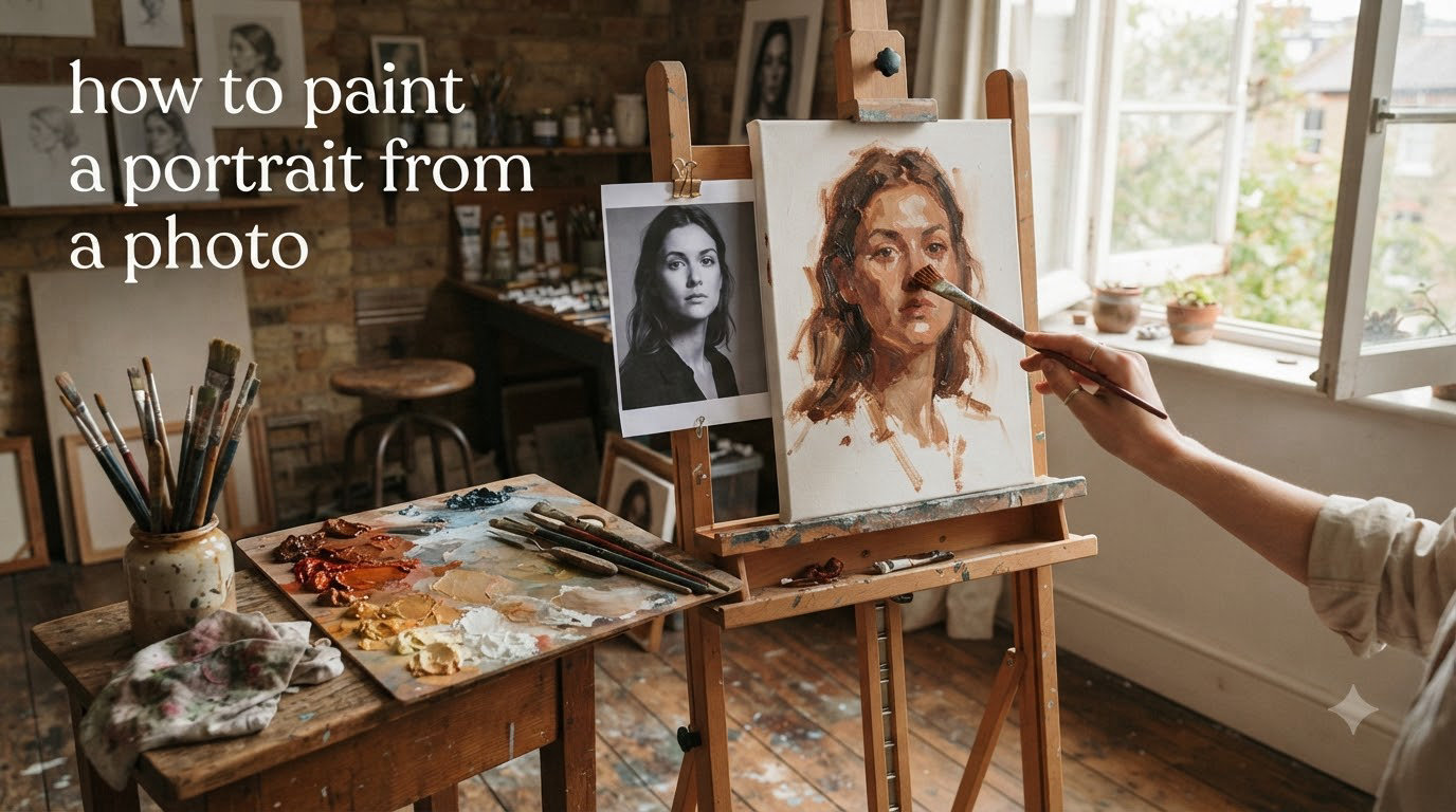
Learning how to paint a portrait from a photo can feel overwhelming at first. I remember staring at my reference photo, brush in hand, wondering why my colors looked completely wrong compared to the image in front of me. The skin looked flat, the proportions felt off, and I wanted to give up.
After years of practice and studying under working portrait artists, I have developed a reliable system that transforms photo reference into original art. This guide walks you through the complete process, from selecting the right photo to applying the final touches that bring a portrait to life.
Whether you work in oils, acrylics, or digital media, these techniques will help you create portraits that capture more than just a likeness. They capture character.
Table of Contents
Choosing the Right Photo Reference
Not every photo works well as painting reference. I learned this the hard way after wasting hours on blurry, poorly lit images that fought me every step of the way.
Start with a high-resolution photo that shows clear details in both shadow and highlight areas. Your reference needs to contain information you can actually use. Overexposed areas blow out to pure white with no recoverable detail, while underexposed shadows become black voids.
Single Light Source Makes Everything Easier
Photos with a single, clear light source simplify the painting process dramatically. Multiple light sources create confusing shadow patterns that compete with each other. Look for images where one dominant light defines the form.
Rembrandt lighting offers an ideal setup for beginners. This classic portrait lighting creates a small triangle of light on the shadow side of the face, giving you clear separation between light and dark planes. The pattern flatters almost every face shape while providing the strong value contrast that makes portraits pop.
Front View vs Three-Quarter View
Front-facing portraits look iconic but offer less dimensional information. I recommend starting with three-quarter views for your first few paintings. The slight turn of the head reveals the structure of the cheekbone, nose bridge, and jawline that front views hide.
Avoid extreme angles for your early work. Looking up at a subject or down from above distorts proportions in ways that require advanced understanding to correct.
Essential Supplies for Portrait Painting
You do not need every color in the art store to paint beautiful skin tones. I use a limited palette that forces me to mix deliberately rather than reaching for convenience colors.
For oil painting, start with titanium white, cadmium yellow light, cadmium red medium, ultramarine blue, and burnt umber. Add yellow ochre and cadmium orange for easier skin tone mixing. This limited palette keeps your colors harmonious because every mixture shares common ingredients.
Acrylic painters should use the same color selection with a slow-drying medium to extend working time. Fast-drying acrylics frustrate blending efforts unless you work very quickly or use retarders.
Choose brushes sized for the painting surface. For an 11×14 inch portrait, I use flats and filberts ranging from size 2 to size 8. Small brushes tempt beginners into detail work too early. Start larger and work down to details only in the final stages.
Getting Accurate Proportions: Drawing Your Subject
Inaccurate proportions doom a portrait before the first paint touches canvas. Take time to establish the drawing correctly, even if you are eager to start painting.
The Grid Method
The grid method breaks complex images into manageable sections. Draw a grid over your photo reference, then replicate that grid lightly on your canvas. Transfer what you see in each square rather than trying to judge the whole image at once.
Use a proportional divider to check relationships without measuring. Compare the width of an eye to the distance between eyes. Check that the nose sits halfway between the eyes and chin. These proportional relationships matter more than exact measurements.
The Eye-Width Method
The eye-width method provides a quick check system for portrait proportions. The width of one eye typically equals the space between the eyes. Five eye widths span the average face. The nose width equals one eye width. The mouth sits about one eye width above the chin.
These guidelines work for front-facing portraits. Three-quarter views require adjusting for foreshortening, which compresses measurements on the turned side.
Checking Angles
Hold your brush or pencil up to your photo reference to check angles. Compare the slope of the eyebrow to the edge of the nose. Check that the corner of the mouth aligns vertically with the pupil of the eye. These angle relationships catch proportional errors early.
Step back frequently. Distance reveals mistakes that close work hides. I check my drawing from across the room every fifteen minutes during the setup phase.
Setting Up Your Palette for Skin Tones
Skin tone mixing confuses many beginners because they reach for peach or flesh colors straight from the tube. Real skin contains surprising colors that shift between warm and cool depending on the light.
Warm-Cool-Neutral Organization
Organize your palette by temperature. Place warm colors (yellows, oranges, warm reds) on one side. Position cool colors (blues, cool reds, greens) on the other. Keep neutrals (umbers, ochres) in the middle.
Shadow areas of skin tend toward cool colors like blue and purple. Light areas lean warm with yellow and orange. The transition zone between light and shadow carries the most interesting color shifts.
Mixing Shadow Colors
Start your palette preparation by mixing the darkest shadow color you see in your reference. This establishes the value range for your entire painting. Everything else relates to this darkest note.
Shadow skin tones mix from ultramarine blue, burnt umber, and a touch of cadmium red. Add titanium white gradually to create the mid-tone values. Keep shadow mixtures cooler than you think they should be.
Mixing Light Colors
Light skin areas combine yellow ochre, cadmium yellow light, cadmium red medium, and white. The exact recipe changes depending on the subject’s natural coloring and the light source temperature.
Warmer light sources (incandescent bulbs, sunset) push light skin toward orange. Cooler light (overcast sky, north window) shifts light skin toward pink or even slightly green.
How to Paint a Portrait from a Photo: Step-by-Step Process
This eight-step process moves from dark to light, general to specific. Follow the sequence for your first few portraits until you understand how each stage builds on the previous one.
Step 1: Start with the Darkest Dark Notes
Identify the darkest value in your reference photo. Mix that color and place it accurately on your canvas. This single dark anchor gives you a reference point for every other value in the painting.
Common darkest darks appear in the nostril openings, deep eye sockets, and under the chin. Do not paint details yet. Just establish the large dark shapes.
Step 2: Lay Down Large Shadow Shapes
Paint all the shadow areas as one connected shape. On a face with Rembrandt lighting, this includes the shadow side of the face, the eye socket shadows, and under-plane shadows beneath the nose and lower lip.
Keep shadow paint thin in oils, especially if you paint in layers. Thick paint in shadow areas creates texture that catches light and ruins the illusion of depth.
Step 3: Build Mid-Tones in the Light Areas
Mix the average light skin tone and block in the lit areas of the face. Leave space for highlights, which come later. Cover the canvas completely at this stage so you stop seeing white canvas peeking through.
Compare each mixture to your dark notes. The contrast between light and shadow creates the illusion of three-dimensional form. Weak contrast produces flat-looking portraits.
Step 4: Paint the Turning Edge Between Light and Shadow
The turning edge, also called the terminator, marks where the form turns away from the light source into shadow. This edge carries crucial information about the roundness of the form.
On a cheek, the turning edge softens gradually. On a sharp jawline, it turns more abruptly. Study your reference to see how the edge quality changes across different facial structures.
Step 5: Add Highlights Carefully
Highlights come last and should occupy the smallest area of any value group. The forehead, nose bridge, cheekbones, and chin catch the most light in a typical portrait.
Do not overdo highlights. Too many bright spots scatter the viewer’s attention and break the illusion of unified light. Place highlights where they actually appear in your reference, not where you think they should be.
Step 6: Refine Facial Features
Only after establishing the big forms should you add details like eyes, nostrils, and lips. These features sit on the larger forms you have already established. Get the big forms wrong and no amount of detail will save the portrait.
Paint the eye socket as a sphere first, then place the eye within that socket. Define the nose as a series of planes, then add the subtle variations that make it look like a specific person’s nose.
Step 7: Paint the Background
Background treatment affects how the portrait reads. A dark background pushes the light side of the face forward. A light background emphasizes the shadow side. Choose based on which side of the face you want to highlight.
The background should not compete with the subject. Keep it simple and slightly out of focus compared to the sharpness of the face. Atmospheric perspective applies even in portraits.
Step 8: Final Touches and Adjustments
Step back and assess the whole painting. Check that the likeness reads from across the room. Adjust values where the form looks flat. Soften edges that feel too hard. Sharpen edges that need more definition.
Add final details like eyelashes, eyebrow hairs, and skin texture only after the big structure works. These details mean nothing if the underlying proportions fail.
Mixing and Painting Realistic Skin Tones
The biggest breakthrough in my portrait work came when I stopped trying to match photo colors exactly and started thinking in terms of warm-cool relationships.
Photos often show skin as more orange or pink than it appears in life. Camera sensors interpret color differently than human eyes. Paint what makes the portrait feel alive, not what the photo claims the color should be.
Shadow Color Family vs Light Color Family
Think of skin in two color families. Shadows belong to the cool family with blues, purples, and cool greens. Lights belong to the warm family with yellows, oranges, and warm reds.
The transition between these families creates visual interest. A face painted entirely in warm colors looks jaundiced. A face painted entirely in cool colors looks dead. The dance between warm lights and cool shadows brings portraits to life.
Avoiding Muddy Colors
Muddy colors happen when you mix too many pigments together or when you mix complementary colors without intention. Keep your mixtures limited to three pigments maximum when possible.
If your skin tones look dirty, check whether you are adding complementary colors by accident. Green and red oppose each other. Blue and orange oppose each other. Purple and yellow oppose each other. Unintentional mixing of opposites produces neutrals that drain color intensity.
Common Portrait Painting Mistakes to Avoid
I have made every mistake on this list multiple times. Learning from errors accelerated my progress faster than any book or video.
Slavishly Copying the Photo
The photo provides information, not instructions. Your job as an artist involves interpreting that information, not transcribing it pixel by pixel. Photos flatten depth, shift colors, and lose subtle value changes that eyes perceive naturally.
Paint the person, not the photograph. Step back from your reference periodically and paint from memory for a few minutes. This forces you to think about the three-dimensional form rather than copying two-dimensional shapes.
Starting with Details Too Early
Beginners rush to paint the eyes because eyes feel important. But eyes painted on an incorrectly shaped head look like stickers pasted on a balloon. Establish the big forms first.
Work from large to small throughout the entire process. Block in the head shape before facial features. Block in facial features before eyelashes and pores.
Ignoring Value Relationships
Value refers to how light or dark something appears. Color matters less than value for creating the illusion of form. A portrait with accurate values and wrong colors looks more realistic than a portrait with perfect colors and wrong values.
Squint at your reference to blur the colors and see only values. Compare the darkest dark to the lightest light. Check that your painting maintains the same contrast range.
Not Knowing When to Stop
Overworking kills more portraits than any other mistake. Every brushstroke risks destroying something that already works. Learn to recognize when additional paint adds nothing and might subtract from the freshness of your work.
Set the painting aside for a day when you feel tempted to keep tweaking. Fresh eyes reveal whether the work needs more attention or just needs to be left alone.
Digital Approach: Painting Portraits on Tablet or Computer
Digital painting offers advantages and challenges compared to traditional media. I use both approaches depending on the project and timeline.
Photoshop and Procreate provide undo buttons that traditional painters only dream about. This encourages experimentation without fear of ruining expensive canvas. However, the undo button also tempts endless noodling that drains energy from bold decisions.
Working digitally from photos requires the same proportional checking as traditional work. Tracing the photo exactly produces flat results regardless of how skillfully you apply digital paint. Use the photo as reference, not as a coloring book.
Digital brushes can mimic oil, acrylic, or watercolor textures. Experiment with different brush settings to find marks that feel natural to your hand. Pressure sensitivity matters more than brush variety. One versatile brush used well outperforms fifty specialty brushes used poorly.
When printing digital portraits, use high-resolution files and quality paper or canvas. Screen colors rarely match printed output exactly, so calibrate your monitor and expect some adjustment when you first print.
Frequently Asked Questions
How to turn a photo into a painted portrait?
Start by selecting a well-lit photo reference with clear details. Transfer the basic proportions to canvas using grid method or freehand drawing. Build the painting from dark to light, starting with shadow shapes and progressing through mid-tones to highlights. Focus on capturing value relationships rather than copying colors exactly.
What is the 70/30 rule in art?
The 70/30 rule suggests spending 70 percent of your time on planning, drawing, and preparation, and only 30 percent on the actual painting. Proper setup prevents problems that are difficult to fix later. Good drawing and value planning matter more than brushwork skill.
How can I turn a photo into a painting for free?
Free apps like GIMP, Krita, or browser-based tools can convert photos to painterly effects. For original artwork, print the photo and trace it onto canvas, then paint over the lines using the photo as reference. You can also project the photo onto canvas and trace the projection.
Why do my colors look wrong when painting from photos?
Camera sensors interpret color differently than human eyes. Photos often exaggerate warm tones or flatten color variations. Paint what makes the portrait feel alive rather than matching the photo exactly. Focus on warm-cool relationships rather than literal color copying.
How do I know when my portrait painting is finished?
A portrait is finished when any additional paint would not improve the result. Step back and assess from across the room. If the likeness reads clearly, values describe the form accurately, and details support rather than distract, the work is complete. When tempted to keep tweaking, set it aside for 24 hours first.
Conclusion
Mastering how to paint a portrait from a photo takes time, patience, and deliberate practice. The process I have shared moves from photo selection through drawing, palette preparation, and an eight-step painting sequence that builds form from dark to light.
Remember that the photo serves as reference, not as a coloring book. Your interpretation transforms a flat image into dimensional art. Focus on value relationships, warm-cool color shifts, and accurate proportions before worrying about fine details.
Each portrait you paint teaches you something new about seeing. The frustration you feel now becomes the foundation for breakthroughs later. Keep painting, keep learning, and trust the process. Your next portrait might be the one that surprises you.