
Music History
May 16, 2026 The Bruce High Quality Foundation
Before 1938, record buyers experienced music as a purely auditory affair. Albums arrived in plain brown paper sleeves, anonymous and indistinguishable, offering no visual companion to the sounds within. This all changed when a young graphic designer named Alex Steinweiss introduced the first illustrated album cover for Columbia Records in 1938, reportedly increasing sales by an astonishing 900%. That single act transformed an audio-only medium into a multi-sensory experience, kickstarting an art form that would define musical identity for decades to come.
The history of album cover art is a story of innovation, artistic expression, and the powerful marriage between sight and sound. From the psychedelic explosion of the 1960s to the digital revolution of the 1990s, album covers have served as canvas, canvas for cultural commentary, marketing powerhouse, and collectible art form. Today, as streaming platforms shrink artwork to thumbnail sizes, both vinyl enthusiasts and digital listeners continue to celebrate the enduring legacy of album cover art.
Table of Contents
The Pre-Cover Era: Before 1938
In the early days of recorded music, visual aesthetics were an afterthought. Records were sold in plain, unbleached paper sleeves that protected the discs but offered nothing in terms of artistic identity. Manufacturers viewed records purely as functional objects, and the plain sleeve was merely a practical solution to prevent damage during shipping and handling. The focus was entirely on the audio experience, with packaging considered a disposable necessity rather than an opportunity for creative expression.
78 rpm records, which dominated the market from the 1890s through the 1950s, were typically sold in simple paper envelopes. These early sleeves often bore only the record company’s logo and basic catalog information. The listener had no visual reference to accompany their musical journey, and albums lacked any cohesive visual identity that might distinguish one release from another or connect the music to a broader artistic vision.
This changed dramatically in 1938 when Alex Steinweiss, working as a graphic designer for Columbia Records, proposed replacing the plain brown sleeves with colorful, illustrated covers. His first design was for a collection of classical music recordings, and its immediate commercial success proved that visual presentation could significantly enhance the appeal of music recordings. Within three years of this innovation, Columbia’s sales reportedly increased by 900%, demonstrating that audiences were ready for a more immersive musical experience that engaged both eyes and ears.
The Steinweiss Revolution: 1938-1940s
Alex Steinweiss’s 1938 innovation marked the birth of modern album cover art as we know it. His bold, eye-catching designs for Columbia Records established illustrated covers as a standard practice rather than an exception. Steinweiss brought his background in illustration and poster design to the world of record packaging, creating vibrant, stylised artwork that captured the spirit of the music within and transformed records into collectible objects worth preserving.
The impact of Steinweiss’s work extended far beyond immediate sales figures. Record labels quickly recognized that distinctive cover art could differentiate their releases in a crowded market, and they began commissioning artists and designers to create unique visual identities for their albums. This shift transformed record packaging from a purely functional concern into a competitive arena where artistic expression and marketing strategy intersected. The record sleeve had become an art form, a canvas for designers to showcase their talents while helping listeners navigate the growing world of recorded music.
During the 1940s, the trend toward illustrated covers accelerated as more record companies adopted the practice. Designers like Jim Flora brought their distinctive illustrative styles to record packaging, creating covers that were as much works of art as they were marketing materials. The groundwork was being laid for the explosion of creativity that would define album cover design in the decades to come.
The LP Era: 1950s-1960s
The introduction of the 12-inch long-play (LP) record in 1948 revolutionized both the music industry and album cover art. The larger format provided more canvas space for artwork, and the 33 1/3 rpm speed allowed for longer recording times, enabling artists to present complete albums rather than individual songs. This technological advancement coincided with a growing recognition of album covers as vehicles for artistic expression, and record companies began investing more heavily in cover design as a result.
The 1950s saw the emergence of sophisticated cover designs that treated the record sleeve as a cohesive artistic statement. Designers experimented with photography, illustration, and typographic innovation, creating covers that reflected the musical content within while establishing visual identities for artists. The LP’s larger surface area also made the gatefold sleeve possible, allowing for expansive artwork that opened up to reveal additional images, lyrics, or credits.
The 1960s represented a watershed moment for album cover art, particularly with the explosion of psychedelic art that accompanied the counterculture movement. Psychedelic rock required psychedelic visuals, and album covers became elaborate showcases for swirling colors, surreal imagery, and mind-expanding design. The Beatles’ “Sgt. Pepper’s Lonely Hearts Club Band” (1967), with its elaborate collage cover designed by Peter Blake and Jann Haworth, exemplified how album art could become a central element of artistic identity. Meanwhile, the Rolling Stones’ “Beggars’ Banquet” (1968), featuring a controversial photograph of a dirty toilet, demonstrated the power of album art to challenge conventions and spark debate.
Other iconic covers from this era include the Velvet Underground and Nico’s 1967 cover featuring Andy Warhol’s banana design, and Pink Floyd’s “The Dark Side of the Moon” (1973), which would become one of the most recognisable images in popular culture. The LP era had transformed album covers from marketing materials into cultural artifacts that could define entire movements and generations.
The Golden Age of Design: 1970s-1980s
The 1970s and 1980s are often considered the golden age of album cover design, a period when the medium achieved unprecedented artistic respect and creative ambition. Record labels invested heavily in art direction, commissioning renowned designers and artists to create covers that would stand as works of art in their own right. Designers like Reid Miles, Storm Thorgerson, and Andy Warhol became as famous for their record sleeve work as for their other creative pursuits.
Reid Miles created some of the most iconic covers of this era, including memorable designs for Creedence Clearwater Revival and, most famously, the Doors. His distinctive typography and bold graphic layouts established a visual language that would influence design for decades. Storm Thorgerson, working primarily with Hipgnosis and Pink Floyd, pushed the boundaries of what was possible on a record sleeve, creating surreal, photographic collages that became inseparable from the music they accompanied. His work on “The Dark Side of the Moon” and “Wish You Were Here” remain among the most recognisable album images ever created.
Andy Warhol’s contributions to album cover art extended beyond his famous banana design for the Velvet Underground. His Campbell’s Soup Cans-inspired approach to commercial art influenced how album covers could function as statements of artistic intent. Burt Goldblatt, working with Vanguard Records, brought his background in fine art to rock and folk record packaging, creating covers that treated the music with the same seriousness as the artwork itself.
The 1980s saw the introduction of CD technology, which would eventually transform album cover art in profound ways. However, the LP era’s influence continued, with many CD packages featuring expanded booklet layouts that allowed designers to explore longer visual narratives within the limited space of the new format. The golden age had established expectations for artistic ambition in record packaging that would persist even as the technology evolved.
The CD and Digital Revolution: 1990s-2000s
The introduction of compact discs in 1982 began a gradual transformation of album packaging that would accelerate through the 1990s. CDs offered superior sound quality and greater durability than vinyl, but their smaller jewel case size presented new challenges for album cover art. The 4.7-inch disc diameter meant that covers shrank from the imposing 12×12 inch LP format to a mere 5-inch square, fundamentally altering how artwork could function in relation to the music.
Designers adapted by creating elaborate booklets that unfolded from the jewel case, allowing for expanded artwork, lyrics, photography, and credits that could be examined more closely than the outsize LP covers. The CD booklet became its own art form, with designers using the multi-page format to create visual narratives that complemented the music. However, the reduction in cover size meant that the bold, statement-making imagery of the LP era was often replaced by more intimate, detailed work that could only be fully appreciated in close proximity.
The digital revolution of the 2000s brought further challenges. As MP3 downloads and later streaming services became dominant, album artwork was reduced to tiny thumbnails on screen. The immersive experience of examining a large LP cover or even a CD booklet was replaced by fleeting glimpses of often-minimised images. The cultural shift toward digital consumption challenged designers to create artwork that could make an impact at extremely small sizes while also functioning across multiple platforms and formats.
Despite these challenges, album cover art continued to evolve. Some artists embraced the new digital landscape, creating animated covers or interactive elements for digital releases. Others looked back to vinyl for inspiration, treating physical releases as premium collectible objects that offered visual experiences impossible to replicate in digital form. The CD era demonstrated that album cover art was resilient enough to survive technological disruption while adapting to new contexts and consumption patterns.
The Vinyl Resurgence: 2010s-Present
The 2010s witnessed a remarkable revival of vinyl records, driven by audiophiles, collectors, and younger listeners discovering or rediscovering the pleasures of physical music format. This resurgence brought album cover art back into focus, as vinyl’s larger format allowed designers to create artwork that could be examined, appreciated, and displayed in ways that digital formats did not permit. Record Store Day, established in 2008, became an annual celebration of vinyl culture and the tactile experience of music ownership.
The vinyl revival encouraged artists and labels to invest in special edition releases featuring elaborate gatefold covers, coloured vinyl, printed inner sleeves, and other premium packaging elements. These collector’s editions transformed album purchases into art acquisition, with fans willing to pay premium prices for physical objects that offered visual and tactile experiences beyond what digital formats could provide. The 12×12 inch canvas once again became a space for ambitious design, with artists collaborating with illustrators, photographers, and graphic designers to create works that honoured the legacy of classic album cover art.
Contemporary album cover art continues to draw inspiration from the medium’s rich history while exploring new aesthetic territories. Designers reference the psychedelic era, minimalist movements, and conceptual approaches pioneered in previous decades while incorporating contemporary techniques and cultural references. The vinyl resurgence has demonstrated that album cover art remains vital, not as a nostalgic relic but as an evolving art form that responds to changing technology and cultural contexts while maintaining its fundamental connection between visual art and musical experience.
Iconic Album Covers Through the Ages
Throughout the history of album cover art, certain covers have achieved cultural significance that transcends their original musical context. These iconic images have become art in their own right, recognised by people who may never have heard the albums they depict. Michael Jackson’s “Thriller” (1982), designed by photographer Lynn Goldsmith, became the best-selling album of all time while its cover image achieved recognition as one of the most replicated photographs in history.
Pink Floyd’s “The Dark Side of the Moon” (1973) features one of the simplest and most striking covers in popular music: a prism dispersing light into a rainbow against a black background. Created by Storm Thorgerson and Hipgnosis, the image has been endlessly parodied and referenced, becoming synonymous with the concept album format and the progressive rock movement. Similarly, The Beatles’ “Sgt. Pepper’s Lonely Hearts Club Band” (1967) transformed the band into honorary members of a fictional club, with a collage of wax figures that became one of the most elaborate and discussed covers in rock history.
The Rolling Stones’ “Beggars’ Banquet” (1968) demonstrated the power of album art to challenge conventions. The original cover photograph of a toilet in a dirty bathroom was considered too controversial by some retailers, leading to delayed release and alternative covers in certain markets. This controversy transformed a seemingly simple image into a statement about authenticity, rebellion, and artistic integrity. The Velvet Underground and Nico’s “The Velvet Underground & Nico” (1967), with Andy Warhol’s iconic banana design, transformed the act of peeling back a banana into a statement of artistic ambition that set the tone for everything that followed.
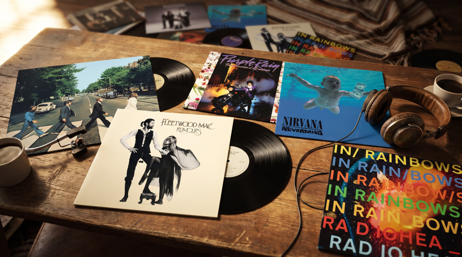
Other covers that have achieved iconic status include Nirvana’s “Nevermind” (1991), featuring the famous underwater baby photograph;Fleetwood Mac’s “Rumours” (1977), with its candid band photograph; and more recently, Kendrick Lamar’s “To Pimp a Butterfly” (2015), which engaged with African American cultural imagery in ways that sparked widespread discussion. These covers demonstrate that album art remains a powerful medium for visual storytelling and cultural commentary.
Pioneering Album Cover Designers
Alex Steinweiss may have invented modern album cover art, but the medium’s development relied on the contributions of numerous visionary designers who transformed record sleeves into art forms worthy of exhibition. Jim Flora’s dynamic, illustration-based approach brought energy and movement to covers during the 1940s and 1950s, establishing a precedent for the integration of artistic sensibilities into commercial packaging. His abstract compositions and bold colours influenced subsequent generations of cover designers.
Reid Miles became one of the most influential cover designers of the 1960s, working with Creedence Clearwater Revival, the Doors, and other major artists. His distinctive typography and minimalist aesthetic created covers that were immediately recognisable and often surprisingly elegant given the commercial context. Miles understood that the cover was the listener’s first point of contact with the music, and his designs aimed to create anticipation and curiosity that would enhance the listening experience.
Storm Thorgerson, working through Hipgnosis and later as an independent designer, pushed the boundaries of what album covers could accomplish visually. His surreal, photographic collages created worlds of meaning that complemented the music while also functioning as independent art works. His collaboration with Pink Floyd produced some of the most recognisable images in popular culture, and his influence can be seen in subsequent designers’ approaches to conceptual cover art.
Roger Dean created some of the most distinctive covers in rock music, particularly for Yes albums, featuring his signature fantastical landscapes and organic forms. His work demonstrated how album art could create consistent visual universes that extended across multiple albums while maintaining a sense of wonder and imagination. Burt Goldblatt brought his fine art training to Vanguard Records covers, creating work that treated folk and blues music with the visual sophistication these genres deserved. These pioneering designers established that album cover art could be taken seriously as an art form, paving the way for subsequent generations of designers to explore the medium’s possibilities.
Frequently Asked Questions
What is the history of album covers?
Album covers evolved from plain paper sleeves in the early 1900s to illustrated covers introduced by Alex Steinweiss in 1938, transforming an audio-only medium into a multi-sensory experience. Steinweiss’s innovation reportedly increased Columbia Records’ sales by 900%, establishing illustrated covers as a standard practice. The LP era of the 1950s and 1960s expanded creative possibilities with the 12×12 inch format, followed by the golden age of design in the 1970s-1980s when designers like Reid Miles, Andy Warhol, and Storm Thorgerson created iconic imagery. The CD era challenged artists with smaller formats, while the vinyl resurgence of the 2010s brought album cover art back into focus as a collectible art form.
When did album art become a thing?
Album art became a significant art form in 1938 when Alex Steinweiss created the first illustrated album cover for Columbia Records. His bold, colourful designs replaced plain brown paper sleeves, demonstrating that visual presentation could dramatically enhance the appeal of recorded music. Within three years of this innovation, Columbia’s sales reportedly increased by 900%, proving that album art was not merely decorative but a powerful marketing tool that transformed the relationship between listeners and recorded music.
Why was Beggars’ Banquet controversial?
The Rolling Stones’ 1968 album Beggars’ Banquet was controversial due to its cover photograph featuring a dirty toilet in what appears to be a grimy public bathroom. The image was considered too controversial by some retailers and record companies, leading to delayed release and the creation of alternative covers in certain markets. The cover reflected the band’s working-class authenticity and willingness to challenge conventions, transforming what might have been a simple design choice into a cultural statement about artistic integrity and rebellion against middle-class propriety.
What is the most sold record of all time?
Michael Jackson’s Thriller (1982) holds the distinction of being the best-selling album of all time with estimated sales exceeding 66 million copies worldwide. The cover, designed by photographer Lynn Goldsmith, features a dramatic image of Jackson in a tiger-striped jacket against an orange background, with a similarly-styled panther visible behind him. The cover’s striking composition and iconic imagery helped establish the album as a cultural phenomenon, demonstrating how album art could function as a visual gateway to the musical experience within.
Conclusion
The history of album cover art reflects broader cultural shifts in how we experience, consume, and value music. From Alex Steinweiss’s pioneering illustrated covers to the psychedelic explosion of the 1960s, from the golden age of design to the challenges of digital miniaturisation, album cover art has continuously adapted while maintaining its fundamental purpose: connecting visual art with musical experience. Today, as streaming platforms continue to shrink artwork to thumbnail sizes, the vinyl resurgence demonstrates that there remains an audience for the tactile, immersive experience that physical formats provide. Whether experienced on a 12-inch LP sleeve or a smartphone screen, album cover art endures as an essential element of musical identity, artistic expression, and cultural history.
© 2026 The Bruce High Quality Foundation. All rights reserved.