
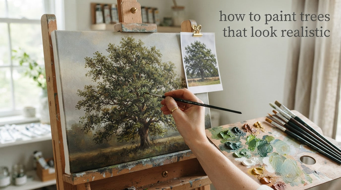
I spent three years painting trees that looked like broccoli glued to brown sticks. Every oak I attempted turned into the same symmetrical green blob. Every pine resembled a toddler’s Christmas tree drawing. If you have ever stared at your canvas wondering why your trees look nothing like the ones outside your window, you are in the right place.
Trees are among the most painted subjects in landscape art, yet they remain one of the hardest things to get right. The problem is not talent. The problem is how our brains process trees. We think we know what a tree looks like, but that mental image is almost always wrong. It is simplified, symmetrical, and stripped of the chaos that makes real trees beautiful.
This guide will walk you through exactly how to paint trees that look realistic, from understanding their underlying structure to mixing natural greens, mastering foliage brushwork, and avoiding the mistakes that keep your paintings stuck in “amateur” territory. Whether you work in acrylics, oils, or watercolors, these principles apply across every medium. I will break down the process into five clear steps and share specific techniques for trunks, bark, canopies, and creating the illusion of depth.
Table of Contents
Understanding Tree Structure: The Foundation of Realism
The single biggest reason painted trees look fake is that artists paint what they think a tree looks like instead of what is actually there. This is called the idealized tree problem, and it is the first thing you need to unlearn.
Close your eyes and picture a tree. You probably imagined something with a brown trunk, a round or triangular canopy, and evenly distributed branches. That is not a real tree. Real trees are asymmetrical. Their canopies have holes where branches died or light breaks through. Their trunks lean, curve, and taper in unexpected places. Branches split at irregular angles, not in perfect Vs.
Break Trees Into Three Basic Masses
Instead of thinking about leaves and bark, train yourself to see three things: the trunk mass, the branch structure, and the canopy mass. The trunk is a cylinder that tapers upward. Branches are smaller cylinders that fork off at various angles. The canopy is not a solid shape but a cluster of smaller rounded forms, some overlapping, some separated by gaps of sky.
When you simplify a tree into these basic shapes, you stop trying to paint individual leaves and start painting the overall form. This simplification principle is the single most important concept in realistic tree painting. Master painters like Ivan Shishkin did not paint every needle on a pine tree. They painted the impression of masses in light and shadow, and our brains fill in the rest.
Study Silhouettes First
Before you pick up a brush, spend time looking at tree silhouettes. At dawn or dusk, trees become pure shapes against the sky. This is the best way to train your eye to see the unique profile of each species. An oak has a wide, spreading silhouette with rounded bumps. A birch is narrow and vertical with weeping branches. A pine is triangular but irregular, never a perfect cone.
Sketch these silhouettes in a notebook. Just the outline, no details. Ten minutes of silhouette sketching will teach you more about tree structure than an hour of detailed drawing. You will start noticing that no two trees share the same profile, and that asymmetry is what makes them look real.
Light Source and Shadow Fundamentals for Trees
Realism in painting comes down to one thing above all others: accurate light and shadow. Without a clear, consistent light source, even the most detailed tree will look flat. With correct lighting, even a simple silhouette reads as three-dimensional.
Before you paint a single stroke, decide where your light is coming from. One direction. One source. This is non-negotiable. Most landscape painters choose an upper-left or upper-right angle because it creates the most natural-looking shadows on a canvas.
The Four Value Zones on a Tree
Every tree, regardless of species, has four distinct value zones you need to identify and paint:
1. The light side. This is the portion of the trunk and canopy facing the light source. It carries your lightest values in the shadow family and your brightest highlights overall.
2. The shadow side. The side facing away from the light. This is significantly darker than most beginners expect. A common error is making this too light, which flattens the tree.
3. The core shadow. The darkest band along the shadow side, right where the form turns away from the light. This narrow strip of deep value is what creates the illusion of roundness on a trunk or a canopy mass.
4. Reflected light. A subtle lighter area along the bottom edge of the shadow side, caused by light bouncing off the ground or nearby surfaces. This is a small detail, but it makes a huge difference in making your tree feel grounded and dimensional.
Dappled Light Through the Canopy
One of the most beautiful effects in nature is dappled light filtering through a tree canopy. It breaks up the canopy into irregular patches of bright and dark. To paint this effect, establish your overall light and shadow masses first. Then, in the shadow areas of the canopy, add small patches of lighter value where light punches through gaps in the foliage. Keep these patches varied in size and irregular in shape. Perfect circles of light look artificial.
Cast Shadows on the Ground
A tree without a cast shadow on the ground looks like it is floating. The cast shadow anchors the tree to the landscape. Its shape depends on the light angle. Low-angle light (morning or evening) creates long shadows. Overhead light creates short, compact shadows directly beneath the canopy. The shadow edge closest to the tree is sharp and gets softer as it extends outward. Paint the shadow darker near the base and lighter at the edges for the most natural effect.
Color Mixing for Realistic Tree Foliage
If you squeeze green paint straight from the tube and apply it to your canvas, your tree will look artificial. I learned this the hard way. Tube greens like sap green or phthalo green are too saturated and too uniform for nature. Real foliage contains a huge range of colors, including yellows, blues, browns, and even reds and purples.
Build Your Green from Scratch
The best approach is to mix your own greens. Start with a warm yellow (like cadmium yellow or yellow ochre) and a cool blue (like ultramarine or cerulean). By varying the ratio of yellow to blue, you get an entire family of natural greens that look alive on the canvas.
For warm, sunlit foliage, lean toward yellow-heavy mixes. For cool shadow areas, add more blue. For variety and naturalism, throw in touches of burnt sienna, raw umber, or alizarin crimson to knock down the saturation. Real trees are rarely pure green. They contain warm olive tones, cool blue-gray undertones, and golden highlights.
The Three-Green Minimum Rule
Never paint a tree with just one green. I recommend mixing at least three distinct greens before you start:
Shadow green: A dark, cool, slightly blue-leaning green. This is your darkest foliage value, used for the shadow side of the canopy and the deepest interior areas where light does not reach.
Mid-tone green: Your workhorse color. A balanced, moderately saturated green for the transition areas between light and shadow. This covers most of the canopy.
Highlight green: A warm, yellow-leaning, lighter green for the areas catching direct sunlight. Add a touch of white to lift the value. This is used sparingly, only on the topmost and outermost foliage facing the light.
Seasonal Color Shifts
Spring trees carry fresh, warm yellow-greens. Summer trees are deeper and more saturated with rich dark shadows. Autumn trees shift to warm yellows, oranges, reds, and browns, with some lingering green in sheltered areas. Winter deciduous trees have no foliage at all, revealing their branch structure against the sky with muted browns and grays in the bark. Adjust your palette to match the season you are painting, and your trees will immediately feel more convincing.
How to Paint Trees That Look Realistic: Step-by-Step Process
This is the core process I use every time I paint a tree. It works for acrylics, oils, and watercolors. The key is working from general to specific: big shapes first, details last. Many beginners want to jump straight to painting individual leaves, but that is the fastest path to a flat, overworked tree.
Step 1: Establish the Silhouette and Position
Start by lightly sketching the overall shape of your tree on the canvas. Use a thin, diluted paint or a charcoal stick. Focus on three things: where the tree sits in the composition, how tall it is relative to other elements, and the unique silhouette of its canopy. Do not draw branches or leaves at this stage. You are establishing a map of where the tree lives in your painting.
Block in the trunk as a simple tapered column. Indicate the canopy as a loose cloud shape. Keep your marks light and adjustable. This is the planning stage, and nothing should be committed to permanently yet.
Step 2: Block In Major Value Masses
With your silhouette established, it is time to fill in the big light and shadow shapes. Using your shadow green mixture, paint the entire shadow side of the canopy as one connected mass. Do not worry about individual leaf clusters yet. Think of this as painting the shadow side of a large sphere or egg shape.
Then switch to your mid-tone green and paint the light side of the canopy. Keep the transition between light and shadow relatively soft but still clear. At this stage, your tree should look like a simple 3D form with distinct light and dark sides. If it reads as round and dimensional at this stage, you are on the right track. If it looks flat, adjust your values before moving forward.
Step 3: Build Up Foliage with Varied Brushwork
Now comes the fun part. Within your established light and shadow masses, start adding smaller foliage clusters using varied brush techniques. On the light side, use warmer, lighter green dabs. On the shadow side, add cooler, darker clusters. The key is variety in your brushwork: some areas stippled, some areas with longer strokes, some areas left as broad masses.
Avoid repetitive mark-making. If every brush stroke looks the same, the foliage will look mechanical. Vary the pressure, the direction, and the size of your marks. Some clusters should be the size of your thumb. Others should be as small as a fingernail. This variation mimics the natural randomness of real foliage.
Step 4: Paint the Trunk, Branches, and Bark Texture
Paint the trunk with the same light and shadow logic as the canopy. One side is lit, the other is in shadow, and there is a core shadow strip running along the turning edge. The trunk color is rarely pure brown. Mix warm browns with touches of the surrounding colors for harmony. Add subtle blue or gray to the shadow side and warm ochre to the light side.
For bark texture, let your base coat dry, then use a dry brush technique: load a stiff brush with a small amount of lighter or darker paint, wipe off the excess, and drag it lightly across the trunk surface. The paint catches on the canvas texture, creating a natural bark-like pattern. Do not overdo this. A few well-placed texture marks read better than covering every inch of the trunk.
Branches should be painted in a hierarchy. The main trunk splits into primary branches, which split into secondary branches, which split into twigs. Each division gets thinner. Observe how real branches curve and taper. They never divide at perfectly equal angles. The most visible branches are the ones at the edges of the canopy where they are silhouetted against the sky or gaps in the foliage.
Step 5: Add Sky Holes, Refine Edges, and Final Highlights
This is the step that separates amateur tree paintings from professional ones. Sky holes are the small patches of sky visible through gaps in the canopy. Without them, a canopy looks like a solid green wall. With them, the canopy breathes and feels real.
To paint sky holes, use your sky color (not white, but the actual mixed sky color from your background) and paint small, irregular openings through the foliage. Concentrate these holes where branches naturally thin out: near the top of the canopy, along the edges, and wherever branches fork apart. Keep the holes varied in size and shape. A few larger openings near the edge and many tiny ones scattered throughout.
Next, refine your edges. Not every edge of the canopy should be sharp. Where the canopy meets the sky, alternate between hard edges (where the silhouette is crisp) and soft edges (where the foliage fades into the sky). This edge quality variation is something almost no beginner does, and it makes a massive difference. You can soften edges by gently blending with a clean brush or by using a lighter touch with more fluid paint.
Finally, add your brightest highlights. These are small, concentrated dabs of your lightest, warmest green placed only on the topmost foliage directly facing the light. Less is more here. Five or six well-placed highlight strokes will do more than fifty scattered ones. Step back from the canvas regularly to check the overall effect.
Foliage Painting Techniques That Create Depth
The brushwork you use for foliage determines whether your tree looks alive or like a green sponge. Here are the five techniques I rely on most, each suited to a different effect.
Stippling and Dabbing
Load a round brush with paint and tap it directly onto the canvas perpendicular to the surface. This creates small, rounded marks that mimic individual leaf clusters. Vary the size of the marks by using different brush sizes or pressing harder versus lighter. Stippling works best for building up the overall texture of a canopy, especially for deciduous trees like oaks and maples.
Dry Brush for Textured Foliage
The dry brush technique is my go-to for adding texture without overworking the paint. Load a stiff bristle brush with a small amount of paint. Wipe off most of it on a paper towel until the brush feels almost dry. Then drag the brush lightly across the surface. The paint skips across the canvas texture, leaving a fragmented, organic mark that looks like natural foliage. This technique is especially effective for the outer edges of canopies and for adding variety to flat areas.
Fan Brush Technique
A fan brush creates a distinctive layered mark that resembles overlapping leaves. Load just the tips of the fan brush with paint and press it lightly onto the canvas in a rolling motion. The fan shape produces a row of parallel marks that work well for building up volume in a canopy quickly. The trick is to vary the angle and pressure with each application so the marks do not look repetitive. Use this for mid-ground trees where you need foliage texture without extreme detail.
Wet-on-Wet for Distant Trees
For trees in the distance, individual leaf marks are too detailed. Instead, use wet-on-wet application: apply a wet layer of your sky color or background tone, then blend the tree color directly into it while both are still wet. This creates soft, indistinct edges that naturally suggest distance. The tree becomes a soft-edged shape rather than a detailed object, which is exactly how distant trees appear in reality due to atmospheric haze.
Edge Quality Variation
This is the technique that almost no painting tutorials cover, but it is what separates professional results from student work. Edges in nature are never all the same. Some are razor sharp (where a branch crosses the sky), some are soft (where canopy fades into atmosphere), and some are completely lost (where two similar values merge imperceptibly).
Consciously plan your edges. Make the lit edge of the canopy against the sky sharp. Make the shadow edge softer. Let some foliage clusters merge with the background. This contrast between hard and soft edges creates visual interest and guides the viewer’s eye through the painting. A tree where every edge is the same sharpness looks like a cardboard cutout.
Trunk and Bark Texture Methods
A convincing trunk does as much for realism as the canopy, yet many painters treat it as an afterthought. The trunk is what grounds the tree and gives it physical presence in the landscape.
Observing Real Bark Patterns
Before painting bark, spend time looking at it. Each species has a distinct pattern. Oak bark is deeply fissured with thick, vertical ridges. Birch bark is smooth and papery with horizontal lenticels. Pine bark has large, plate-like scales. Eucalyptus bark peels in long strips. These patterns are rhythms you can suggest rather than replicate.
When I paint bark, I start with the overall light and shadow of the trunk cylinder. Then I add the bark texture as a secondary layer, using the dry brush technique described earlier. The texture marks follow the grain direction of the specific tree type: vertical lines for oak, horizontal dashes for birch, diagonal for sycamore.
Color Variation in Bark
Bark is never a single brown. Even on a single trunk, you will find warm reddish-browns, cool gray-browns, greenish patches where moss or algae grow, and light tan areas where the bark has worn smooth. Mix several variations of brown and alternate between them as you paint. Add touches of your sky color reflected onto the trunk surface. Add warm highlights where light catches raised bark ridges.
Branch Structure: How Real Trees Divide
The most common mistake with branches is painting them like a coat rack: a single trunk with branches sticking out at even intervals in opposite directions. Real branches follow a rhythm but never symmetry. Branches alternate sides, grow at different angles, and curve as they extend. They also get progressively thinner, and the spaces between branches shorten toward the top of the tree.
When painting branches that show through the canopy, paint only the most prominent ones. You do not need to paint every branch. Three or four visible branches at the edges of the canopy will suggest a complete internal structure. Place them where foliage gaps occur, and make sure they connect logically to the trunk or to larger branches.
Creating Depth with Atmospheric Perspective
A landscape painting with trees at a single level of detail throughout looks flat, regardless of how well each individual tree is painted. Atmospheric perspective is the technique of modifying trees based on their distance from the viewer, and it is what gives a landscape painting convincing depth.
How Distance Changes Trees
Trees close to the viewer have sharp details, high contrast between light and shadow, warm and saturated colors, and visible texture in the bark and foliage. As trees recede into the distance, four things happen:
Value range compresses. The contrast between light and shadow decreases. Distant trees have a narrower range of values, compressed toward the middle.
Colors cool and desaturate. Warm greens shift toward cool blue-greens. Saturated colors become muted. This is because the atmosphere between you and the distant tree scatters warm light and lets cool blue wavelengths through.
Details disappear. Individual leaf clusters, bark texture, and small branches vanish. Distant trees become simple silhouettes or soft-edged masses.
Edges soften. Every edge becomes gentler. Sharp transitions blur into gradients. This happens naturally due to atmospheric haze, and painting it consciously adds depth.
Foreground vs Background Strategies
Paint your most distant trees first, using cool, desaturated blue-green masses with soft edges and minimal detail. Think of them as simple value shapes. Then work forward, progressively warming the color temperature, increasing the value contrast, sharpening the edges, and adding more detail. Your closest trees should have the richest colors, the sharpest edges, and the most varied brushwork.
This layering approach creates a natural sense of receding space. The viewer’s eye moves from the detailed foreground through the middle ground to the soft background, experiencing the same depth cues it encounters in real landscapes.
Common Tree Painting Mistakes (and How to Fix Them)
After years of painting trees and teaching others, I see the same problems come up repeatedly. Here are the five most common mistakes and exactly how to fix each one.
Mistake 1: Painting Every Single Leaf
This is the number one trap. Beginners try to render every leaf they see, which creates an overworked, stiff result that looks more like a botanical illustration than a painting. The fix is to focus on masses of foliage rather than individual leaves. Squint at your reference photo. The details disappear, and what remains are the big light and shadow shapes. Paint those shapes first, then add just a few individual leaf suggestions at the edges where the viewer expects to see detail.
Mistake 2: Making Trees Too Symmetrical
Our brains want trees to be balanced and even, but real trees are delightfully lopsided. One side of the canopy is always heavier. Branches are longer on one side. The trunk might lean. Fight the urge to center and balance everything. When you think your tree looks symmetrical, deliberately make one side heavier, add an extra branch on one side, or shift the canopy slightly off-center. Asymmetry reads as natural.
Mistake 3: Using Flat, Uniform Green
A canopy painted in a single green looks like a painted wall, not a living thing. Real foliage has enormous color variation. The fix is the three-green minimum rule described earlier. Mix at least three distinct greens and also introduce warm yellows, cool blues, and touches of earth tones and complementary colors into the canopy. Color variety within the foliage is what makes it feel alive.
Mistake 4: Ignoring the Light Source
Without a consistent light source, a tree has no dimensionality. If the left side of your tree is lit but the cast shadow falls to the left as well, the painting will feel wrong even if the viewer cannot articulate why. Before you start, mark your light direction on the canvas edge or on a separate reference sheet. Check it constantly as you paint. Every highlight, every shadow, and every cast shadow must align with that single source.
Mistake 5: Not Knowing When to Stop
Overworking is the silent killer of tree paintings. You add one more highlight, then another texture mark, then a few more leaves, and suddenly the freshness is gone and the tree looks muddy. Here is a practical rule: when you think you are about 80 percent done, stop. Step back ten feet from the canvas. If the tree reads well from that distance, you are finished. Most of the “finishing touches” you want to add will not be visible from a normal viewing distance anyway.
Bonus: Choosing Good Reference Photos
Not all reference photos are equal. A bad reference leads to a bad painting, no matter how skilled you are. Here is what I look for in a tree reference photo:
Clear light source. The photo should have obvious, directional lighting with visible shadows. Overcast photos flatten everything and make poor references for learning.
Full tree visible. Make sure the entire tree from base to crown is in the frame. Cropped references lead to guessed proportions.
High resolution. You need to see the structure clearly. Blurry or pixelated photos hide the information you need most.
Single tree, clean background. Trees against a simple sky are easier to study than trees tangled with buildings, power lines, and other trees. Start simple, then work up to complex scenes.
Practice Exercises to Level Up Your Tree Painting
Reading about techniques will only get you so far. Improvement comes from focused practice. Here are four exercises I assign to students who want to see fast progress in their tree painting.
Exercise 1: The Three-Tone Value Study
Choose a tree reference photo with strong lighting. Paint the tree using only three values: dark, mid, and light. No color. Just black, gray, and white (or three values of a single color like burnt umber). This exercise forces you to see the big value structure without getting distracted by color or detail. Do five of these studies and your understanding of tree lighting will improve dramatically.
Exercise 2: Same Tree, Different Lighting
Find a single tree in your neighborhood or in a photo collection and paint it three times: once in morning light, once at midday, and once in evening light. This teaches you how the same tree changes with different lighting conditions. You will discover that the tree’s form, color temperature, and mood shift entirely based on the light.
Exercise 3: Five Species from Photos
Paint five different tree species: an oak, a birch, a pine, a willow, and a maple, each from a clear reference photo. This exercise trains your eye to see the structural differences between species. Each has a unique silhouette, branching pattern, and foliage texture. After completing this exercise, you will never paint a “generic tree” again.
Exercise 4: Sky Holes Drill
Paint a simple canopy mass in your shadow green. Then, using your sky color, paint twenty sky holes of varying sizes throughout the canopy. Place larger holes near the edges and top, smaller ones scattered through the interior. Make sure none of the holes are perfectly round or evenly spaced. This drill builds the specific skill of creating breathing, believable canopies, and it directly addresses one of the biggest gaps in most painters’ toolkits.
FAQs
How do I paint a realistic tree with loose brush strokes?
Start by blocking in the major value masses (light side and shadow side) with a large brush. Then use a medium brush to add foliage clusters with varied pressure and direction. Keep your strokes confident and avoid going over the same area repeatedly. Work from large shapes to smaller ones, and let some strokes blend naturally on the canvas. The key is variety: alternate between dabs, short strokes, and sweeping marks to prevent a repetitive, mechanical look.
How do I make a painted tree look more realistic?
Focus on three things: establish a clear light source and paint accurate shadows, mix at least three different greens instead of using one flat color, and add sky holes (small gaps of sky color) through the canopy. Also, make sure your tree is asymmetrical and avoid painting individual leaves. Realism comes from capturing the overall impression of light, shadow, and natural irregularity rather than copying every detail.
What are the most common mistakes when painting trees?
The five most common mistakes are: painting every individual leaf instead of foliage masses, making the tree too symmetrical, using only one flat green color, ignoring or contradicting the light source, and overworking the painting by adding too many details. Each of these problems has a straightforward fix: simplify into masses, introduce asymmetry, mix multiple greens, plan your lighting before you start, and stop painting when the tree reads well from a distance.
What brushes should I use for painting realistic trees?
For most tree painting, you need three brush types: a large flat or bright brush (size 8-12) for blocking in major value masses, a medium round brush (size 4-8) for foliage clusters and medium-detail work, and a stiff bristle brush for dry brush bark texture. A fan brush is optional but useful for building up layered foliage marks quickly. Use the largest brush you can for each stage to avoid getting pulled into premature detail work.
Why do my painted trees look flat and two-dimensional?
Flat-looking trees almost always come down to insufficient value contrast between the light and shadow sides. If your shadow green is too light, the canopy will not turn away from the viewer. Darken your shadow side significantly more than you think is necessary. Also check that you have a consistent light source, a visible core shadow along the turning edge, and reflected light along the bottom of the shadow side. These four value zones create the illusion of three-dimensional form.
How do I mix natural-looking greens for tree foliage?
Mix your greens from scratch using a warm yellow (cadmium yellow or yellow ochre) and a cool blue (ultramarine or cerulean). Vary the ratio for different greens: more yellow for warm sunlit foliage, more blue for cool shadows. Then knock down the saturation by adding small amounts of burnt sienna, raw umber, or alizarin crimson. Real foliage is never pure saturated green. Mixing from primary components gives you natural, alive-looking color that tube greens cannot match.
Conclusion
If there is one thing I want you to take away from this guide, it is this: realistic tree painting is not about detail. It is about seeing clearly and painting simply. The five-step process, establishing the silhouette, blocking in value masses, building foliage with varied brushwork, painting trunk and bark texture, and refining with sky holes and edge variation, gives you a reliable framework every single time you approach a tree.
The most common problems, flat color, symmetry, overworking, and ignored lighting, all trace back to the same root cause: painting what you think a tree looks like instead of observing what is actually there. Train your eye to see masses, not leaves. Train your hand to mix variety, not uniformity. And train your instinct to stop before you overwork the surface.
Start with the practice exercises, especially the three-tone value study. That single drill will do more for your tree painting than anything else in this guide. Pick a reference photo with strong directional light, simplify it into three values, and see how quickly your understanding of tree form improves. Once you know how to paint trees that look realistic at the foundational level, you can push into looser styles, expressive color, and more complex compositions with confidence.