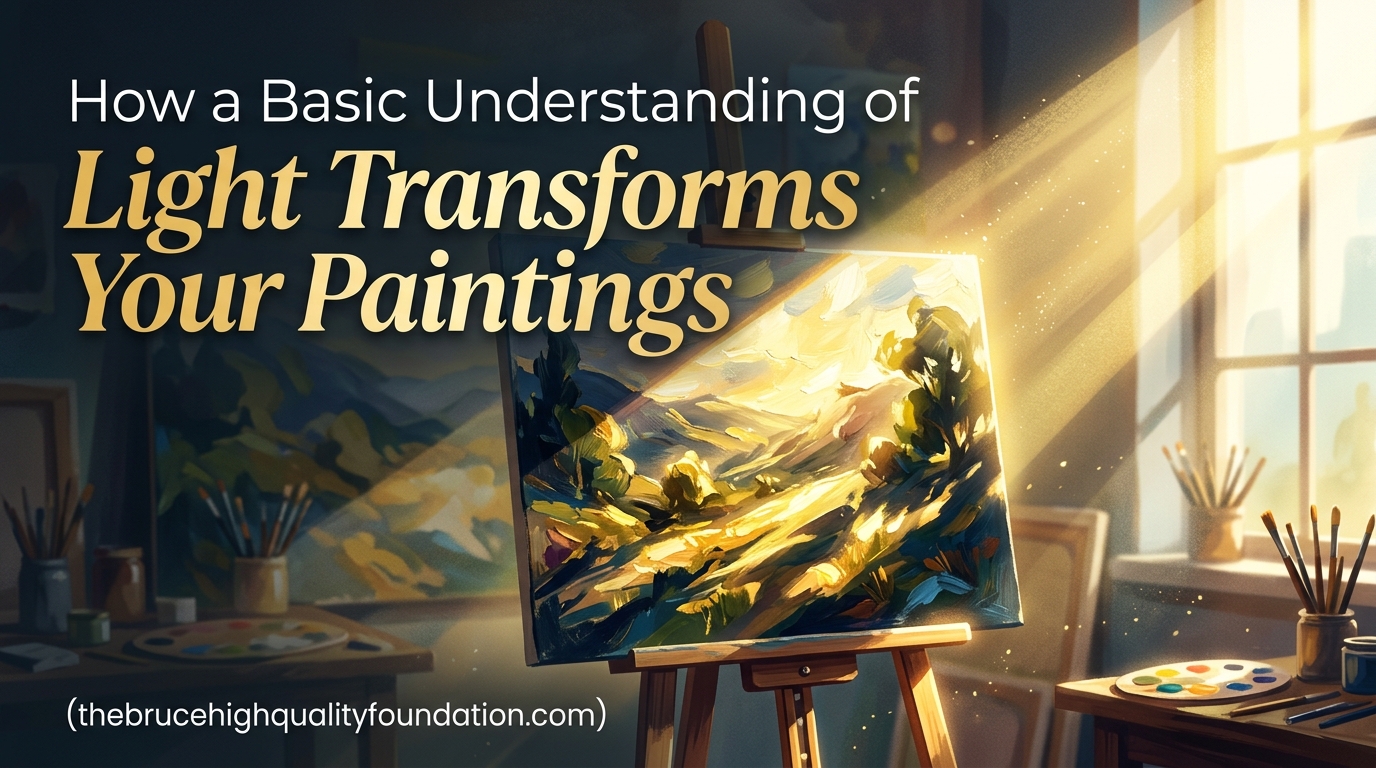
Every painter has experienced that moment of frustration. You know what you want to paint. You see the reference photo. But somehow your canvas ends up looking flat and lifeless. The colors are right. The proportions check out. Yet something is missing.
That something is light. Not just any lighting. An actual understanding of how light works and how it interacts with forms in your paintings.
When I first started painting seriously, I spent months making technically correct but fundamentally flat artwork. My shadows were in the right places. My highlights existed. But my paintings lacked that dimensional quality that makes viewers stop and look. It was only after I started studying light itself, not just copying what I saw, that my work began to transform.
This guide will give you that foundational understanding. You will learn how light creates the illusion of three dimensions on a flat surface. You will discover why certain shadows appear where they do. And you will practice techniques that bridge the gap between knowing theory and applying it effectively, drawn from how art movements have depicted light throughout history.
Table of Contents
The Fundamentals of Light: Source, Direction, and Quality
Before you can represent light in your paintings, you need to understand what light actually does in the real world. This is not about artistic style or creative choices. This is about the physics that governs how we see the world around us, and how light transforms familiar objects in unexpected ways.
Light Source: Natural vs Artificial
Every painting that depicts light has a light source. This source can be natural, like the sun or moonlight. Or it can be artificial, like a lamp, candles, or studio lights. Each type creates different characteristics in your painting.
Natural light changes throughout the day. Morning light carries a warm, golden quality. Midday light creates shorter shadows with harder edges. Evening light produces long shadows with soft, diffused quality. If you have ever wondered why plein air painters work quickly, it is because the natural light they are capturing changes constantly.
Artificial light offers consistency. A lamp in your studio will maintain the same position and quality hour after hour. This makes artificial light easier for learning because the relationships between light, subject, and shadow remain constant while you practice.
Light Direction Sets Everything
The direction from which light comes determines where shadows fall and where highlights appear. This is the single most important factor in painting dimensional forms.
When light comes from the upper left, highlights appear on the upper left surfaces of objects. Shadows fall on the lower right sides. Every form in your painting follows this simple rule. When you establish a light direction early, everything else follows logically.
We see this principle demonstrated in the work of artists like Rembrandt. His characteristic lighting, where a strong light source illuminates one side of the face while the other falls into shadow, creates immediate dimension and visual interest. The same principle applies whether you are painting portraits, landscapes, or still lifes.
Establish your light direction before you begin any painting. Write it down if needed. That single decision will govern every subsequent choice about where to place shadows, highlights, and midtones.
Light Quality: Hard vs Soft
Light quality refers to the transition between lit areas and shadowed areas. This transition can be abrupt or gradual, and each creates different effects in your painting.
Hard light, often found in bright sunlight or single-point artificial sources, creates sharp transitions. The edge between light and shadow is clearly defined. Hard light is dramatic. It creates strong contrasts and emphasizes form.
Soft light, common on overcast days or in shaded areas, creates gradual transitions. The boundary between light and shadow blurs together. Soft light is atmospheric. It creates subtle gradations and softer forms.
Most scenes contain both. A figure standing in open shade might have soft, gradual transitions on their form while the ground beneath them shows hard-edged shadows from nearby sunlight. Understanding when to use each quality makes the difference between a painting that feels real and one that looks mechanically rendered.
Our team has found that beginners often struggle with soft light because it requires more observation and less assumption. Hard edges are easier to identify and paint. But soft light appears in most subjects, and mastering it separates intermediate work from advanced painting.
Understanding Shadows: Form Shadow vs Cast Shadow
Here is where many painters run into trouble. They understand that objects have shadows. But they do not understand that there are two fundamentally different types of shadows, each behaving differently and requiring different treatment.
Form Shadows Wrap Around Objects
Form shadows are the shadows you see on the surface of an object itself. They occur on the portions of the form that face away from the light source. As a sphere turns away from the light, it gradually darkens from highlight through midtone to shadow.
Form shadows follow the contours of your subject. They define the three-dimensional shape of the object. On a cylinder, the form shadow creates a gradation along the curved surface. On a face, form shadows wrap around the nose, cheeks, and jawline.
The key characteristic of form shadows is that they remain attached to the object. They move with the form. They change as the form changes.
Cast Shadows Fall Away From Objects
Cast shadows are different entirely. They are shadows that the object throws onto other surfaces. A sphere casting a shadow onto a table. A tree casting a shadow onto the ground. A person casting a shadow onto a wall behind them.
Cast shadows follow the direction of the light. They are usually darker than form shadows in the same scene. And they often have harder edges than form shadows because light bouncing off a surface creates a sharper boundary.
The location of cast shadows depends on the light direction. If light comes from the upper left, cast shadows fall to the lower right. The length of cast shadows depends on the light angle. Low sun angles create long shadows. High noon sun creates short shadows.
The Shadow Terminology You Need to Know
Professional painters use specific terms for areas within shadows. Understanding these helps you paint more accurately when analyzing light in paintings.
Core shadow is the darkest part of the form shadow, where the surface turns most directly away from the light. Reflected light is the light that bounces back into the shadow from surrounding surfaces. This is why shadow areas are not pure black but often contain subtle color and value changes.
Cast shadow has its own parts. The shadow edge where the shadow meets the ground is called the shadow line. The area where the shadow is darkest, closest to the object, is the shadow’s core. The shadow gradually fades as it moves away from the object.
These distinctions matter because they create visual interest within shadow areas. A painting where all shadows are simply darker versions of the local color looks flat. A painting where shadows contain the full range of subtle value and color changes looks dimensional and alive.
Value Scales: The Language of Light
Value refers to how light or dark something is. It is the foundation of representing light in painting. Without accurate values, no amount of color will make a painting look dimensional.
What is a Value Scale
A value scale is a range of tones from white to black, with grays in between. Most painters use a scale with five to nine distinct steps. The simplest useful scale has five values: white, light gray, middle gray, dark gray, and black.
Understanding your value scale matters because photography and direct observation can deceive you. A white object in deep shadow might appear darker than a gray object in full light. Your value scale gives you a consistent system for evaluating what you see.
Value scales also help you evaluate your painting from a distance. When working on details, it is easy to lose track of overall value relationships. Squinting at your painting and comparing it to your subject reveals whether your values are accurate.
Seeing Values in Your Subject
Training yourself to see values requires practice. The exercise I recommend is the squint test. Squint your eyes until details disappear and you see only masses of light and dark. This simplifies the visual information and makes value relationships clearer.
When you squint, the world separates into a limited number of value categories. All the medium values merge. All the dark values merge. What remains are the primary value divisions. These are what your painting needs to capture.
Try this with any scene. Squint and identify the lightest light, the darkest dark, and the major value steps between them. Practice this daily. Within weeks, you will start seeing value relationships automatically.
Value Relationships Create Depth
Individual values matter less than value relationships. A mid-gray object placed next to a darker gray appears lighter. The same mid-gray placed next to white appears darker. Context determines perception.
This principle creates depth in paintings. Objects in the foreground typically have stronger value contrasts. Objects in the background often have compressed value ranges with less contrast. Understanding this helps you push objects forward or back in your painting.
The darkest dark in your painting draws the most attention. The lightest light does the same. Using these strategically guides the viewer’s eye to your center of interest.
Value relationships also create atmospheric perspective. Distant objects in landscapes typically appear lighter and bluer than objects in the foreground. This is not about color temperature yet. It is about value. Distant mountains appear lighter than near hills because of the atmosphere between them and the viewer.
Edge Quality: Hard, Soft, and Lost Edges
Edges are where one thing meets another. In painting, edges can be hard, soft, or lost. Mastering edge quality is what separates amateur work from professional results.
Hard Edges Define Forms
A hard edge is a sharp, clearly defined boundary between two values or between an object and its background. Hard edges occur where light hits a surface directly and creates maximum contrast.
Hard edges are useful for emphasizing important elements. The edge of a highlight on a metal surface. The shadow line defining where form shadow meets cast shadow. The outline of a subject against a bright background.
Using hard edges sparingly but deliberately creates visual punch. A painting with hard edges throughout looks frantic and overworked. A painting with carefully placed hard edges feels dynamic and intentional.
Soft Edges Create Atmosphere
A soft edge is a gradual transition between values or between objects. Soft edges occur in areas where light is diffused, where surfaces curve away from the viewer, or where atmosphere intervenes.
Soft edges create atmosphere and depth. They suggest that objects exist in space, affected by the environment around them. Background objects typically have softer edges than foreground objects.
The technique for painting soft edges involves loading your brush with paint and making a slow, deliberate stroke. The paint gradually thins at the edge, creating the transition. Rushing this process creates a hard edge where you want a soft one.
Lost Edges Push Objects Back
A lost edge occurs when two values or two objects become the same. The edge disappears entirely. This technique is sophisticated but powerful.
Lost edges often occur where light-colored objects meet light backgrounds. Or where shadow-colored objects meet other dark areas. The areas blend together, creating unity and depth.
Using lost edges strategically pushes objects back in space. This technique is particularly useful in atmospheric painting where you want distant elements to recede, including contemporary artists working with light who use edge variation as a primary compositional tool.
The challenge is knowing when to use each edge type. Hard edges demand attention. Soft edges create mood. Lost edges create depth. A successful painting uses all three appropriately, guiding the viewer’s eye through the composition.
Color Temperature and Light
Once you understand values, you can begin exploring color temperature in lighting. This is where paintings move from accurate to expressive. Understanding proper art lighting techniques helps you see these temperature shifts more clearly.
Warm Light vs Cool Light
Light has color. Sunlight at noon runs slightly warm or neutral. Morning and evening light runs strongly warm. Overcast sky light runs cool. Indoor tungsten light runs very warm. Fluorescent light runs cool.
These color temperatures affect everything in your painting. A portrait painted under tungsten light has warmth throughout. The shadows, not just the highlights, carry that warm quality. This is why a portrait painted under indoor lights looks wrong when placed under natural light.
Understanding color temperature helps you paint scenes more accurately. It also helps you create mood. Warm light suggests comfort, energy, happiness. Cool light suggests melancholy, calm, mystery.
Shadow Colors Are Not Gray
Here is where many painters go wrong. Shadows appear darker than lit areas, so painters use darker values. But shadows also shift in color. They take on the complement of the light color and often include reflected colors from nearby objects.
A red apple under white light has a red highlight. Its shadow, however, contains not just darker red but also hints of green and purple. These colors come from reflected light bouncing off surrounding surfaces.
Outdoors, shadows often contain blue. This is the sky reflecting into shadow areas. The bluer the sky, the bluer the shadows. This is why plein air painters talk about painting “blue shadows” and why those shadows can look wrong if you try to make them gray.
Study shadows in real life. You will be surprised by the colors you find there. Greens, purples, blues, and warm earth tones all appear in shadow areas that beginners would simply paint as darker versions of the local color.
Reflected Light and Ambient Color
Reflected light bounces off surfaces and enters shadow areas. This light carries the color of whatever it bounced off. Snow shadows are blue from sky reflection. Indoor shadows are warm from lamplight bouncing off walls. Forest shadows contain green from foliage reflection.
This ambient light creates the subtle color shifts in shadow areas. It also explains why shadow areas on white objects in snow are not gray but blue. The shadow receives sky light, which is blue.
Practicing this observation takes time. Make it a habit to look for reflected light in shadow areas. Ask yourself what color is in the shadow and where is that color coming from. The answer might surprise you. Those colors you find are what make paintings feel dimensional and real rather than mechanical.
Training Your Eye: Observation Exercises
Understanding light theory means nothing without the ability to observe it. These exercises build that ability. They come from techniques professional painters use and from addressing the common struggles painters face.
Exercise 1: One-Hour Observation
Before you paint, spend one hour simply looking at your subject. Do not pick up a brush. Do not make sketches. Just observe.
Watch how light moves across surfaces. Notice where the hardest edges appear. Find the darkest dark and the lightest light. Identify the color temperature of the light and the color temperature of the shadows.
This practice trains your eye to see before you act. Many beginners rush to paint, missing crucial observations. The artists who create the most convincing light work often spend as much time looking as painting.
Exercise 2: Value Squint Test
Place your subject under consistent lighting. Stand back and squint until you see only masses. Identify three to five major value divisions. Now paint those divisions, ignoring detail.
This exercise forces simplification. Your painting will initially look like a crude representation. But it creates a foundation. Add details to accurate values and you build toward a successful painting. Add details to inaccurate values and you build on a flawed foundation.
Practice this exercise weekly. Use different subjects: still life, landscape, portraits. Each will teach you something about value simplification.
Exercise 3: Shadow Mapping
Choose an object and identify all the shadows it contains. Mark the form shadows in one color and the cast shadows in another. Now ask yourself: where is my light source? How would this shadow pattern change if the light moved?
This exercise builds the connection between light direction and shadow placement. It addresses the common forum question about where shadows should actually go. The answer is always determined by light direction. Learn to map shadows mentally and you will never place them incorrectly again.
Exercise 4: Color Temperature Hunt
Find a scene with strong lighting. Identify the warmest and coolest areas. Do not worry about values yet. Only color temperature.
Where is the warmest light? Where is the coolest shadow? Can you find areas where warm and cool sit next to each other?
This exercise trains color awareness. Painters who understand color temperature can create mood and depth that painters who only understand value cannot achieve. This is the difference between technical accuracy and artistic expression.
Exercise 5: Edge Inventory
Choose a section of your painting or reference. Identify every edge. Categorize each as hard, soft, or lost.
Ask yourself why each edge has the quality it does. Hard edges often occur at high-contrast boundaries or where light hits directly. Soft edges often occur on curved surfaces or in atmospheric conditions. Lost edges occur where similar values meet.
Creating an edge inventory makes you conscious of a tool you might have been using unconsciously. With this awareness, you can make deliberate choices about edge quality in future paintings.
Common Light Mistakes and How to Fix Them
Based on struggles shared by artists in forums and community discussions, here are the most common light-related mistakes and how to address them.
Mistake 1: Flat Paintings
The complaint: “My paintings look flat even when I add shadows.”
The cause: Value relationships are not quite right. The entire painting exists in too narrow a value range. Or important value steps are inverted, with dark areas appearing light or vice versa.
The fix: Squint at your subject and squint at your painting. Compare the major value divisions. Your painting should have similar range to your subject. If the subject has deep shadows and bright highlights but your painting does not, extend your value range.
Mistake 2: Random Shadow Placement
The complaint: “I do not know where shadows should go.”
The cause: Light direction is not established. Shadows appear based on what “looks right” rather than on actual light behavior.
The fix: Before painting, determine light direction and write it down. Light comes from upper left or lower right or directly above. Pick one. Now every shadow you paint follows from that decision. If a shadow does not make sense with your light direction, it does not go there.
Mistake 3: Ignoring Reflected Light
The complaint: “My shadows are boring. Just darker versions of the local color.”
The cause: Reflected light is overlooked. Shadows are considered empty spaces rather than areas receiving bounced light.
The fix: Look into shadow areas. What colors do you see? What is bouncing light into those shadows? Add those colors subtly. Green reflected light from grass. Blue reflected light from sky. Warm reflected light from nearby walls. These additions bring shadows to life.
Mistake 4: Same Edge Throughout
The complaint: “My painting looks overworked and stiff.”
The cause: All edges treated the same way. Every boundary is hard or every boundary is soft. The painting lacks the variety that creates depth and interest.
The fix: Review your edges. Identify hard edges and ask if they should be softer. Identify soft edges and ask if any should be harder. Make deliberate choices about each edge type. Vary hard and soft edges throughout to create visual interest and depth.
Bringing It All Together
Understanding light transforms paintings from flat representations into dimensional experiences. This transformation does not happen overnight. It requires study, observation, and practice.
Start with light direction. Establish where your light comes from and let that decision guide everything else. Practice seeing values with the squint test. Train your eye to identify shadow types. Explore color temperature in both lights and shadows. Use edge variation to create depth.
These fundamentals work together. Each one reinforces the others. As you develop skill in each area, you will find them combining into a unified understanding of light in painting.
The artists whose work you admire have mastered these fundamentals. They might not articulate them in these terms, but their paintings demonstrate this understanding. You can develop the same understanding with dedicated practice.
Your next painting should incorporate one new element from this guide. Perhaps you establish a clear light direction for the first time. Perhaps you add reflected light to a shadow area. Perhaps you vary your edge quality more deliberately. One new element per painting compounds over time.
Understanding light is not a destination. It is a continuous journey. Every painting teaches you something new about how light behaves. That growth is what makes painting such a rewarding pursuit.
How do artists capture changing natural light in paintings?
Artists capture changing natural light by working quickly during stable conditions, establishing a clear light direction early, and understanding that natural light shifts in color temperature and quality throughout the day. Plein air painters often complete work in single sessions or use systematic approaches to record light conditions. The key is observing how shadows, highlights, and value relationships change with the light before making paint decisions.
How do you actually understand light in art?
Understanding light in art comes from studying how light behaves in the physical world. Light travels from a source, creates highlights on surfaces facing it, forms shadows on surfaces turned away from it, and bounces as reflected light into shadow areas. Artists learn to observe these patterns rather than assume them. Practical exercises like the squint test, shadow mapping, and one-hour observation sessions train the eye to see light accurately. This knowledge then applies to making deliberate painting decisions.
Any tips on understanding light better for painting?
Start with consistent artificial lighting in your studio rather than challenging natural light. Practice the squint test daily to see value relationships. Learn to identify form shadows versus cast shadows in every subject. Explore color temperature by asking what warm and cool areas exist in your scene. Keep a light direction journal noting where your light sources are and how that affects your paintings. Most importantly, spend time looking before you paint.