Every artist has experienced that moment of confusion. You mix what looks like the perfect green, then lay it next to your reference photo and wonder what happened. The color looks completely different. This gap between expectation and result comes down to one thing: understanding how humans actually perceive color.
The science of color perception for artists is not just academic trivia. It is the foundation that separates painters who fight their materials from those who work with them. When you understand what is actually happening when light bounces off a red apple and lands in your eye, you gain the ability to make colors do exactly what you want.
In this guide, I will walk you through the biology, physics, and psychology behind how we see color. You will learn why colors shift depending on their neighbors, how warm and cool tones create mood, and what you can do to train your eye to see more accurately. By the end, you will have a toolkit of concepts that transform guesswork into intentional color choices.
Table of Contents
How Human Eyes Perceive Color
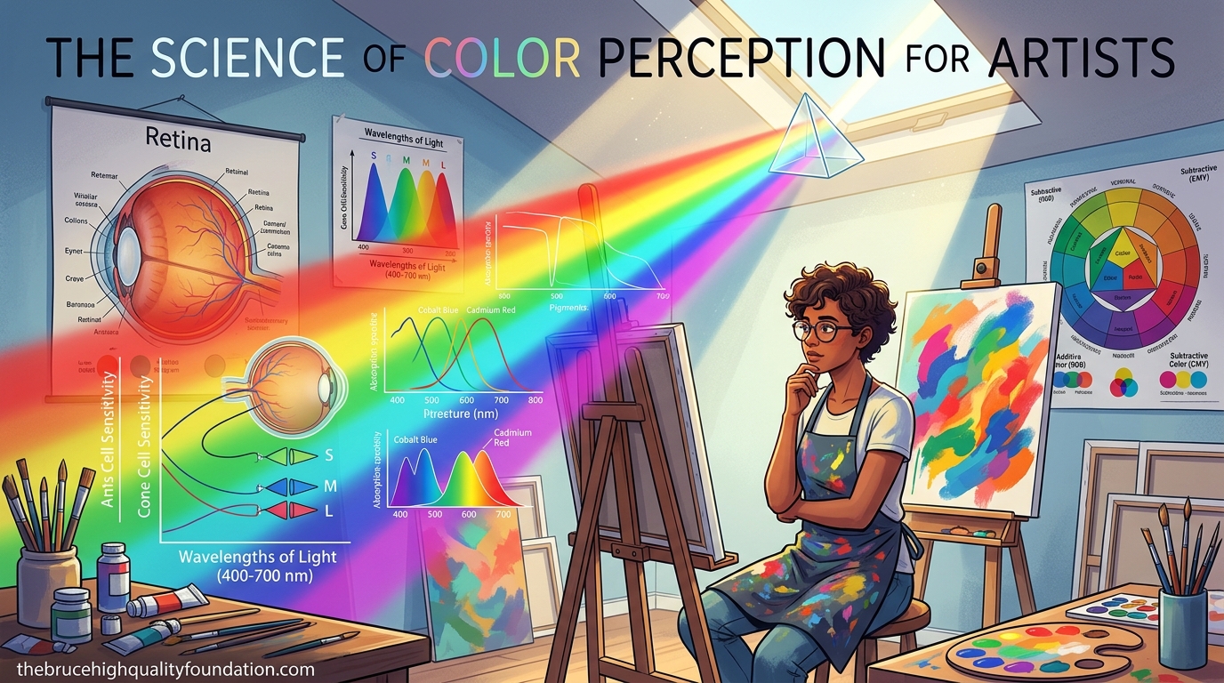
Color perception begins long before conscious vision. Light travels from a source, bounces off an object, and enters your eye through the cornea. This clear front layer bends the light, which then passes through your pupil. That small opening controls how much light gets in, much like the aperture of a camera.
The light that enters your eye lands on the retina, a thin layer of tissue lining the back of your eyeball. Here is where things get interesting. Your retina contains two types of photoreceptor cells: rods and cones. Rods handle low-light vision and do not detect color at all. Cones are responsible for color perception, and you have three different kinds, each tuned to respond to specific wavelengths of light.
One cone type detects short wavelengths, which your brain interprets as blue and violet. Another handles medium wavelengths, corresponding to green and yellow. The third responds to long wavelengths, creating your experience of red and orange. This trichromatic system means that every color you see is actually a blend of signals from these three cone types.
Once your cones detect light, they fire electrochemical signals along the optic nerve to your visual cortex. The brain does not simply report what it sees. It processes, filters, and interprets these signals based on context, surrounding colors, and past experiences. This is why the same gray patch looks lighter against black and darker against white. Your brain is constantly making adjustments.
The Role of Wavelength in Color
Visible light exists on a spectrum from about 380 to 700 nanometers. Violet sits at the short end, red at the long end. When light of a single wavelength hits your eye, you perceive a pure spectral color. Most objects around you reflect multiple wavelengths simultaneously, which is why you rarely see pure spectral colors in daily life.
Understanding wavelength matters for artists because it explains why certain color relationships feel natural. Red and green sit on opposite ends of the visible spectrum. When placed together, they create maximum contrast because they activate the most different cone types. This biological fact is why complementary color pairs feel vibrant and alive.
The visible spectrum is relatively narrow compared to the full electromagnetic spectrum. Radio waves, microwaves, and X-rays all exist around us but our eyes cannot detect them. This limitation is not a flaw but an adaptation. The wavelengths our eyes evolved to see correspond to the peak output of our sun, making them maximally useful for survival and navigation.
The Color Wheel and Its Significance
The color wheel as we know it today traces its roots to Sir Isaac Newton’s experiments in the 1660s. Newton passed white light through a prism and discovered it separated into the familiar rainbow spectrum. He then placed these colors in a circular arrangement, adding magenta to connect the ends, creating the first modern color wheel.
Artists quickly adopted this tool because it organizes colors in a way that reveals their relationships. Colors adjacent on the wheel behave similarly. Colors opposite each other create tension and energy. The wheel gives you a map for making informed choices about which colors to combine.
The structure of the color wheel also explains why certain pigment mixtures produce unexpected results. When you mix paints, you are working with subtractive color. Pigment particles absorb certain wavelengths and reflect others. Mixing blue and yellow paint absorbs most red and blue wavelengths, leaving green for your eyes to detect. This subtractive process means that adding more pigments actually reduces the range of wavelengths your mixture can reflect.
Why Artists Need the Color Wheel
The color wheel solves practical problems. It helps you identify which colors to mix when you want a specific hue. It shows you which combinations create harmony and which create discord. It guides decisions about temperature, saturation, and value without requiring trial and error on the canvas.
Professional artists do not memorize the color wheel once. They internalize it through practice until understanding color relationships becomes automatic. The wheel is not a limitation. It is a launching point for intuition.
Johann Heinrich Wilhelm Itten, the famous Bauhaus color teacher, identified that beginners often fail because they try to memorize rules rather than develop direct experience. The color wheel should be used to generate questions and observations, not to replace perceptual learning.
Primary, Secondary, and Tertiary Colors
Primary colors form the foundation of your palette. These are colors that cannot be created by mixing other colors. In traditional painting, red, yellow, and blue serve as primaries. In digital design and light-based work, the primaries are red, green, and blue because of how your eye’s cones respond.
Secondary colors emerge when you mix two primary colors in equal amounts. Yellow and blue produce green. Red and yellow create orange. Blue and red make violet. These secondary colors sit between their parent colors on the color wheel, which means they inherit some of the properties from both.
Tertiary colors form when you mix a primary with an adjacent secondary. Red-orange, yellow-green, and blue-violet are examples. These in-between hues allow for remarkable subtlety in your work. They prevent the jarring quality that comes from using only primary and secondary colors.
Additive vs Subtractive Color
Artists should understand that two different color systems govern what they see. Subtractive color applies to paints, dyes, and pigments. Each pigment particle absorbs certain wavelengths and reflects others. As you add more pigments, you subtract more wavelengths, which is why mixing all primaries creates muddy brown rather than white.
Additive color governs screens, projectors, and light-based displays. Here, you start with darkness and add wavelengths. Combining red, green, and blue light at full intensity creates white. This is why your digital design work follows different rules than your canvas work.
The confusion between these two systems causes many beginner mistakes. If you scan a painting and notice the colors look different on screen, you are seeing the additive color system of your monitor interacting with the subtractive system of your pigments. Understanding both helps you diagnose and correct color problems.
Essential Color Theory Terms
Every artist needs a vocabulary for describing color. These terms provide precision that words like “dark blue” or “reddish” cannot offer. Mastering them means you can communicate color decisions and analyze your own work with clarity.
Hue
Hue refers to the pure state of a color, before you add white or black. Red, blue, green, and orange are all hues. When artists say “shift the hue,” they mean move the color’s essential character along the spectrum, perhaps from red toward orange or from blue toward violet.
Saturation
Saturation describes a color’s intensity or purity. A highly saturated red appears vivid and bold. A desaturated red appears muted, closer to gray. You can think of saturation as the color’s distance from an equal-brightness gray. Digital tools often call this property “vibrance” or “chroma.”
Desaturation happens naturally as colors recede into the distance. Atmospheric perspective causes distant mountains to appear bluish and washed out compared to foreground elements. Artists use this relationship deliberately to create depth.
Value
Value indicates how light or dark a color appears. This is perhaps the most critical skill for artists to develop. Research shows that value does more to create the illusion of form than hue or saturation combined. A painting with perfect color relationships but poor values will look flat. A painting with bold value contrasts will read as dynamic even with limited color.
Artists sometimes use the terms “tints” and “shades” to describe value changes. A tint results from adding white to a hue, making it lighter. A shade comes from adding black, making it darker. Understanding these relationships lets you build depth and dimension in your work.
The Munsell color system, developed by artist Albert Munsell in the early 1900s, remains influential because it separates hue, value, and chroma into distinct dimensions. Many artists find that working with Munsell notation helps them analyze existing palettes and plan new ones with greater precision.
Color Temperature: Warm vs Cool
Color temperature is a psychological property that affects how we experience a painting. Warm colors advance toward the viewer. Cool colors recede. This spatial effect means you can create depth without changing values at all.
Warm colors cluster around red, orange, and yellow on the color wheel. They remind us of fire, sunlight, and heat. These colors feel energetic, exciting, and inviting. In portraits, warm tones in the skin create a healthy, alive appearance.
Cool colors center on blue, green, and violet. They evoke water, shade, and cold. Cool tones feel calm, mysterious, and distant. A landscape painted with cool shadows creates a sense of early morning or late evening light.
Practical Applications of Temperature
Understanding temperature helps you create cohesive color schemes. A painting made predominantly of warm tones will feel unified even if the actual hues vary widely. The same principle applies to cool-dominant work.
Temperature also explains why some color mixes produce muddy results. Warm and cool colors placed side by side create vibration and energy. Mixing them on the palette tends to neutralize both, creating gray. For this reason, many artists keep warm and cool versions of each primary color rather than relying on a single version.
Ultramarine blue versus cobalt blue represents one such warm-cool pair. Ultramarine carries a slight red bias, making it warmer. Cobalt blue trends toward violet, positioning it as the cooler option. Having both on your palette expands your ability to create temperature variation without introducing new hues.
Color Combinations and Schemes
Color schemes are predetermined relationships that artists use to create harmony. These are not rules but frameworks. Understanding them lets you make informed choices about palette development.
Complementary Colors
Complementary colors sit directly opposite each other on the color wheel. Red and green, blue and orange, yellow and violet. These pairs create maximum contrast because they stimulate very different cone responses. Used strategically, complements make each other appear more vibrant. Used carelessly, they create visual vibration that tires the eye.
Complementary schemes work well for creating emphasis. If you want a particular area to pop, place its complement nearby. The eye naturally gravitates toward areas of maximum contrast.
Analogous Colors
Analogous colors sit next to each other on the wheel. Blue, blue-green, and green form an analogous group. These colors share wavelengths, meaning they harmonize naturally. A palette built on analogous relationships feels cohesive and unified. The drawback is potential monotony without value or temperature variation.
The Impressionists pioneered analogous palettes for capturing specific lighting conditions. Monet’s haystacks series demonstrates this principle beautifully. Each painting uses a narrow range of hues appropriate to the time of day and weather conditions being depicted.
Triadic and Split-Complementary Schemes
Triadic schemes use three colors equally spaced around the wheel, forming a triangle. Red, yellow, and blue is a triadic scheme. These combinations offer variety while maintaining balance. They work best when one color dominates and the others serve as accents.
Split-complementary uses a base color plus the two colors adjacent to its complement. If your base is blue, you would use yellow-orange and red-orange. This approach captures some contrast of the complementary scheme while being easier to balance.
Color Psychology for Artists
Colors carry emotional associations that your brain processes instantly and often unconsciously. This is not universal. Cultural context shapes which emotions certain colors evoke. But some patterns appear across most Western art traditions.
Red grabs attention. It feels urgent, passionate, and aggressive. This is why warning signs and sale banners use red. In art, red draws the eye first, making it ideal for focal points.
Blue promotes trust and calm. Corporate logos frequently use blue for this reason. In paintings, blue creates depth and tranquility. It works well in backgrounds and areas you want the viewer to rest their eyes.
Yellow radiates optimism and energy. It appears to advance, much like red, but with less intensity. Yellow works for highlights and areas meant to feel cheerful or illuminated.
Green balances red’s aggression with blue’s calm. It feels natural, growth-oriented, and refreshing. This is why green appears in so many landscape paintings.
Cultural Considerations
Artists working across cultures should note that color associations shift. White represents mourning in some Eastern traditions. Purple signifies royalty in Western contexts but mourning in Thailand. These differences matter when creating work for diverse audiences.
The most successful artists understand psychology but do not become slaves to it. They use color associations as starting points, then subvert or amplify them for effect. A horror filmmaker might use soft greens to create unease precisely because green typically feels natural and safe.
Josef Albers, whose book “Interaction of Color” remains a foundational text, demonstrated that context matters more than absolute color choice. The same gray appears different against different backgrounds. Artists who internalize this principle gain flexibility in using color emotionally rather than literally.
The Neuroscience of Color Perception
Your brain does far more work in color perception than your eyes. The visual cortex receives signals from the retina but must interpret them correctly. This interpretation process introduces both remarkable capabilities and frustrating limitations.
Color constancy is one of your brain’s most impressive tricks. A white table looks white whether viewed under bright sunlight, fluorescent office lighting, or warm candlelight. Your brain adjusts for the lighting conditions automatically, recognizing that the table’s color has not actually changed.
For artists, color constancy creates a challenge. You may perceive the white table as perfectly white in all lighting conditions, but a photograph will capture different values under each lighting setup. This is why painting outdoors on an overcast day produces different results than painting under direct sun, even if you are looking at the same object.
Context Effects in Color Perception
The same color will appear different depending on what surrounds it. Place a gray square next to black and it looks light. Place that same gray next to white and it appears dark. This simultaneous contrast effect means you can never judge a color in isolation.
The Munker illusion demonstrates this principle dramatically. Two identical colors appear different when surrounded by different hues. Your brain processes the entire visual field, not individual patches in isolation. This is why artists must always compare colors side by side rather than trusting memory.
Research from the University of Pennsylvania suggests that your brain begins processing color within 100 milliseconds of seeing a new stimulus. This rapid processing happens pre-consciously, meaning you experience color emotions before you have time to analyze what you are seeing. This helps explain why art can move us so immediately.
Optical Illusions Artists Can Exploit
Artists have used color illusions for centuries to create effects that seem impossible. Understanding these tricks lets you push color beyond its normal boundaries.
Simultaneous Contrast
When you place two colors next to each other, each affects how the other appears. A medium red looks warmer next to blue, cooler next to orange. This effect operates even when neither color actually changes. Skilled artists use simultaneous contrast to make colors appear more saturated without actually using more pigment.
The impressionists exploited this effect extensively. Rather than mixing colors on their palettes to achieve specific hues, they placed pure colors side by side on the canvas, allowing the viewer’s eye and brain to blend them. This approach created luminosity that mixing could not achieve.
The Chevreul Illusion
Michel Eugene Chevreul discovered that when a color is surrounded by progressively lighter versions of itself, the center appears darker than it actually is. This effect works in reverse as well. Surround a color with progressively darker versions, and the center appears lighter.
Impressionist painters used this illusion to create vibrating, luminous effects. Rather than mixing colors to achieve a specific hue, they placed distinct colors next to each other, letting the viewer’s eye and brain blend them at a distance.
Chevreul worked as a dye chemist for the French tapestry industry. His observations of how colors appeared different in large masses versus small samples directly influenced the Impressionist movement’s approach to brushwork and color placement.
Afterimages and Complementarity
Stare at a red square for thirty seconds, then look at a white wall. You will see a green square. This afterimage results from cone fatigue. Staring at red overstimulates your red-sensitive cones, causing them to temporarily stop responding. When you look at white (which contains all wavelengths), the red cones remain “offline,” and your brain interprets the remaining signals as green.
Artists exploit afterimages by placing complements next to each other. The vibration this creates keeps the viewer’s eyes active and engaged. It also explains why staring at bright colors for too long can make later color choices difficult.
This is why artists sometimes squint when evaluating color relationships. Squinting reduces visual input, allowing your brain to process relationships more holistically without being distracted by specific hues.
Practical Exercises for Artists
Understanding color theory intellectually is only half the battle. Your eyes need training to see color more accurately. These exercises build the observation skills that color perception requires.
Grayscale Seeing Exercise
Convert a photograph to grayscale and study the value relationships. Then try to recreate the color version using only your value analysis as a guide. This exercise disconnects hue from value, helping you see each property independently.
Many artists find that their color mixing improves dramatically after practicing grayscale conversion. They stop relying on guesswork and instead match colors to values they can identify.
Environment Testing
Place your current painting project in different lighting conditions. Morning light, afternoon light, artificial light, shade. Watch how the colors shift. This teaches you which colors are stable and which are lighting-sensitive.
You will discover that some pigments shift dramatically under different lighting while others remain relatively stable. This knowledge informs future purchases and helps you plan paintings for specific lighting conditions.
Color Observation Practice
Spend five minutes each day naming the colors you actually see, not the colors you think you should see. Shadows are not black. They contain blue, purple, and green depending on the surrounding environment. This exercise builds honesty in your color perception.
Artists who complete this practice report that their paintings become more interesting. They stop painting what color theory says shadows should be and start painting what shadows actually are. This shift from idealized to observed color creates work that feels fresh and alive.
One practical approach involves spending time each morning simply looking at the sky, observing how its colors shift from horizon to zenith and from sunrise to sunset. This trains your eye to notice subtle gradations without the pressure of capturing them in a painting.
How do we perceive color?
Light enters the eye through the cornea and passes through the pupil to reach the retina. Here, photoreceptor cells called cones detect specific wavelengths of light. The brain then interprets these signals as colors, processing them based on context, surrounding colors, and past experiences.
Are colors real or just an illusion?
Colors exist as wavelengths of light in the physical world, but our perception of them is constructed by the brain. Different wavelengths of light bounce off objects and enter our eyes, but what we see is our brain’s interpretation of these signals, not the wavelengths themselves. This is why colors can appear to change depending on their surroundings.
What is the 70-30 rule in art?
The 70-30 rule suggests that approximately 70% of your painting should use one color family or value range, with the remaining 30% providing contrast and interest. This creates visual harmony while preventing monotony, helping artists balance unity with variety.
Why do colors look different next to each other?
Simultaneous contrast causes colors to appear different depending on their surroundings. Your brain processes the entire visual field, not individual colors in isolation. A gray will look lighter next to black and darker next to white. This effect is why artists must compare colors side by side rather than judging them alone.
Can color perception be trained?
Yes, color perception improves with practice. Exercises like viewing through grayscale filters, testing colors in different lighting, and observing real-world subjects rather than relying on memory help artists see more accurately. Understanding the science behind perception gives artists tools to consciously improve their observation skills.
Conclusion
The science of color perception for artists is ultimately practical knowledge. Every concept in this guide serves your work. The biology explains why colors behave the way they do. The psychology helps you create intended effects. The exercises train your eyes to see what is actually there rather than what you expect.
Start applying what you have learned today. Pick one concept, perhaps simultaneous contrast or value relationships, and look for it in your current project. Then expand. Color mastery comes from the accumulation of many small observations, each building on the last.
Artists who understand color perception gain freedom. They stop fighting their materials and start working with them. They make intentional choices rather than hoping for lucky mixes. They see the world with greater richness and translate that vision into paintings that move viewers.