Walking through a museum gallery, you have probably noticed how every piece seems perfectly positioned, as if the art was always meant to be there. That is not an accident. Museum curators spend years mastering the subtle art of display, and their techniques can transform your home from simply decorated to deliberately curated. Learning how to display art like a curator is not about having a museum-sized budget or an art history degree. It is about understanding a few key principles that professionals use daily to create those breathtaking gallery experiences.
I have spent over a decade visiting museums across the country, studying how curators arrange, light, and present artwork to tell compelling stories. The good news is that these same principles work in any space, whether you have a sprawling loft or a studio apartment. You can apply museum standards to your personal collection and create displays that protect your art while maximizing its visual impact.
This guide will walk you through everything you need to know to bring museum-quality art display into your home in 2026. From the specific measurements professionals use to the lighting specifications that preserve delicate works, you will learn practical techniques that deliver professional results. By the end, you will understand exactly how curators think about space, story, and presentation, and you will have a clear roadmap for transforming your walls into a personal gallery.
Table of Contents
The Curator’s Mindset: Understanding Museum-Quality Display
Before you hammer a single nail, you need to understand how curators approach art display. Professional curators do not simply hang pictures on walls. They create narratives and experiences that guide viewers through a visual journey. This mindset shift is the foundation of museum-quality art display at home.
Curators think about three core elements: the art, the space, and the viewer. Every decision flows from balancing these factors. The artwork must be protected and showcased. The space must be enhanced, not overwhelmed. And the viewer must have a clear, comfortable sight line that allows for proper appreciation. When you adopt this three-part thinking, your displays become intentional rather than accidental.
Thinking Like a Professional
The first thing curators do when planning a display is establish a focal point. This anchor piece sets the tone for everything around it. In your home, this might be your largest or most meaningful work. Everything else in the room should relate to this anchor, either complementing it or creating intentional contrast that adds visual interest.
Curators also consider the rhythm and flow of a space. They ask how viewers will move through the room and what they will see first, second, and third. You can apply this by standing in your doorway and tracing the natural path your eye takes. Place your most important pieces where they will catch attention first, then arrange supporting works to guide the viewer deeper into the space.
Creating a Narrative
Museum exhibitions tell stories, and your home art display should too. This does not mean every piece needs to match. In fact, some of the most compelling displays mix periods, styles, and mediums. The connection can be thematic, color-based, or purely emotional. What matters is that you can articulate why these pieces belong together.
Janet Bishop, Curator of Painting and Sculpture at the San Francisco Museum of Modern Art, emphasizes this point in her advice to homeowners. She recommends thinking about what draws you to each piece and finding connections that might not be obvious at first glance. A landscape photograph and an abstract painting might share a color palette. A vintage print and a contemporary sculpture might both reference nature. These subtle connections create depth in your display.
The 58-60 Inch Rule: Hanging Height Fundamentals
If you take only one technique from this guide, make it the 58-60 inch rule. This is the industry standard that separates amateur displays from professional ones. The rule is simple: the center of your artwork should hang 58 to 60 inches from the floor. This places the art at average eye level, creating a consistent sight line that feels natural and intentional.
The 58-60 inch rule works regardless of ceiling height or artwork size. Whether you are hanging a small photograph or a massive canvas, you measure to the center of the piece. This consistency creates visual harmony across multiple works, even in different rooms. It is why museum galleries feel cohesive even when displaying wildly different pieces.
Understanding the Center Line
The center line is the horizontal middle point of your artwork. For a single piece, measure the total height and divide by two to find the center. That center point should sit between 58 and 60 inches from your floor. For most people, 60 inches is the sweet spot, though 58 inches works better in spaces where viewers will often be seated.
This rule applies to nearly all artwork types. Paintings, photographs, prints, and mixed media pieces all benefit from center line alignment. The only exceptions are pieces specifically designed to be viewed from below, such as certain sculptural installations, or pieces hung above furniture where the 58-60 inch rule would place the art too low.
Tools You Need
Professional hanging requires minimal tools, but the right ones make a significant difference. You will need a steel tape measure for accuracy, a pencil for marking, a level to ensure straight hanging, and appropriate hardware for your wall type and artwork weight. Do not rely on the small sawtooth hangers that come pre-installed on many frames. These are rarely sufficient for secure, long-term hanging.
For heavier pieces, invest in D-ring hangers and hanging wire rated for the artwork’s weight. These distribute weight more evenly and reduce stress on the frame. For plaster or drywall, use anchors rated for at least twice your artwork’s weight. For brick or concrete, you will need masonry bits and appropriate anchors. A stud finder helps locate solid anchoring points for heavy pieces.
Step-by-Step Measurement
Start by measuring your artwork’s total height and dividing by two to find the center. Add this to your chosen center line height (58 or 60 inches). Then measure the distance from the top of the frame to where the hanging hardware sits. Subtract this hardware offset from your total to determine exactly where your nail or hook should go.
For example, if you have a 24-inch tall piece and want a 60-inch center line, the artwork center should be at 60 inches. If your hanging wire sits 4 inches below the top of the frame when pulled taut, your nail goes at 56 inches from the floor (60 minus 4). Mark this spot with a pencil, check it with a level against adjacent pieces, then install your hardware.
Lighting Your Artwork Like a Museum Professional
Lighting can make or break your art display. Too little light and your artwork disappears into shadow. Too much direct light and you risk permanent damage. Museums follow strict lighting standards to balance visibility with preservation, and you can apply these same principles at home.
The goal is consistent, even illumination that reveals the artwork’s colors and details without creating glare or hotspots. Museum standards typically call for 5 to 10 foot-candles of light for sensitive works like watercolors and photographs, and up to 20 foot-candles for oil paintings and sturdy prints. While you do not need to measure foot-candles at home, understanding this baseline helps you evaluate your lighting choices.
Natural Light Dangers
Sunlight is the enemy of art. UV rays cause fading, discoloration, and deterioration of paper, fabric, and pigments. Even indirect natural light accumulates damage over time. Museums use UV-filtering films on windows and rotate sensitive works out of light exposure regularly. You should avoid hanging valuable or light-sensitive pieces on walls that receive direct sunlight.
If you must hang art in a naturally lit room, consider UV-filtering window films. These transparent films block up to 99% of UV radiation while maintaining visibility. They are an affordable alternative to specialty glazing for every window. You can also use blackout curtains or shades to control light exposure during peak hours.
Artificial Lighting Standards
LED lighting has revolutionized art display. Modern LED bulbs emit minimal UV radiation and produce little heat, both major advantages for art preservation. Look for bulbs with a Color Rendering Index (CRI) of 90 or higher. CRI measures how accurately light reveals true colors. Standard LEDs often have CRIs around 80, which subtly distorts artwork colors.
Color temperature matters too. Museums typically use 3000 to 3500 Kelvin for warm, natural-looking illumination. Avoid cooler temperatures (4000K and above) which can make artwork appear harsh. Picture lights mounted on the frame or above it provide focused illumination, while track lighting offers flexibility for changing displays. Wall washers create even illumination across larger pieces or gallery walls.
UV Protection Solutions
Even with proper lighting, your artwork needs physical protection. UV-filtering glazing, whether glass or acrylic, blocks harmful radiation while allowing visible light through. Museum-grade glass offers the best clarity with 99% UV protection, but it is expensive and heavy. UV Plexiglas provides similar protection with lighter weight and better shatter resistance, though it can scratch more easily.
For works on paper, photographs, and textiles, UV protection is non-negotiable. These mediums are particularly vulnerable to light damage. The investment in proper glazing pays off by extending your artwork’s lifespan indefinitely. Standard glass offers no UV protection, so upgrading existing frames is often worth the cost for valuable pieces.
Framing and Presentation Techniques
Framing is both protection and presentation. A well-chosen frame enhances the artwork without competing with it. Museums often use simple, consistent framing to keep focus on the art itself. You can apply this principle at home by choosing frames that complement rather than dominate.
The three main framing approaches are traditional frames with mats, floating frames, and shadow boxes. Each serves different artwork types and aesthetic goals. Understanding when to use each style helps you make choices that look deliberate and professional.
Frame Style Options
Traditional framing with an overmat creates breathing room around the artwork. The mat board separates the art from the glass, preventing moisture buildup and sticking. It also provides visual transition between the art and frame. Museums typically use wide mats in neutral colors like warm white or soft cream. These colors do not cast color onto the artwork and feel timeless.
Floating frames create a gap between the artwork and frame edge, making the piece appear to float within the frame. This contemporary look works well for canvases, thick paper, and pieces with deckled or raw edges. Floating frames let the artwork’s physical presence stand out rather than containing it traditionally.
Shadow boxes are deep frames that accommodate three-dimensional objects, layered collages, or pieces that need depth. They are essential for textiles, medals, and mixed media works. The depth creates dramatic presentation while protecting fragile elements from contact.
Matting and Spacing
Mat width affects how artwork is perceived. Narrow mats feel cramped and amateur. Wide mats create gallery presence even for small pieces. A good rule is that the mat should be at least 2 inches wide on each side for works under 11 by 14 inches. Larger pieces can handle proportionally wider mats. The bottom mat can be slightly wider than the sides, a traditional convention that grounds the artwork visually.
When using multiple mats, the inner mat (called the reveal) creates a subtle accent line. Choose a color drawn from the artwork itself. This detail shows sophisticated framing and draws the eye inward toward the piece. Keep reveals between 1/8 and 1/4 inch for subtlety.
Glass vs Acrylic
Glass offers superior clarity and scratch resistance but is heavy and fragile. Museum glass includes anti-reflective coating and UV protection, but at a premium price. Standard glass reflects light and distorts colors slightly. For most home applications, UV-filtering acrylic (Plexiglas) offers the best balance of protection, weight, and safety.
Acrylic is lighter than glass, reducing frame stress and making large pieces easier to hang. It does not shatter if dropped. However, it scratches more easily and can build up static that attracts dust. Use acrylic cleaner and a microfiber cloth for maintenance. Never use glass cleaner on acrylic, as ammonia can cause clouding and cracking.
Creating Visual Impact with Composition
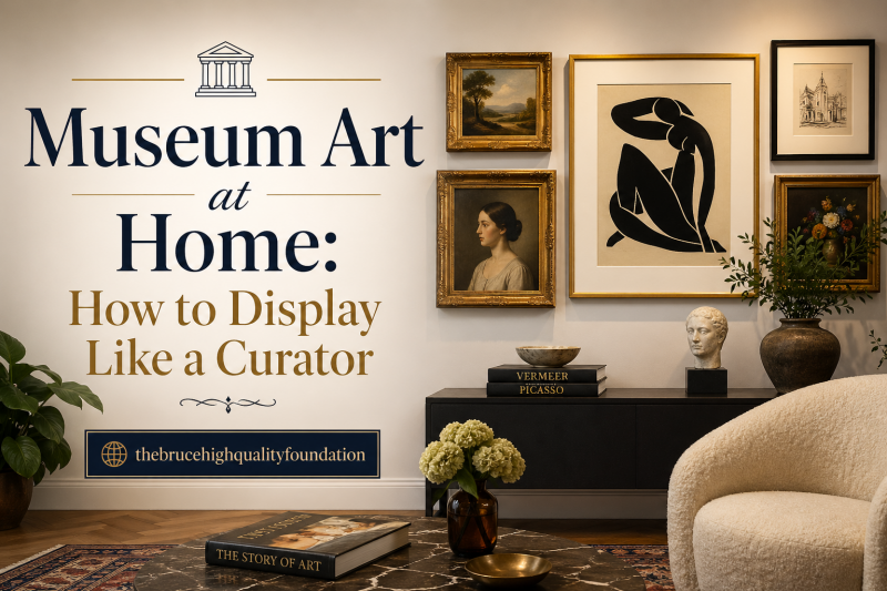
Single pieces make statements, but groupings tell stories. How you arrange multiple works determines whether your display looks collected or cluttered. Curators use specific compositional techniques to create gallery walls and multi-piece arrangements that feel cohesive and intentional.
The key principles are balance, rhythm, and focal points. Balance does not mean symmetry. Asymmetrical arrangements can be perfectly balanced through visual weight. Rhythm comes from consistent spacing and alignment. And focal points anchor the viewer’s attention before the eye travels to surrounding pieces.
The Gallery Wall Method
Gallery walls, also called salon-style arrangements, layer multiple works in an organic cluster. Start with your anchor piece, typically the largest or most visually weighty work. Place it slightly off-center, then arrange smaller pieces around it, maintaining consistent spacing of 2 to 3 inches between frames.
Plan your layout on the floor first. Arrange pieces until the overall shape feels balanced, then photograph the arrangement. Use paper templates cut to each frame’s size to transfer the layout to your wall. This trial-and-error process on the floor saves your walls from unnecessary holes.
Mix frame styles and art mediums thoughtfully. A gallery wall benefits from variety, but there should be unifying elements. Perhaps all frames are wood-toned, or all pieces share a color story. Avoid mixing metal finishes unless you are deliberately creating eclectic contrast.
Focal Points and Anchor Pieces
Every room needs a visual anchor, a piece that immediately draws attention and establishes the space’s artistic tone. This is often a large-scale work, but size is not the only factor. A small, intensely colored piece can anchor a room if positioned prominently and properly lit.
Position your anchor piece where the eye naturally lands when entering the room. Above a fireplace, behind a sofa, or on the wall facing the main entry are classic anchor positions. Once established, arrange secondary pieces to create conversation with the anchor. They can echo its colors, contrast its mood, or extend its theme.
Mixing Mediums
Combining paintings, photographs, prints, and sculpture creates dimensional interest. Two-dimensional works on walls pair beautifully with three-dimensional pieces on shelves, pedestals, or the floor. The interplay of flat and dimensional art keeps a space dynamic.
When mixing mediums, consider scale relationships. A large floor sculpture can balance a substantial painting. Small tabletop pieces work best grouped in odd numbers, arranged in triangular compositions. The rule of three works well: one dominant piece, one secondary piece, one accent piece creates visual harmony.
Common Art Display Mistakes to Avoid
Even with the best intentions, certain mistakes creep into home art displays. Learning what to avoid saves you from regret and potential damage to your collection. These are the most common errors curators see in residential settings.
Hanging art too high is the most frequent mistake. People intuitively place art higher than eye level, perhaps to keep pieces away from children or pets. The result is that viewers must crane their necks to see the work. Stick to the 58-60 inch center line rule even when it feels low at first. Your eye will adjust, and the display will feel more natural.
Ignoring sun exposure until damage appears is another costly error. By the time fading is visible, it is irreversible. Prevention through UV protection and placement is the only solution. Many forum users report learning this lesson the hard way with valuable photographs and watercolors.
Overcrowding walls creates visual chaos. Gallery walls work when spaced thoughtfully, but cramming too many pieces too close together looks cluttered, not curated. Give each piece room to breathe. If you have more art than wall space, rotate your collection seasonally rather than crowding it all at once.
Using improper hanging hardware risks both your art and your walls. Cheap hooks pull out of drywall. Sawtooth hangers stress frame corners. Wires too thin for the weight snap over time. Invest in proper D-rings, quality wire, and wall anchors appropriate for your artwork’s weight.
Frequently Asked Questions
What is the 2/3 rule for hanging art?
The 2/3 rule states that artwork should cover approximately two-thirds of the wall space above furniture. When hanging art above a sofa, console, or bed, the artwork width should be about two-thirds the width of the furniture piece below it. This creates proportional balance between the art and furniture. If using multiple pieces, their combined width should follow the same ratio.
How do I protect art from sun damage?
Protect art from sun damage by using UV-filtering glazing on frames, applying UV-blocking window film, hanging pieces away from direct sunlight, and using curtains or shades to control light exposure. Works on paper and photographs are especially vulnerable and require UV protection. Rotating sensitive pieces periodically also helps distribute any light exposure evenly.
Should I mix different styles of art together?
Yes, mixing different art styles can create dynamic, collected displays when done thoughtfully. Find unifying elements like color palette, theme, or frame finish to create cohesion. The key is intentionality. Mixing a vintage portrait with contemporary abstract works when both share warm earth tones creates conversation between pieces. Avoid mixing without any connecting thread, which can feel chaotic.
How can I create a gallery wall?
To create a gallery wall, start with an anchor piece placed slightly off-center. Arrange smaller pieces around it on the floor first, maintaining 2 to 3 inches between frames. Use paper templates to transfer the layout to your wall. Mix frame styles and mediums while keeping unifying elements like color or material. The overall shape should feel balanced even if not symmetrical.
What is the best lighting for art?
The best lighting for art is LED with a Color Rendering Index (CRI) of 90 or higher and a color temperature of 3000 to 3500 Kelvin. This provides warm, natural-looking light that reveals true colors. Position lights to avoid glare and hotspots. Picture lights, track lighting, and wall washers all work well. Avoid direct sunlight and use UV-filtering glazing for additional protection.
Conclusion
Displaying art like a curator is about intention, not expense. The techniques in this guide cost nothing to apply but transform how your art is experienced. Start with the 58-60 inch rule for consistent, professional hanging heights. Protect your collection with proper lighting and UV filtering. Frame pieces thoughtfully to enhance rather than compete. And compose your displays with the narrative eye of a storyteller.
You do not need to implement everything at once. Choose one room, one wall, or even one piece to start. Apply the curator’s mindset and technical standards to that single project. Once you see the difference professional techniques make, you will want to bring museum-quality display to every corner of your home.
Your art deserves to be seen as the artist intended, protected for future enjoyment, and arranged to tell your unique story. In 2026, make the commitment to display your collection with the care and expertise it deserves. The transformation will surprise you.